
Pavioli: rescuing good memories through typography

Alongside StudioBah’s designers, Fabio Haag Type explored typographic routes for the repositioning of a brand that is part of Southern Brazilians’ memory, Pavioli.


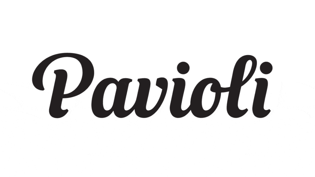
The cursive style of the current logotype, launched in 2013, was the starting point for exploring variations — of angle, weight, contrast, terminations, connections, etc. Although it was interesting, we agree that this style is commonplace in the food industry and that we should go further into Pavioli’s background to uncover something more unique about the essence of its brand.
The first logotype, from 1960, presents the name using only capital letters with strong triangular serifs; it seemed too distant from the attributes of the brand today, which in addition to Pavioli’s history, also includes affection, care and zeal.

We found what we were looking for in the 1990 logotype, which was featured on Pavioli products for 23 years. This version has an expressive personality thanks to the condensed proportion and the letter ‘o’ and its tilted axis. We took these characteristics and designed eight variations on this theme until we arrived at the final solution, a logo that respects the 52-year history and paves the way for new memories, for other generations.


Team: Fabio Haag (Creative Direction & Lettering), Sauê Ferlauto (Lettering); StudioBah: Felipe Bernardes Amaral (Creative Direction), Natália Athayde Porto (Strategy), Bianca Groff, Camila Sanzi, Maria Laura Jeremias, Rafael Poloni e Ronald Zanardi (Design Team); Luiza Protas (Social Media); Moropolo Studio: Eduardo Bussolin e Alexandre Pico (Photography)
Find out more about StudioBah.


