
We are a typographic studio that believes in the strength of expressiveness to increase brand value.
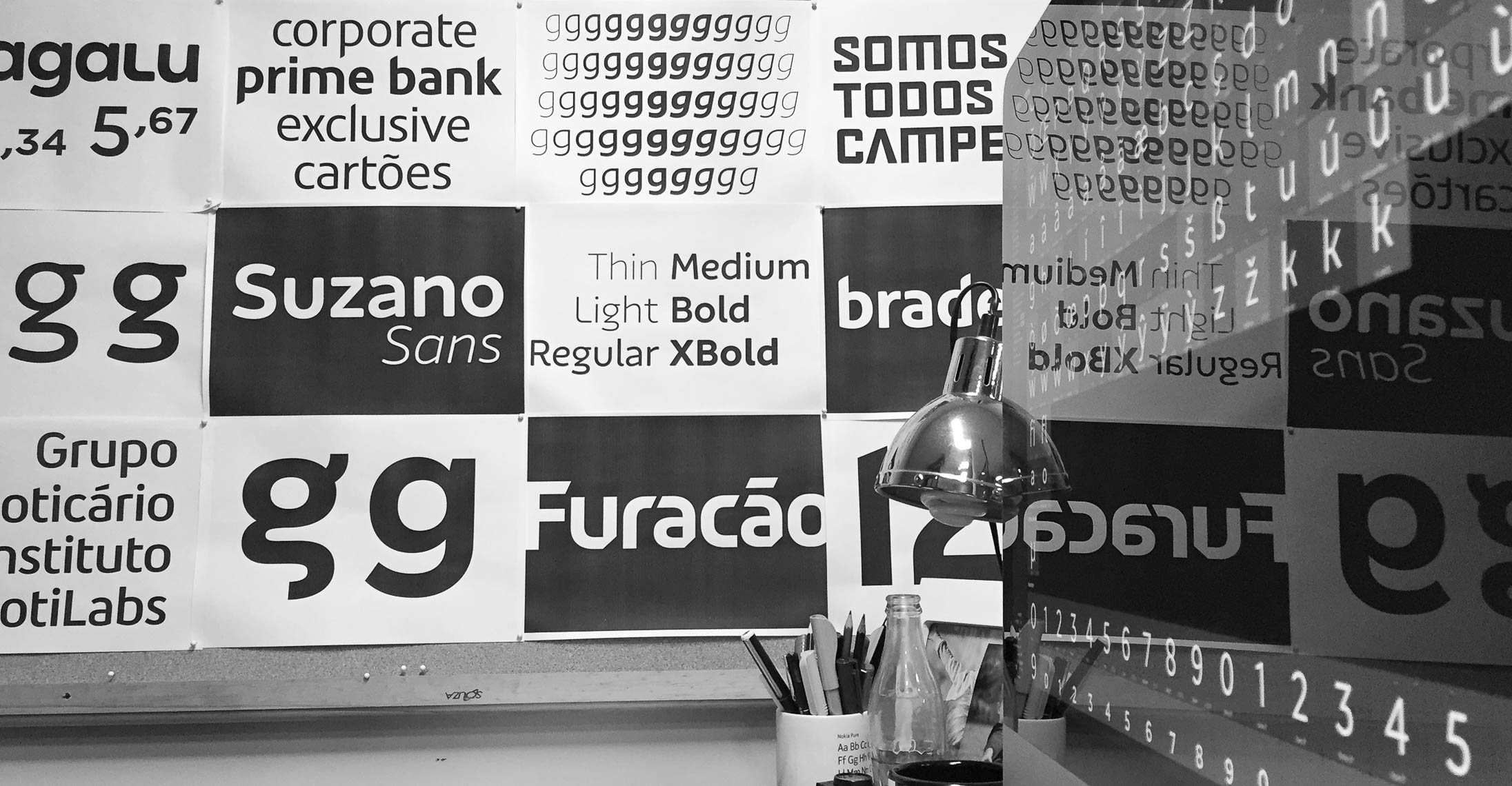
With a typographic eye for detail, we contribute to the work of the designer who seeks new forms of expression, with functionality.
Our services show a thorough work, with real impact. Whether in retail or custom fonts, or in the refinement of logotypes, every detail contributes to a single purpose: to enhance the strength of the brand.
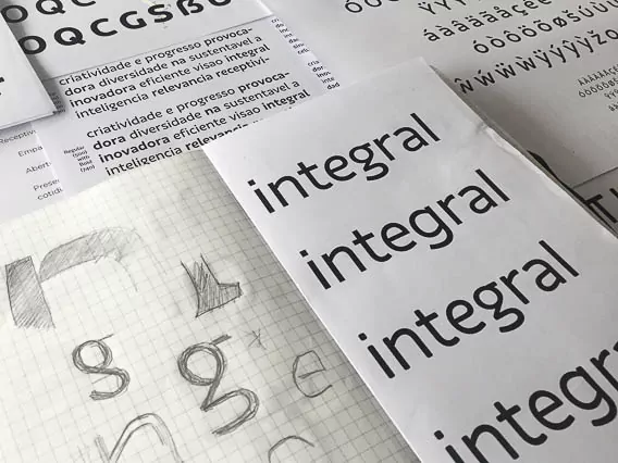
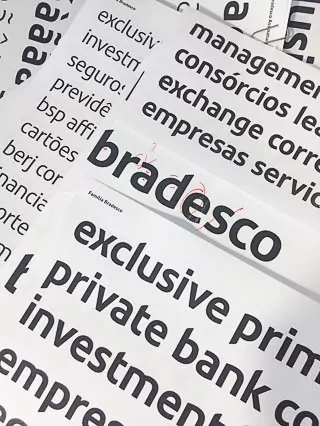
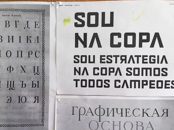
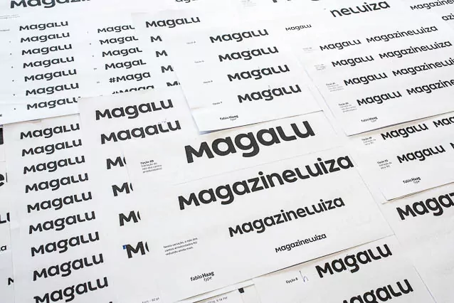
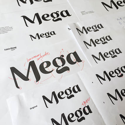
Under the creative leadership of Fabio Haag — type designer with more than 14 years of experience, former Deputy Creative Director at one of the world’s largest studios based in London — Fabio Haag Type has become a reference in the market and today has a diverse team, with expertise ranging from technology to lettering. We have already worked on more than 200 projects in partnership with design studios in Brazil and abroad, for established companies, including some of the most valuable brands in Brazil, and even fast unicorns.
We have already worked for these brands:
Together with these studios:
At Fabio Haag Type, a single principle guides all of our fonts: expressiveness to the limit of functionality.
meet our team
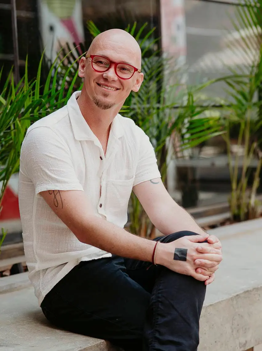
fabio haag
“Typefaces are like watches: a tension between form and function.”
For someone who has the handwriting of a doctor in a hurry, Fabio draws letters pretty well. He is one of the pioneers of digital typeface design in Brazil.
He built his career as a type designer at Dalton Maag, one of the largest typographic studios in the world, where he had the chance to work for 5 of the most valuable brands in the world. It was also there that he had the opportunity to create the typeface for the Rio 2016 Olympic Games.
And among the letters, the numbers also have their turn: 8 medals in the Brazil Design Award; 7 projects selected at the 13th Brazilian Graphic Design Biennial; 1st and 2nd place in the Typography category, in one of the editions of the Bornancini Award; and countless mentions and references of his work in specialized international magazines.
The secret of corporate typeface design, according to Fabio, is to understand that a corporate typeface is at the service of a brand strategy, it is part of a larger identity system, composed of intricate gears, like a watch.
When he takes a break between classes and lectures at international conferences, Fabio has a camera in his hand and can be found in breathtaking landscapes, exercising his hobby, photography.
His most important job was to shape the message of the book “O Poder do Eu Te Amo” by Piangers, which you will understand better _here_.
And if you ask about his most challenging project, it’s the one that is always in progress: the type that stamps the naked emperor’s clothes.
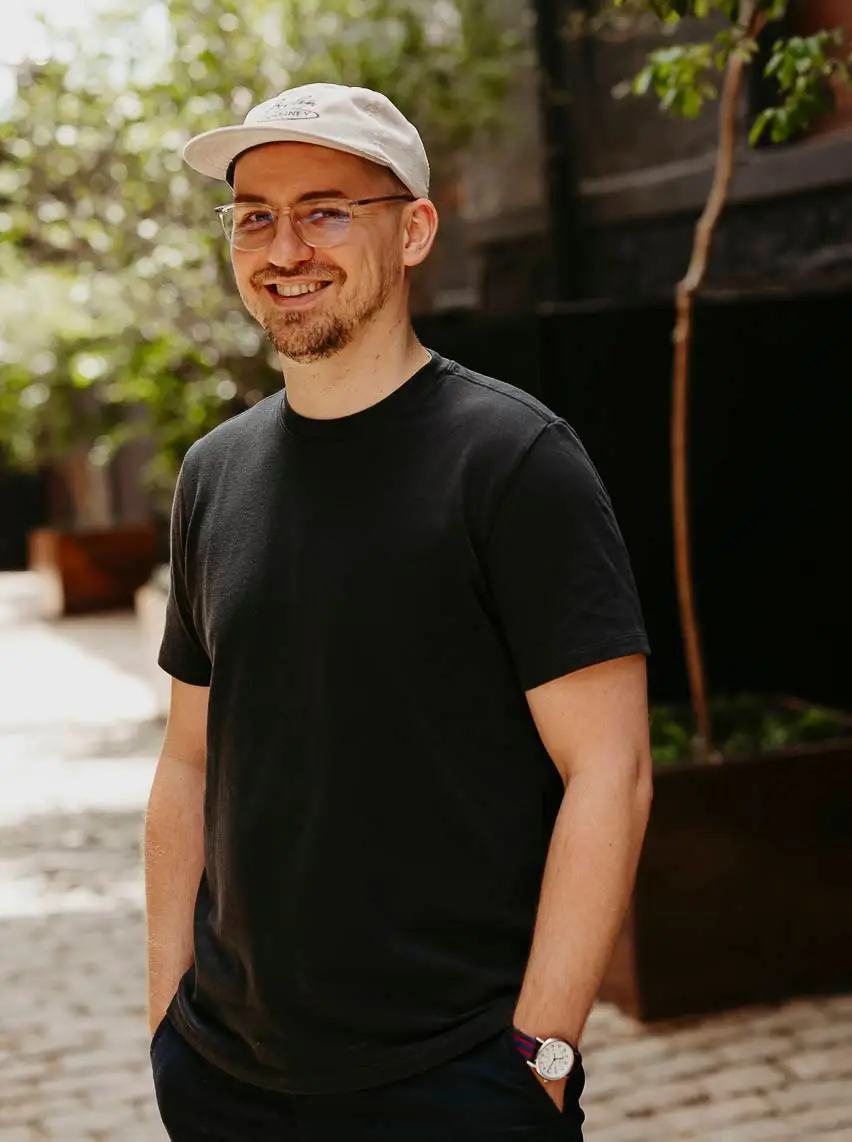
henrique beier
“My interest in typography arose in college, when a teacher forbade the class to use Arial.”
Henrique prefers to design friendly typefaces, he likes the heavier styles. His first great pride, Garibaldi, was selected for the 2014 Tipos Latinos Biennial and was the little push he needed to start his own foundry, Harbor Type.
His full-time dedication to typeface design earned him awards at the ADG Biennial, Hiii Typography and Typographica. With the same dedication he learned programming language and believes that the beauty of typography is the balance between art and technology.
He starts work and tunes in the usual podcast and he only pauses his types to binge watch The Office.
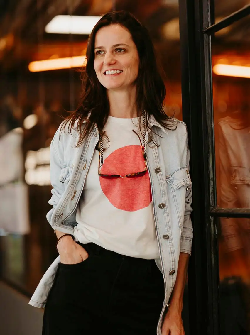
ana laydner
“No to invisible typography! If it is beautiful and well crafted, it has to show!”
Ana draws typefaces for text with personality. Between Porto Alegre and Buenos Aires, her luggage brings a specialization in Typeface Design and extensive experience in branding and editorial design, from studios in both cities.
Awarded at the 2018 Tipos Latinos with Gigio, a slab serif for text, this passion that crosses countries also led her to the selection for the 13th Brazilian Graphic Design Biennial with the Kiperman family.
Founding partner of Coletivo Plomo71, she likes to rethink concepts and exchange experiences with designers. Even with a studio in Porto Alegre, Ana has what she needs in any corner of the world, she was a nomad long before the quarantine.
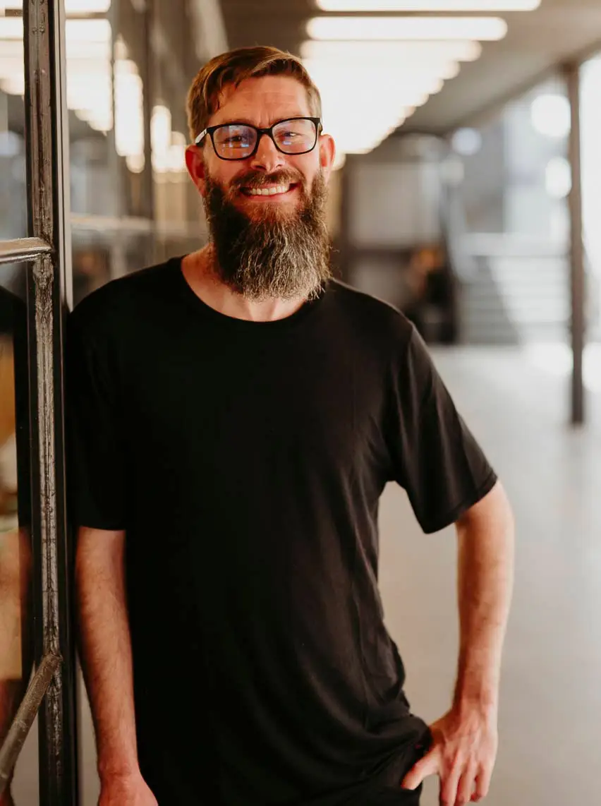
eduilson coan
“It was just a hobby. Suddenly, it became a profession.”
The hobby was even named: Ninfa, his first commercial typeface, created in 2008. But it took a few years for the self-taught Eduilson to leave his graphic design agency behind to, in 2012, bet the farm on the typeface design market with dooType.
In the Type Design specialization at Cooper Union in New York, Eduilson studied from calligraphic practice to digital letterform design. And he has already developed more than 30 families for the retail market, plus custom projects, 6 of which have already been selected for the Tipos Latinos biennial.
When he’s not working, he’s focused on his personal project and biggest challenge: going through at least 300 days a year meat free.
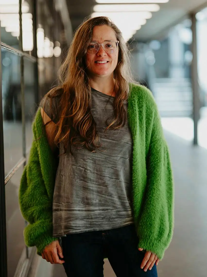
sofia mohr
“After living in Chile for a decade, Sofia harmonizes visually appealing letterforms with legibility, creating unique blends.”
Graduated in Architecture in Brazil at UFRGS, and in Digital Typeface Design in Chile at UC, Sofia reinterprets her experiences and culture without borders in designing fonts with personality. Inspiration can come from the aroma of an espresso, tropical wildlife, or even personal experiences from her childhood.
Since 2014, through Latinotype, she has released more than 20 typefaces, many of which have made the bestseller lists, being used in branding, publications and packaging projects worldwide.
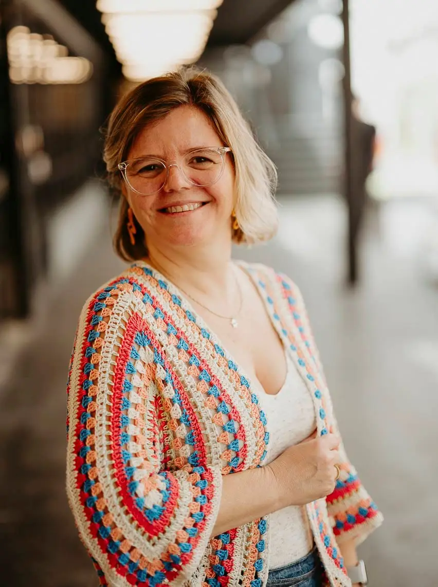
luciana haag
“I don’t design letters like they do, but I’m a perfectionist too: if there’s a difference of 2 cents, I will find it.”
The most beautiful handwriting here is not the one of a designer, but can be found in our Administrative and Finance department. Luciana graduated in Pedagogy and writes down everything on paper, highlighting and abusing the colors of text markers. For 20 years in education, she has also explored the world of manual crafts and now organizes our Administrative and Finance area with such care and detail that no typeface designer can dream of doing.
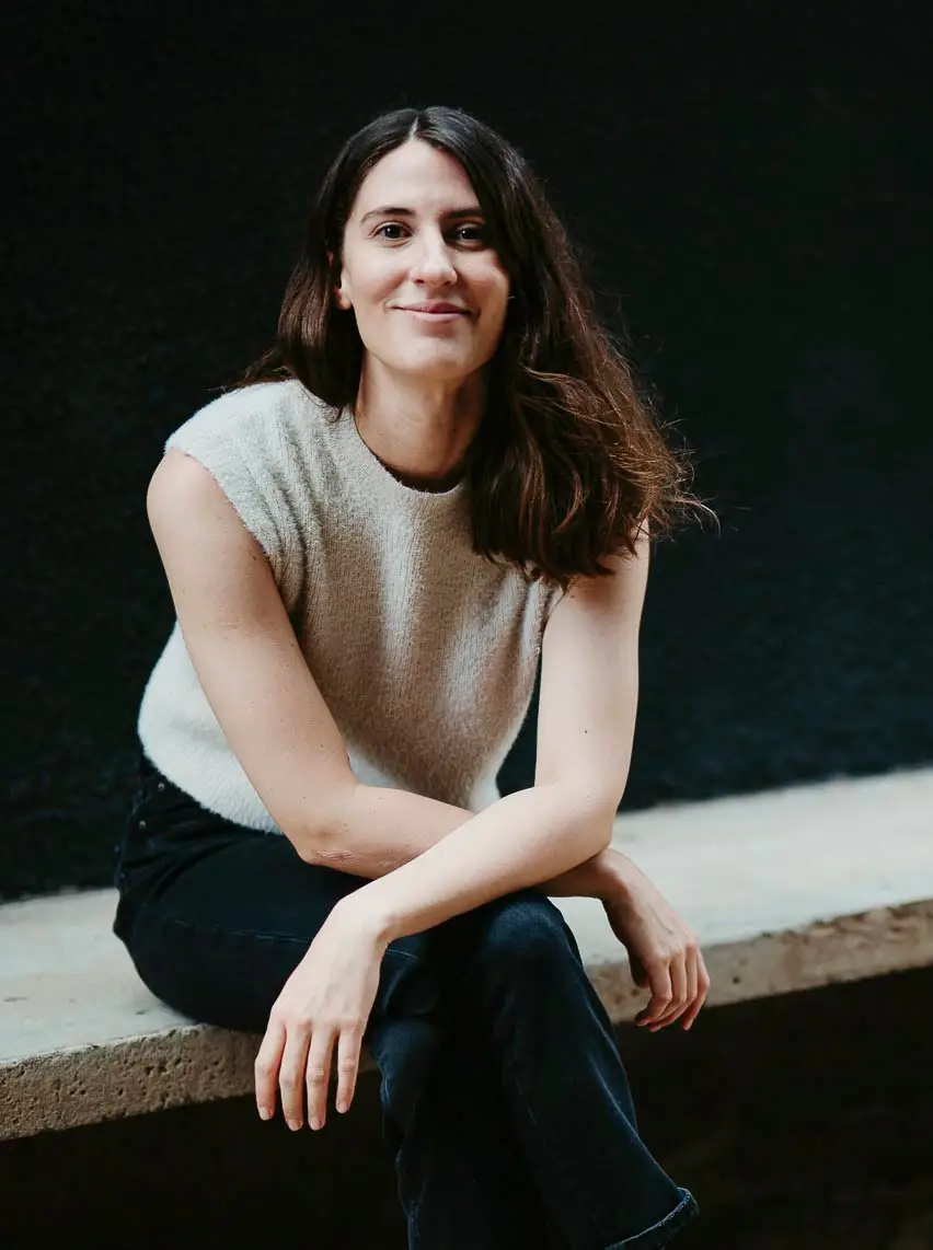
Marina Rigolleto
"To me, a conversation is a shared landscape."
From Architectural History to photography festivals, Marina found her place in design, where narrative and form meet. She now brings all of this experience to the forefront of the studio.
Graduated in Architecture and Urbanism from FAU USP, Marina explored Brazilian graphic production through academic research on books and posters. At IMS, she worked with Zum Magazine and photography exhibitions. At Estúdio Alles Blau, she developed visual identity and editorial design projects for festivals, exhibition catalogues, and books, sharpening her eye for the relationship between strategy and form. Now at Fabio Haag Type, Marina joins the commercial team with an extra layer of insight: her design background allows her to understand projects in depth and translate needs into precise typographic solutions.
Cycling through São José dos Campos, Marina proves that good connections happen in motion.
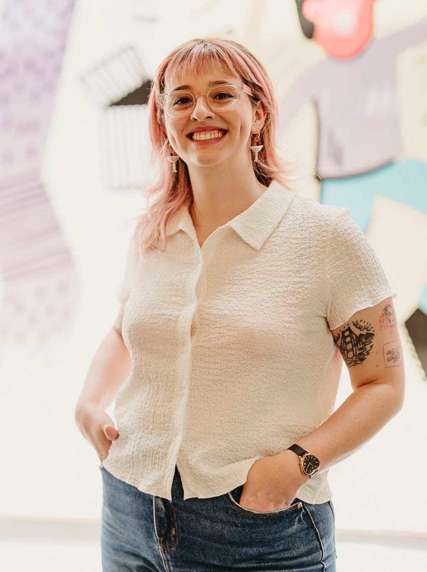
Kalany Ballardin
“I dream with color palettes and music.”
Kaly is an art director with a degree in Visual Design from UFRGS and believes that print is not dead. She works globally combining graphic design, typography, strategy, and lots of color in editorial, visual identity, and digital marketing projects.
One of her great passions is working with the world of books, and she has been able to do this in partnership with publishers such as Companhia das Letras, Todavia, HarperCollins, Planeta, Lote 42, TAG Experiências Literárias, and many others.
Believing in the power of the collective and of women, she was part of the Porto Alegre chapter of Ladies, Wine and Design. Kaly shares her reading impressions and literary products through her brand Kaly Out Loud and believes in the power of analog media to awaken people’s sensitivity.


