
A story of the new Itaú logotype: to explore, find and polish

At first, we got stuck. All of us. Anyone who is a designer in Brazil understands that the most valuable brand in the country (and in all of Latin America, in fact) is the result of decades of investment in design, taken very seriously. In college, we study the names of those who touched this brand. The standard is so high. What should we do, and how, when invited to join this story?

Once upon a time, in 2016, I was a creative director at another studio and was in charge of the custom font project for Itaú. And, like a good story, there is drama: I abandoned the project halfway through. That’s right. I resigned from an international studio after almost ten years, in search of a calmer way to make a living from design, better balancing my personal and professional lives (spoiler: life is just one). It would never be the ideal time. In addition to abandoning the project for Itaú, I gave up going to California and being the creative director of the font for AirBnB. I wanted to write a different story.
In 2021, we developed proprietary icons for the íon platform of Itaú, with the studio that brings my name and vision towards management. The story was beautiful, and the following year, we were invited to discover, together with Itaú, what it means to be premium today in the letterforms of Personnalité. But the climax of this story arrived with the year of 2023, on January 3rd. A restricted team within Itaú was developing a new brand, together with Pentagram from NY, and felt it was time to bring us into this story.

An unknown path
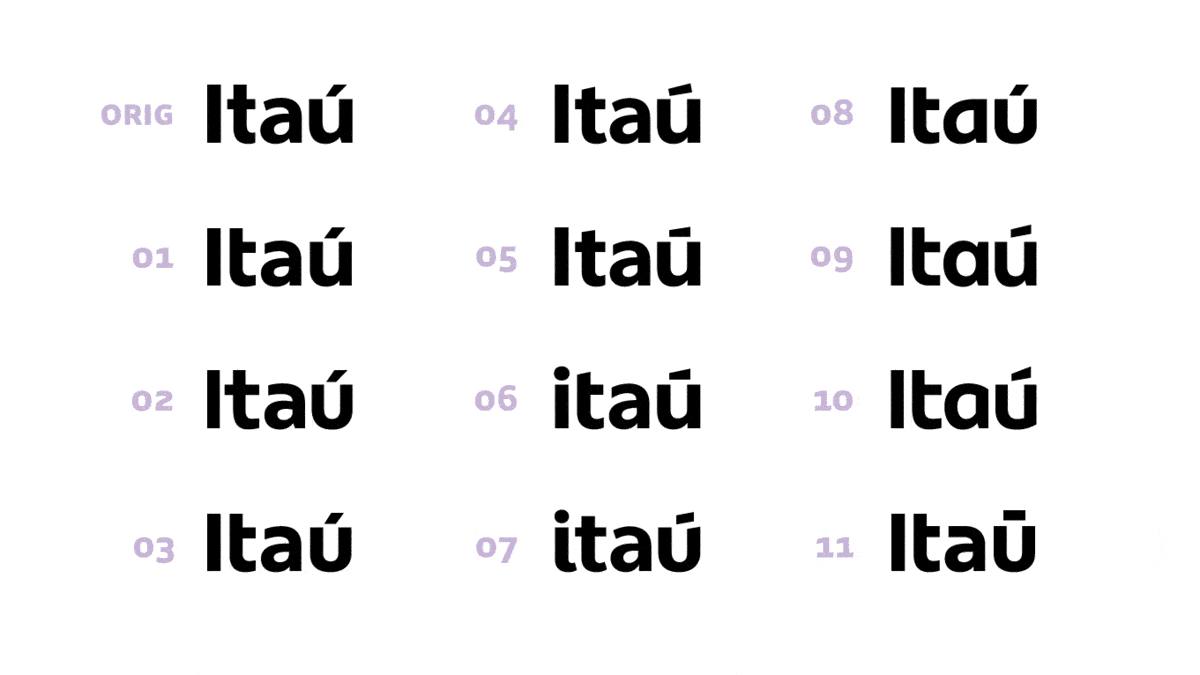
The briefing was incredibly broad. “If the logotype were to change slightly, what would you do to it? If you could radically change everything, what would it look like?” And it made a lot of sense for it to be that way. It took time to gradually take the weight of the history of national design off our shoulders so we could start designing naturally. It was necessary to shed light in several directions and take many paths (more than 80) with the Itaú team until we felt confident in certain routes. And they were not immediately clear. It was a process of going, stopping, feeling, coming back, exploring. Inviting others to walk this path here, then go back a little and take another direction, a little different. Or a lot. Another person invited us to explore another route, further on. Over time, in these comings and goings, the viable paths started to appear naturally like marks on the ground on a forest trail.


In March, the story went silent. I didn’t hear anything about the project for several months. That was the time Itaú needed to tell this story and bring new characters to the journey. In October, I was personally called to work in a restricted access room at Itaú’s headquarters, without even being able to tell my team. There was an approved path, designed by Pentagram, and it was time to polish the letters of the black stone, in secret. Furthermore, what could the letters of the Itaú BBA brand look like, within this new identity?

In typography, everything can feel like tiny details. But that cliché that it’s the details that make the difference was repeated even by Leonardo DaVinci. The typographic style is the same as the previous logo, humanist sans serif letters. Humanist because the design shows an influence of the human hand, of calligraphy. There is a subtle difference between thick and thin strokes. The terminals of ‘a’ and ‘t’ are very open, which greatly aids legibility. The letter ’t’ gained more width and definition in small sizes.


What it means to abandon capital letters
We also have a symbolic change: the initial letter is no longer capitalized. Capital letters emerged with the Roman Empire — wherever they went, in each conquered territory, they erected monuments with their capital letters very well executed, carved in stone. When the sun hit them, the depth generated an almost magical effect. Even though the conquered people could not read what was written there, these letters aroused a feeling of grandeur, solemnity and authority. Choosing to use only lowercase letters is a way of defying traditional formality. The new composition goes in this direction, bringing it closer and humanizing.
Horizontal also in the diacritic
We Brazilians have a great deal of freedom when it comes to designing accents and cedillas, just look at the vernacular writing around us. Different shapes can be used without compromising legibility. Thus, the new accent was a safe, controlled way to move away from the traditional. The design ceases to have a vertical, conventional construction and becomes horizontal and ascending.
Integrating the BBA logotype
We explored more than 20 design variations for the letters BBA, from a safe solution close to the original, to something very expressive, incorporating elements of the new identity. The approval of an expressive option, with curved tops inspired by the new symbol, confirms the desire for innovation.


Epilogue
“We needed to put together a strong team to deal with the challenge of evolving Itaú’s brand. Having references in the national and international markets would be essential for the success of the project. When we talk about typography in Brazil it is impossible not to think of the Fabio Haag Type team. We called them to the game primarily for their technical excellence, present in the entire team, added to another very important factor in this journey, our long-standing partnership. We knew it would be possible to create a work dynamic of continuous exchange between our teams.” — Clayton Caetano, Head of Branding and Design
We are extremely happy and proud of the trust in our typographic studio and the incredible process we experienced with Itaú. Since our founding, 7 years ago, we have believed that the design of expressive and functional type can increase the value of brands, facilitating recognition and consistency of communication, and thus generating business results. It’s no surprise that many of our clients are among the most valuable brands in the country. Now, helping Itaú write this new chapter, we are certain that this is not just a story.


Our team: Fabio Haag, Henrique Beier, Ana Laydner and Eduilson Coan; Itaú: Ary Suptitz, Bells Domingos, Beatriz Oliveira, Clayton Caetano, Diego Oliveira, Eduardo Tracanella, Felipe Luna, Ramon Frutuoso, Julia Resende, Lucas Mayer, Marina Monteiro, Michele Marrul, Mylena Rocha, Paula Pazikas, Sarah Machado, Vallery Victoria, Thabata Simões, Tuia Brito and Marcella de Oliveira; Pentagram: Michael Bierut, Robin Haueter, Ginger, Camila Pérez, Jonny Sikov and Lauren R.


