Marca Brasil: a redemption of who we are
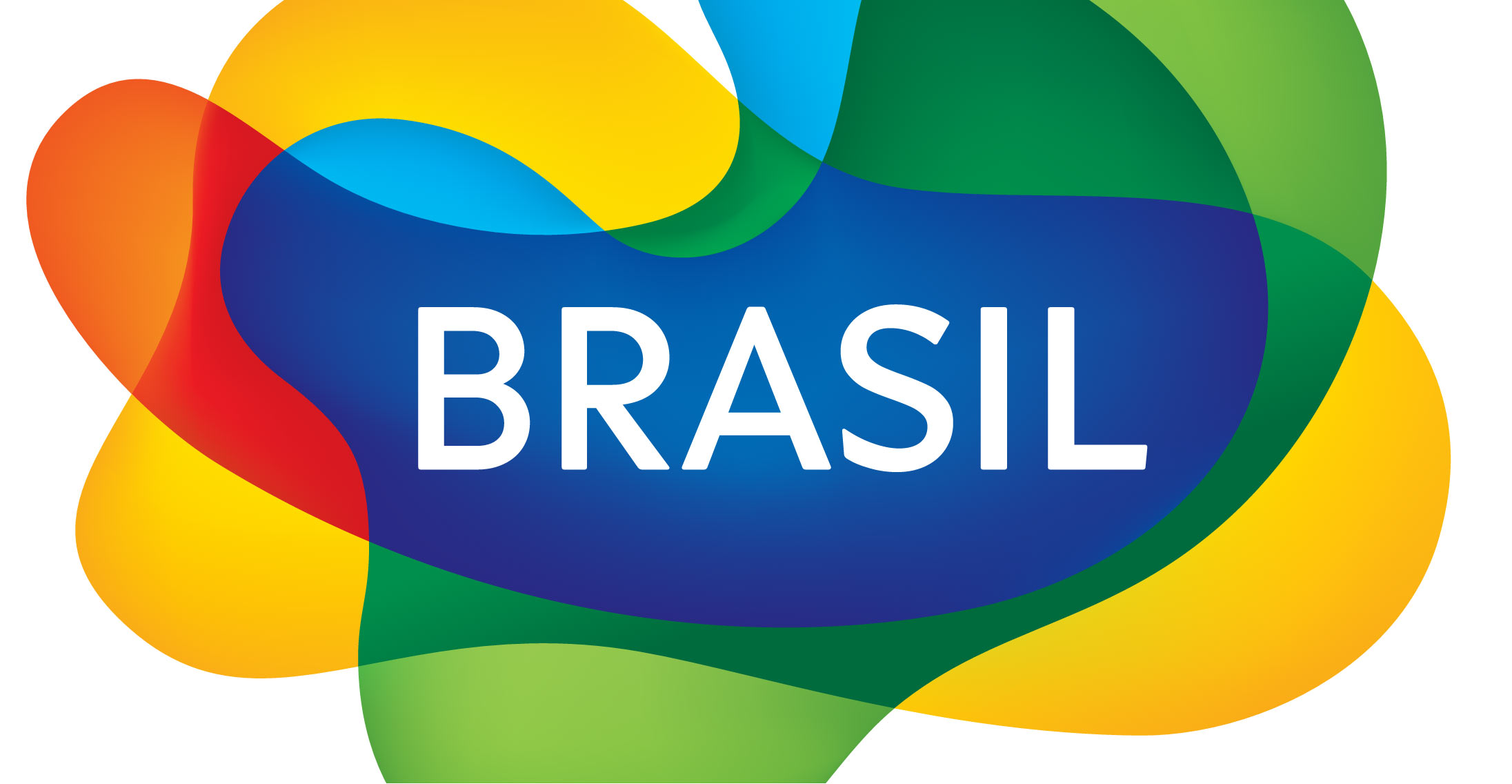
It was 2005. After in-depth research with more than 6,000 people in 19 countries, a design contest that brought together 37 studios, Marca Brasil emerged from the sketches of Kiko Farkas, from Máquina Estúdio, to unify the promotion of tourism abroad.
The Brazilianness was in the curves and transparency, which symbolizes the overlapping of cultures, a fundamental element in the formation of the Brazilian identity.
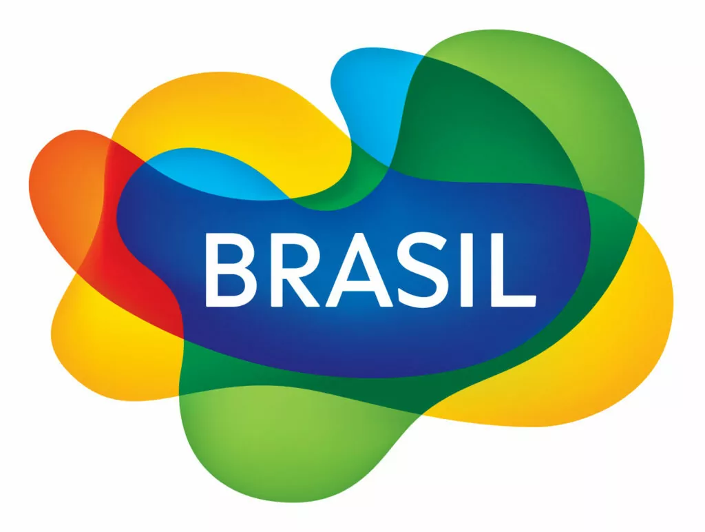
After four years of disuse, it returns more contemporary than ever. And more: now with letterforms designed by us, here in Brazil. Kiko Farkas, who had already updated the lettering in 2010, invited us to participate in this crucial moment in our country.
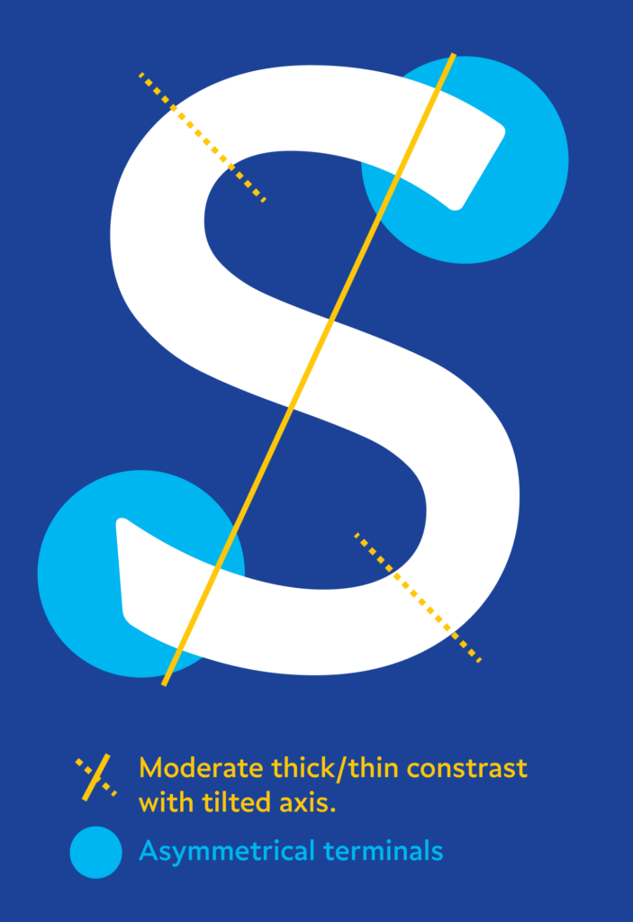
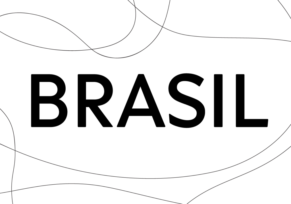
Our typeface called Curiosa — which will soon be launched as a retail font — reaches the world complementing the symbol of Marca Brasil.
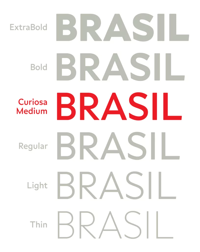
The asymmetrical terminals of the ‘S’, added to the tilted contrast axis, also visible in the letters ‘B’ and ‘R’, are unusual features in sans serif typefaces. This plurality living in harmony is a portrait of Brazil that we are proud to show, and above all, to live.
