


Drika
14 weights, 2 stylesSuspire
9 weights, 2 stylesAconchego
9 weights, 4 stylesPitanga
8 weights, 2 stylesPasso
8 weights, 2 stylesPasseio
8 weights, 2 stylesCuriosa
9 weights, 2 stylesVersos
8 weights, 2 stylesPausa
3 weights, 2 stylesSeiva
6 weights, 6 stylesSalva
9 weights, 4 stylesIgual
8 weights, 4 stylesMargem
7 weights, 12 stylesSua
7 weights, 1 stylesLembra
6 weights, 2 styles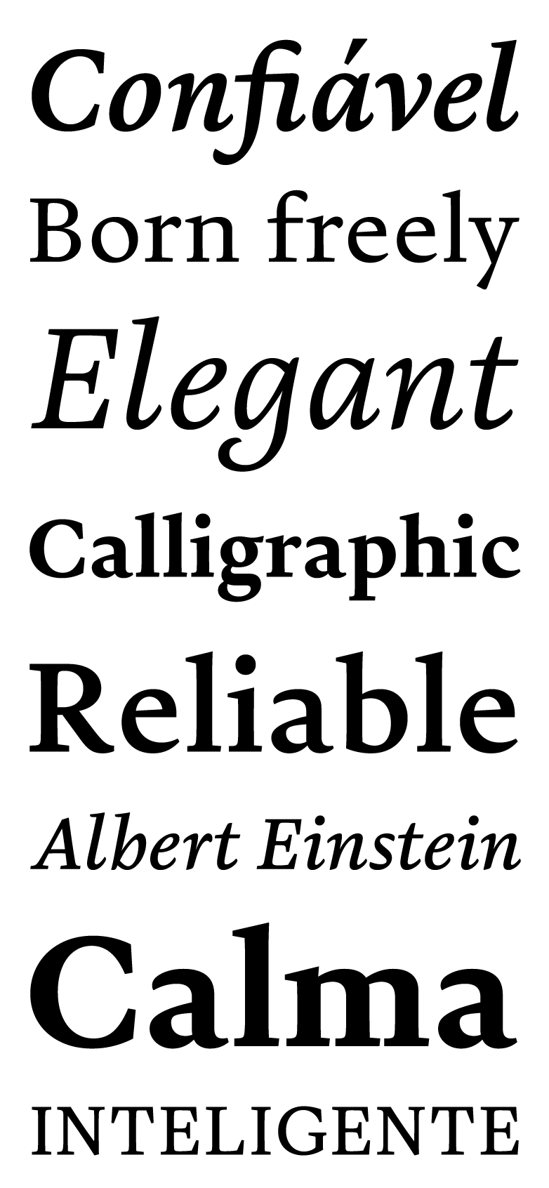
Parece que você está no celular, acesse nosso site pelo computador para conhecer nossas fontes
Creativity is the residue of time wasted
I love deadlines;
I love the whooshing noise they make as they go by.
The times, they are a-changin’.
Tempo de qualidade é essa mentira que a gente conta pra justificar nossos únicos quinze minutos por semana ao lado dos nossos filhos. Pra ter tempo de qualidade a gente precisa, antes, ter tempo de quantidade. Não tem outro nome, é horas mesmo. Dias. Sábados e domingos, mas também terça-feira à noite e segundas-feiras bem cedo, café da manhã juntos, confidências sem julgamentos.
A calma é amiga da perfeição;
Ela chegou a estudar com a procrastinação que, apesar se ser uma má influência, elas se davam super bem.
Serious without being cold
The distinction between the past, present and future is only a stubbornly persistent illusion.
Time after time
Questions you cannot answer are usually far better for you than answers you cannot question.
As sábias frases neste type tester tem o oferecimento de: Albert Einstein, Douglas Adams, Bob Dylan, Marcos Piangers, Yuval Harari e Cyndi Lauper, com exceção daquelas de qualidade bastante duvidosa, por Fabio Haag mesmo.


Uppercase & Lowercase
Numerals
Diacritics
Symbols
About
Sometimes, all we need is a pause. Calm. Clarity.
This is the story of a typeface started in 2015 in New York, by the hands of Eduilson Coan. In an intense experience of five weeks and more than 12 hours of study per day, Eduilson delved into the history of typography, typographic practice, and hand-drawing techniques in the renowned Type@Cooper program. And it was in this tightening of studies, lack of space and time, that Pausa received its first contours.
Born freely, without direct references, it began to show its forms. After the program, the typeface gained space. Over the course of six years, it received new features and refinements. The italics changed, taking on new dimensions. The spur on lowercase “d” and “u”, which had a calligraphic design, became straighter and was adjusted to a conventional serif. And so it matured.
Because it has a horizontal design, it values space, paper and breath. Like its creation process, Pause is a typeface that asks for calm.
Finally, font licenses designed for you:
Clients can easily share with suppliers and don’t need to worry about web pageviews or renewals at any time.
Designers and studios have easy free trials and fair pricing, no matter the size of their practice.
Who are you and what do you need?


test drive
No cost to install and test in practice
- 1 user
- Web
- App
- Sharing with suppliers
Access from your computer to make the purchase

individual
A special offer for those who run solo
- 1 user
- Web
- App
- Sharing with suppliers
Access from your computer to make the purchase

studio
Unlimited distribution in studios and agencies
- Unlimited users
- Web
- App
- Sharing with suppliers
Access from your computer to make the purchase

client
Convenience and legal security for companies of all sizes
- Web
- App
- Sharing with suppliers
Access from your computer to make the purchase