
Globo’s new brands arrived to shine on all screens

In 2018, Fabio Haag Type worked on the Globoplay logotype, when the ‘l’ got diagonal endings suggesting a ‘play/start’ button. Now, we have been invited to assist the squad of the new Globo Brand in the visual expression of other brands, including the largest of them all, that of Globo itself.


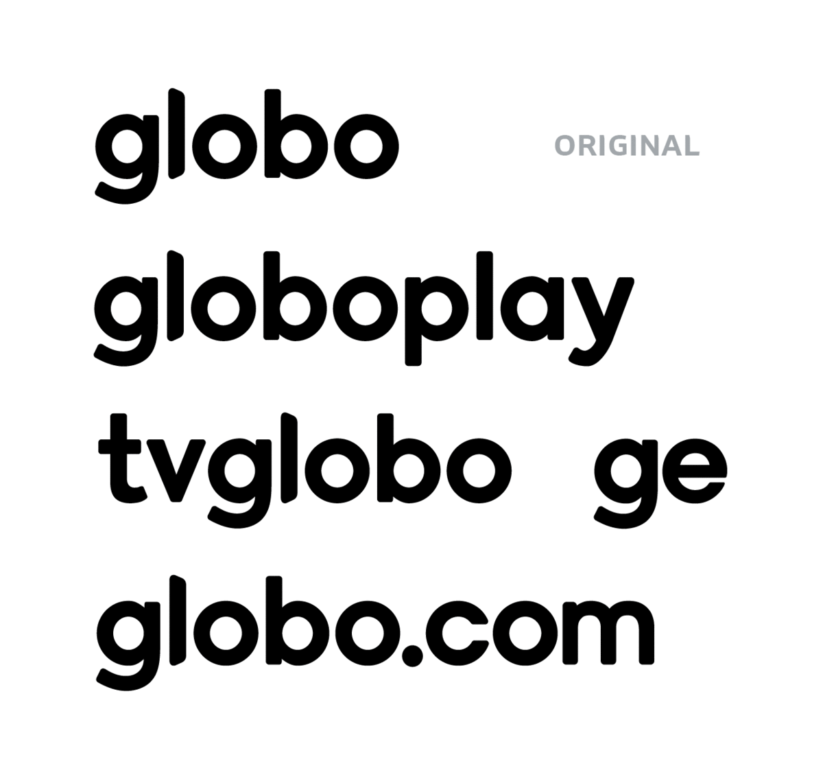
Globo, TV Globo, Globoplay, Globo.com and GE now have the same typeface in their brands, created from the internal work of a multidisciplinary team from Globo, with the expertise of Fabio Haag Type in the exploration of stylistic variations and meticulous refinement of different versions, optimized for different screen sizes and background colors.
The ‘l’ with diagonal endings became the protagonist and was cast to appear on the other logotypes, materializing the group’s integration. The other letters follow a geometric construction, with angled terminals, in letters such as ‘g’ and ‘y’, and horizontal, as in ‘c’ and ‘e’. This particularity reconciles the style adopted in 2018 for Globoplay and the visual heritage of TV Globo.


Each logotype has versions optimized for different uses: in reductions, complex shapes such as the letter ‘e’ gain a larger counterform, in addition to more open spacing, facilitating legibility in small sizes. Also, each logotype has a variation for use on dark backgrounds. In these situations, a well-known optical illusion makes the letters appear heavier if there is no visual compensation.


No matter the size of the screen, Globo’s new brands have come to shine.
Fabio Haag (Typographic Design and Consultancy); Sergio Valente e Mariana Sá (Creative Direction); Carolina Miranda, Christiano Calvet, Julio Marcello, Lara Miranda, Lorena Moreira, Marcelo Valente, Ricardo Moyano (Design Squad); Manuel Falcão, Washington Teotônio e Bernardo Magalhães (Planning and Strategy); Suzana Poli e Didi Lima (Operations);


