Banco BV: a custom typeface for a light chat
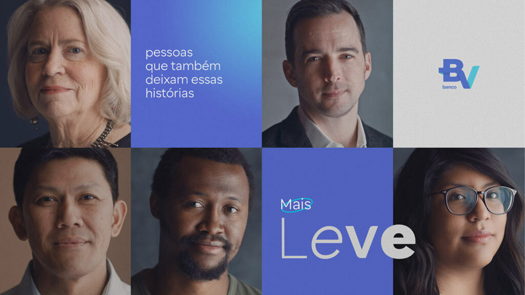
Banco BV proposes to bring financial tranquility to the lives of people and companies, promoting a light and open conversation about money. And for that, it needed a typeface that would help in the fluidity of this conversation with its employees, customers and society.
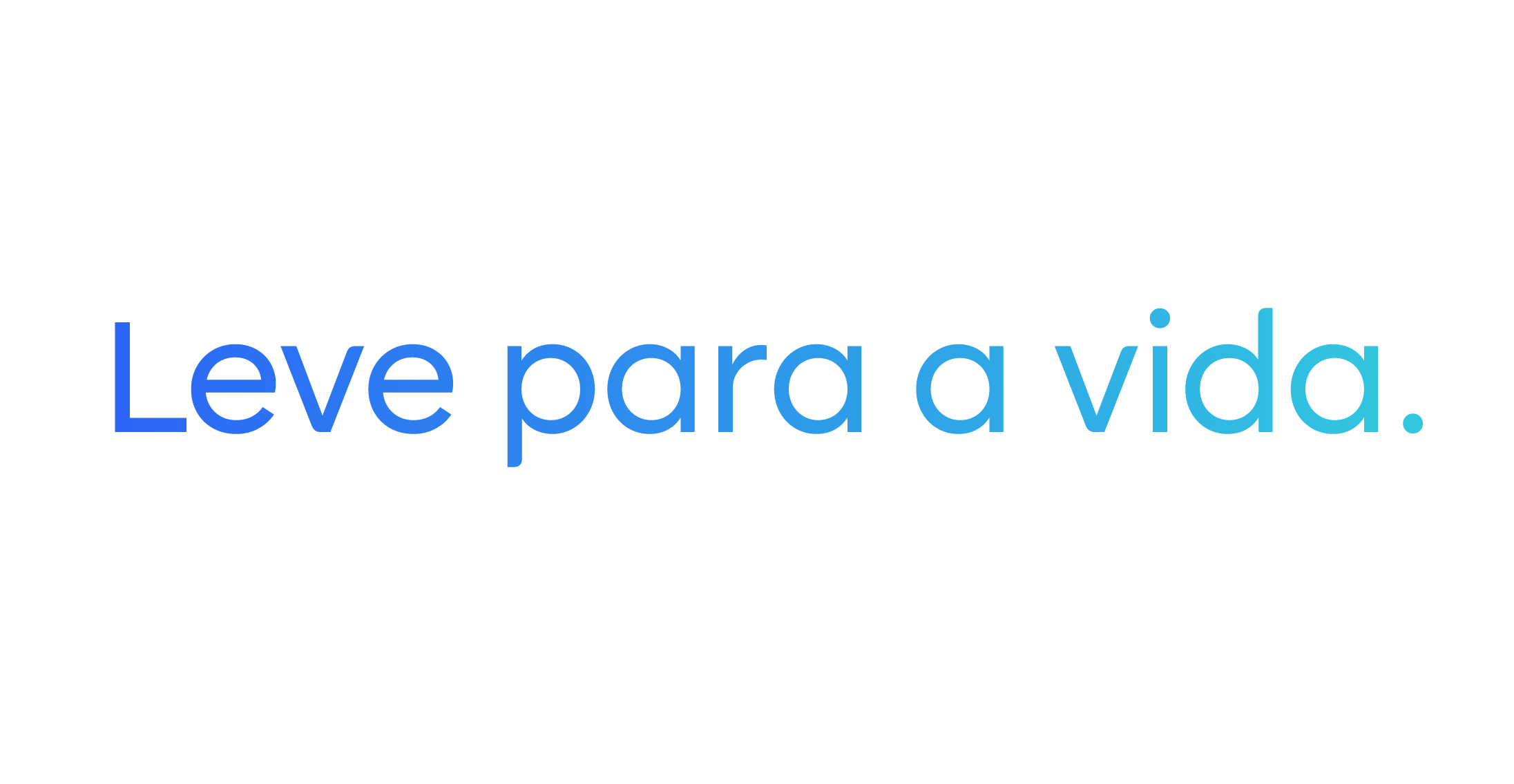
No wonder the project started with a good conversation, in a workshop bringing together several teams from the Banco BV with Fabio Haag Type. From this dynamic, we discovered that it was necessary to improve the central attribute of the brand identity, summarized in the slogan “Light for life”.

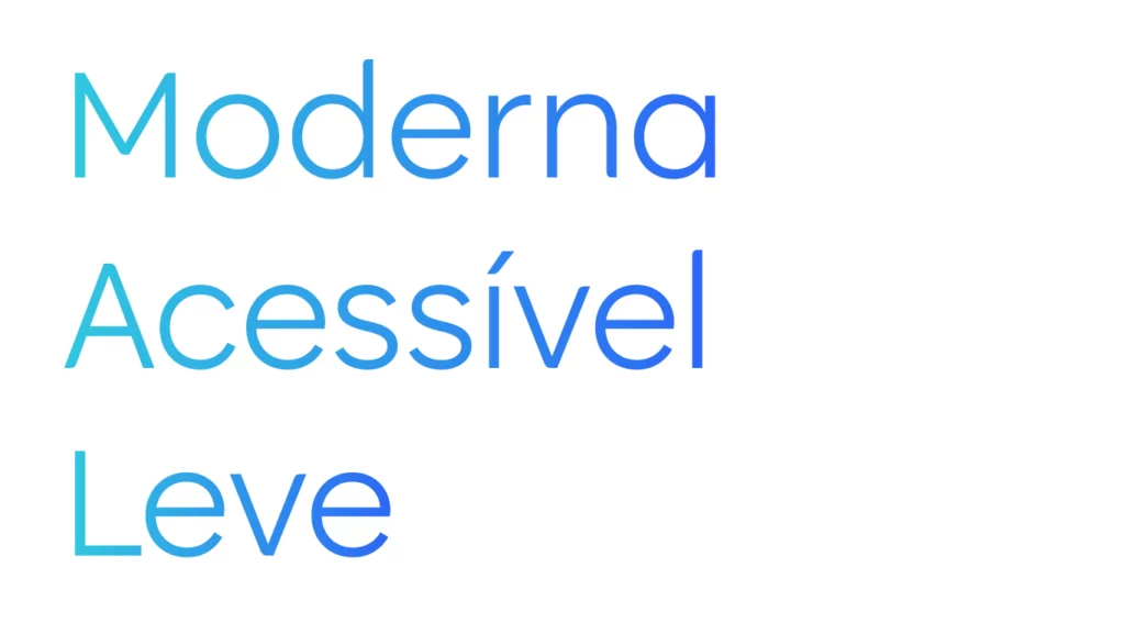

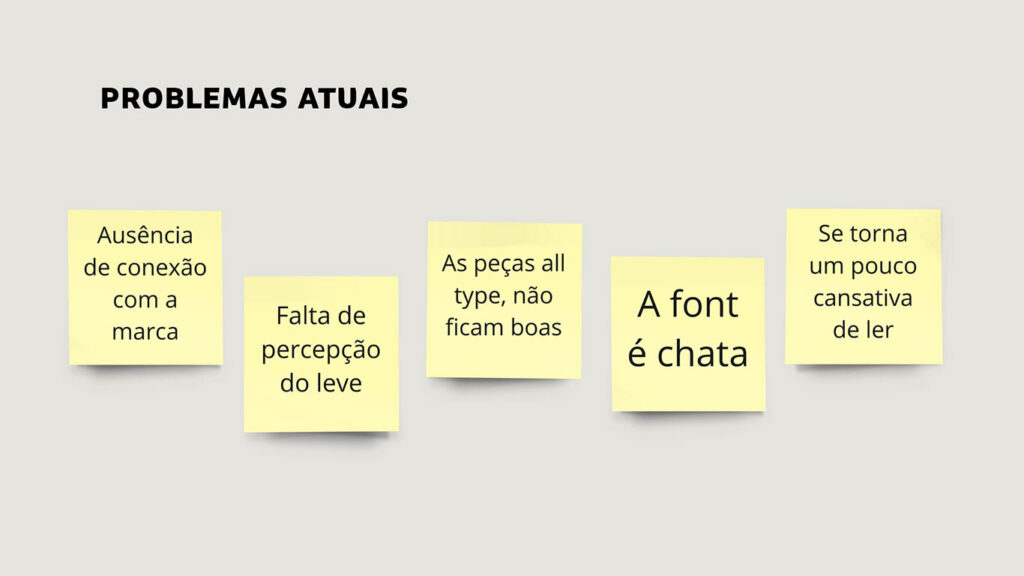
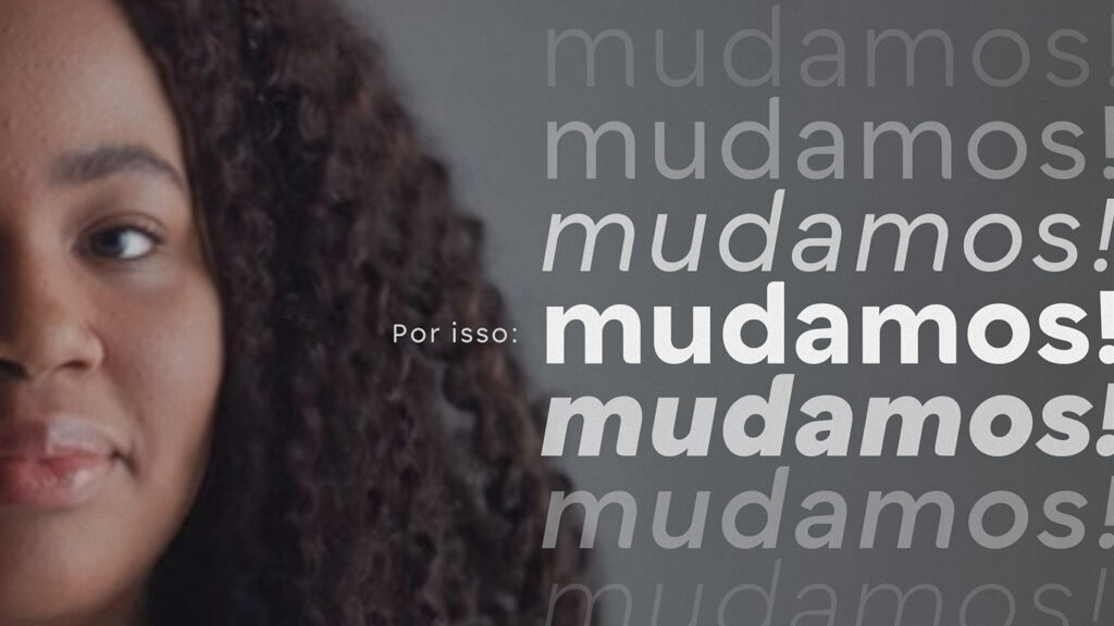
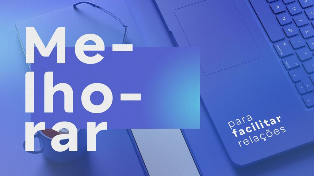
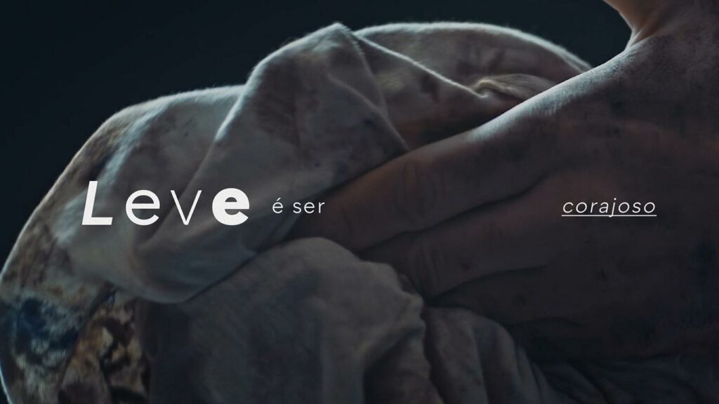
Eight typographic ideas were presented, solving the challenge in different ways, and Banco BV’s leadership and designers were unanimous on which idea should evolve to the Concept stage. There, with a larger character set and all the weights, we were sure that the client’s intuition was right. The winning solution was born from the logo itself, taking inspiration from the sloping angle of the “V” and the rounded corners. The design is clean, clear and, most importantly light, like the brand.
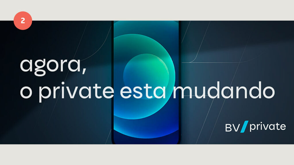

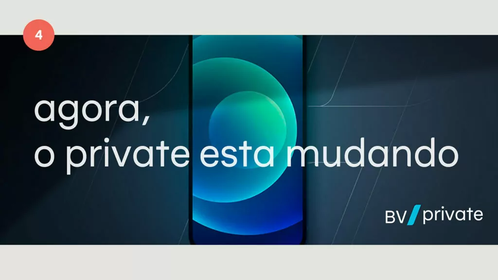
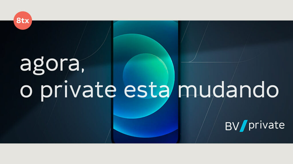
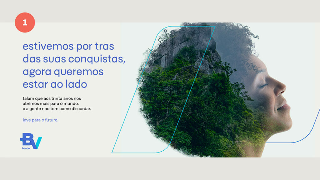

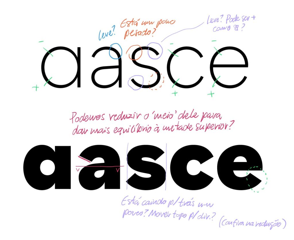
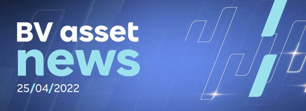
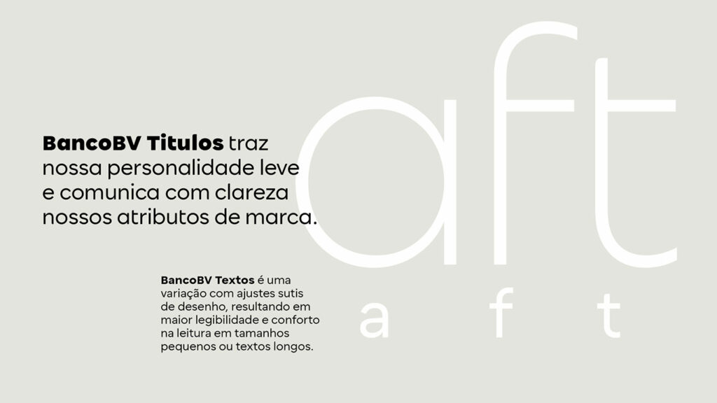
The new typeface family is a powerful communication tool, with a total of 24 fonts, with weights from Thin to ExtraBold, including a specific version for use in texts, where the letter ’a’ has a two-story construction and the letters ’f’ and ’t’ get a longer crossbar; design decisions to facilitate reading at small sizes and longer texts.
A lightweight typeface that helps Banco BV open the door to new conversations, in any written word.
Fabio Haag (Creative Direction), Ana Laydner (Design Lead), Henrique Beier (Design and Engineering), Eduilson Coan (Design) and Thiago Bellotti (Design); Banco BV: Conrado Cotomácio, Catharina França, Heloisa Feitosa, Alex Novaes, Vinicius Spanghero, Vinicius Bellacosa, Italo Teixeira, Luana Grybosi and Vivian Terzini;


