Seiva’s big bang in the universe of Diana Coe
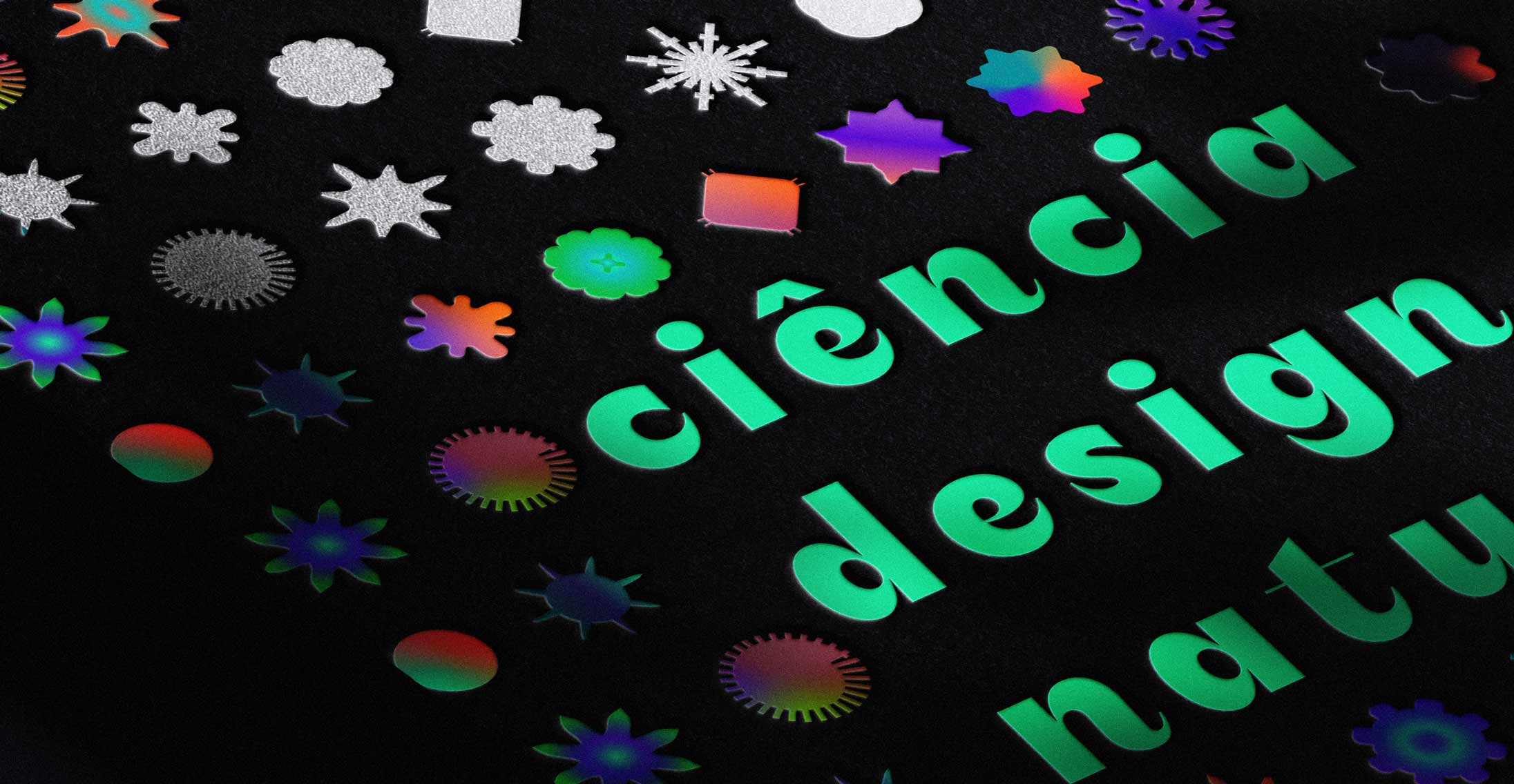
Not knowing where our fonts will end up being used is of great anguish for the type designer. Ask Vincent Connare, creator of Comic Sans, and he‘ll confirm. One of Fabio‘s designs was already used to demand the return of military dictatorship in Brazil — something stupid on so many levels, including typographic, as the letters had soft and friendly curves. But, sometimes, the universe presents us with such an incredible application. It’s as if the font was born for that occasion.
A clear example is the visual identity of Diana Coe, designer of emotional brands. The integration of the Seiva font with the elements of Diana Coe‘s identity and essence is striking, and more, it moves us. Asked why she chose Seiva, we have a testament to the strength of typography:
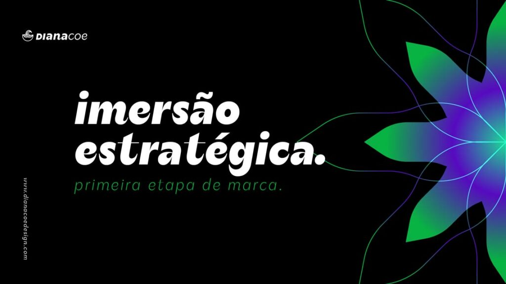
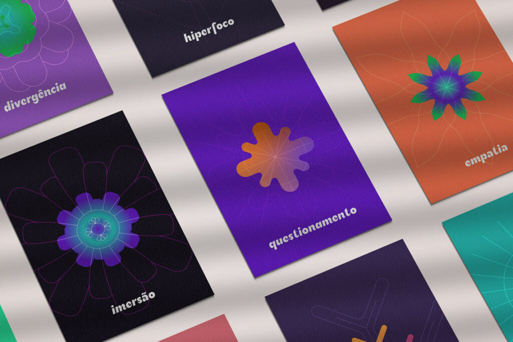
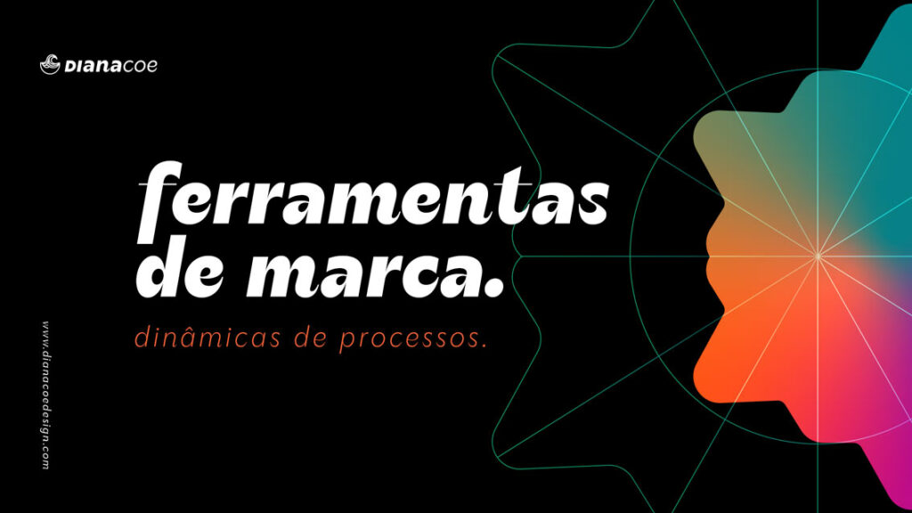
It was love at first sight. Not only because of the typography concept, which intertwines in perfect harmony with the concept of my brand, but because of all the universes of possibilities it opens up. Expressing our worlds through words is easier when the accompanying forms can narrate the story with a unique intensity. And really, it adapts to the environment and transforms itself in each composition, bringing more life, strength, and vitality. It is nature in the form of a fountain.
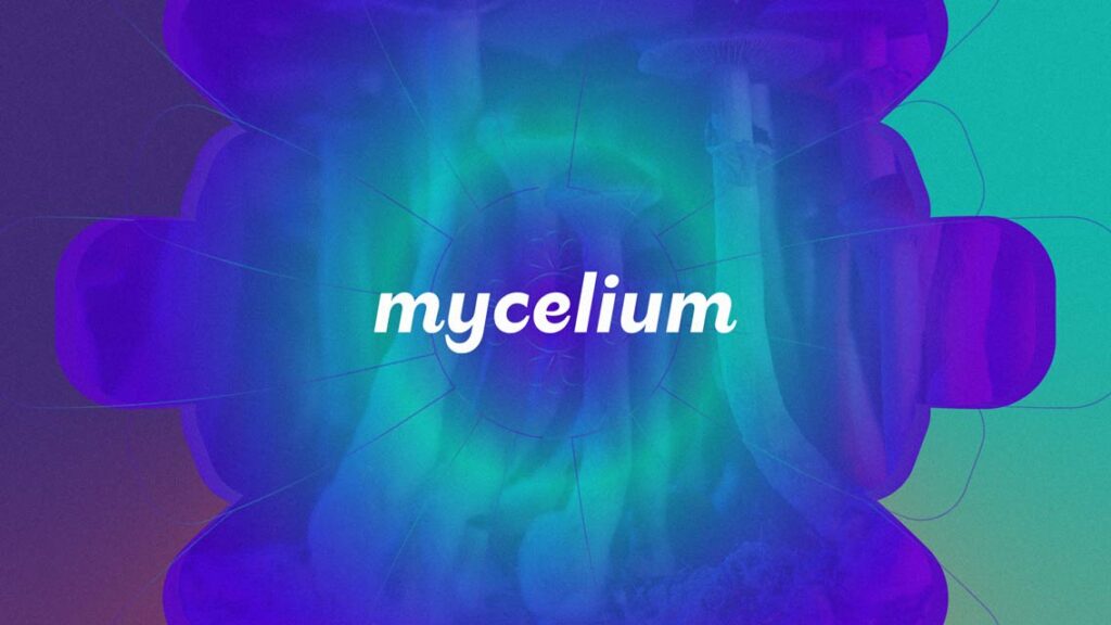
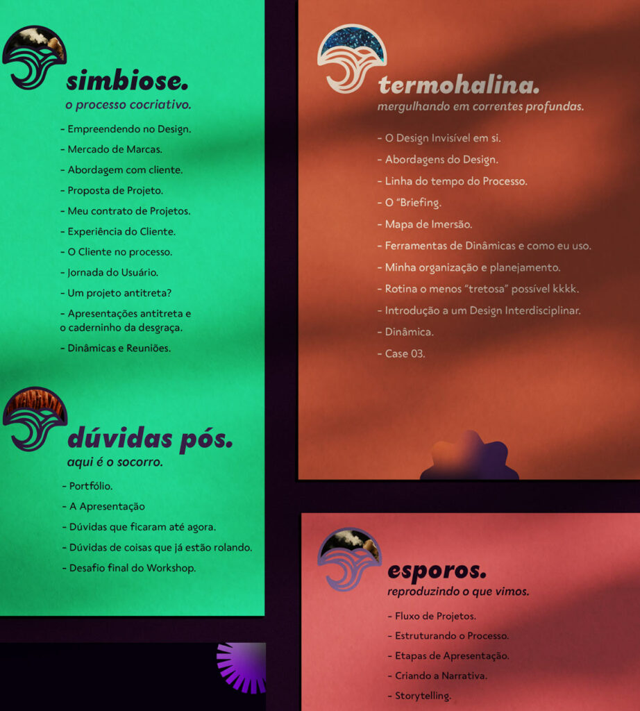
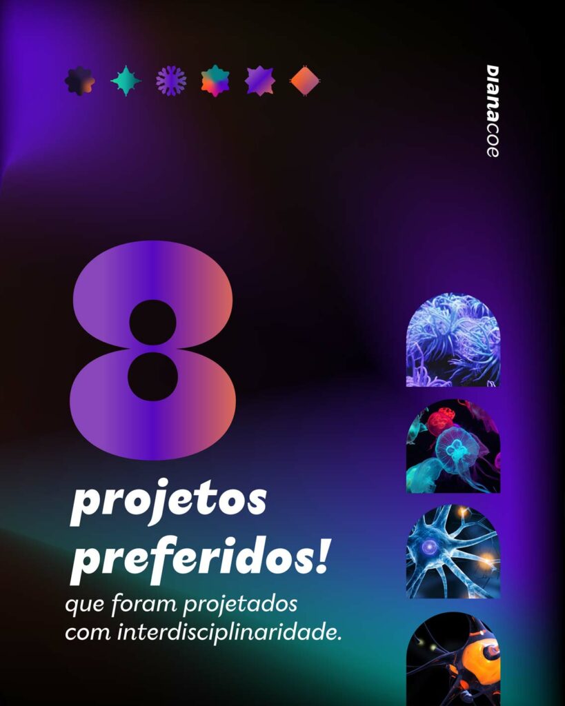
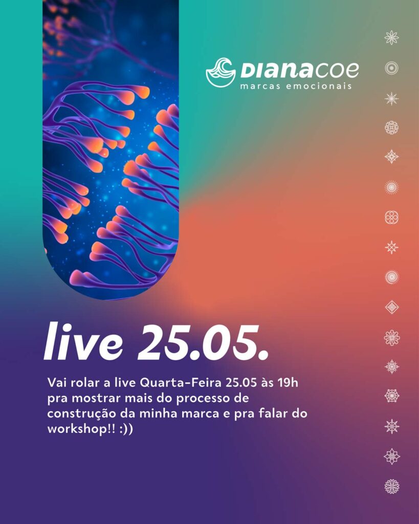
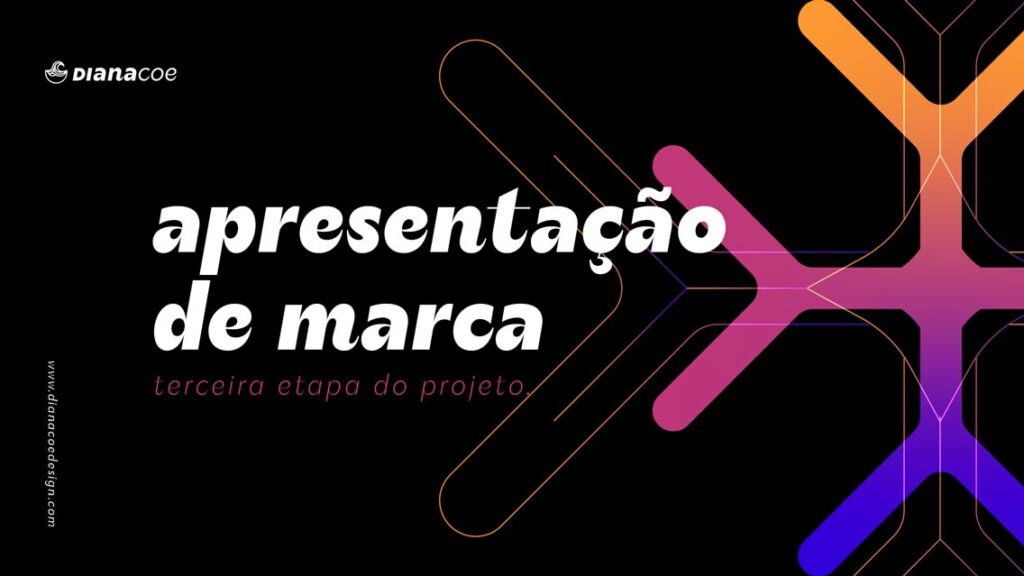
It is as if each letter came to life through the enormous diversity of our ecosystem, as if each of them had its own story, its own identity, growing and changing according to the context. Their shapes echo as if each had its own sound and color, as in a synesthetic dance through writing.
When I saw the font, I knew I would say goodbye to the wonderful Sua and start a new path with Seiva, which now perfectly accompanies every step of all the changes my brand and I have been experiencing. As Lavoisier says: everything is transformed. And she masterfully turned everything around.
Visit Diana Coe’s website
Get to know Diana Coe on Instagram
Discover Seiva


