The logical answer is not enough. I want more.

I’m going to start complaining. Tell me, please, if I’m already grumpy.
In front of a class of design students, I often ask who among them has heard of David Carson. My favorite hero (or anti-hero). To my surprise, no matter the university, only one or two hands are raised. One is always the teacher.
When the word ‘design’ was elevated to the board of directors of companies, the process was systematized in a logical way in search of maximum efficiency. It was discovered that it is at the intersection between design, technology and business that the most effective solutions are found, serving everyone at the table. The consensus, not by chance, tends to be unimaginative.
Carson’s work is much more intuitive than logical. After all, he was a professional surfer (indeed, 9th in the world) with a degree in Sociology, armed with a computer in the desktop publishing boom. His design broke all the rules, and precisely because of that, it marked a generation. The difficult readability did not prevent him from being hired by ‘traditional’ companies, such as American Airlines, Audi, Intel, and Microsoft. Today, in his Masterclass, he teaches how to create through collages, trusting instinct, intuition, and not reason.
The reason inside the SEO algorithm says this article sucks, because the words in the title don’t appear in the first paragraph. I must early on make my point. People don’t have time for this rambling. I’ll keep on.
Twenty years from now, will you remember the design of any websites you visit today? I remember two from my dial-up internet days. One was from 2Advanced, an extremely high-tech studio whose technology blew our minds. It was a pleasure to wait two full minutes for it to load; and another, by the insightful Luli Radfahrer, which was literally a maze for you to navigate. Unforgettable.
In a postgraduate class, the copywriting specialist hands us the perfect formula, the most effective text structure on a platter, even dictating the number of arguments that need to appear in bullet points and when they should appear. And he has solid (I’m not joking) research to back up those recommendations. We know that this is what works.
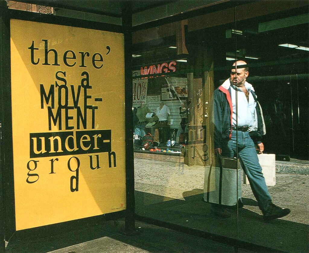
Solving a problem with as little friction as possible is the function of design. They say Carson does art, not design. Art touches our emotions with subjectivity. Design doesn’t have time for that, it has a clear job to do. This makes sense in the design of a medicine insert or a bus timetable, but do we need to separate design from art so brutally? Are there opportunities for us to incorporate more subjectivity? To add layers of meaning that can delight those who discover them? In the image below, it wasn’t functionality that made the pedestrian squirm to read this poster:
When all sites have the same template. When new products are launched with the same formula. When sales funnels are all the same, exploiting the same triggers. When logos, typefaces, illustrations and icon styles follow the same trends, safe, consensus approved, I wonder if we can’t do more. And I suspect that memorable design already does exactly that.
Fabio Haag