
Rich in Details

Da Vinci wrote that the details make perfection and that perfection is not a detail. When Tátil Design invited us to help them design the Rico logo, they knew very well what Da Vinci meant.
We type designers have an advantage over graphic designers. We have the privilege (some will say it’s a curse) of working focused only on straights and curves, black and white, every day. There are no layers of elements, colors, photography, or textures to worry about; only black and white, forms and counter-forms.


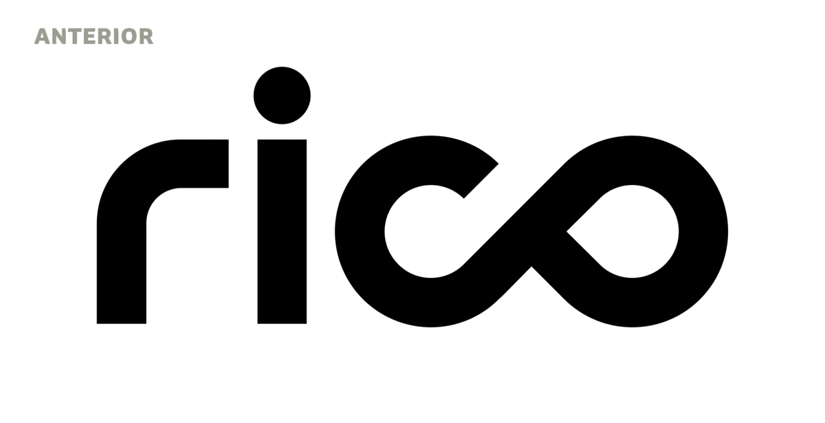
Our challenge was to refine and explore possibilities that would bring more fluidity, more natural curves. The “co” ligature was particularly difficult. The geometric approach resulted in rigid forms. Visual compensations were made overall to achieve a more organic feel. A new angle of the “c” terminal brings more balance between the sides. Variations for the letter “r” were also tested; an exercise that only reinforced the harmony of the original form. In the end, it received only one trick: its size was reduced since its top gives the illusion of having greater height.

It was a meticulous process, also visible to those who do not share a monogamous relationship with the basic forms, like us. After all, we’re not talking about details.
Fabio Haag (Type Design); Tátil: Renan Benvenuti, Camila Dias, Luiz Fernando, Vanessa Clark and Karla Ribeiro;


