Farine Lacteé Nestlé: from a logotype to a typeface

The product that gave rise to Nestlé in the world, created in Switzerland over 150 years ago, was on the table of our grandmothers and mothers until it reaches us today.
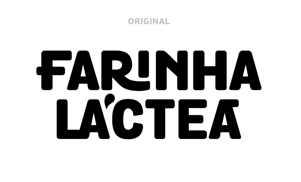
Farinha Láctea Nestlé is a brand that lives in the hearts of generations of Brazilians and has now gained a proprietary typeface — born from the rebranding presented to the market in July.


With playful language to get even closer to children, the new visual universe of Farinha Láctea was the inspiration for the creation of the logotype, which, in turn, paved the way for the birth of the typeface. The visual identity is signed by FutureBrand São Paulo and the typeface by Fabio Haag Type.
The new typeface was named Farine Lacteé Nestlé, the product’s original name in Switzerland, as a tribute to its legacy. Present in all communication, the new font facilitates recognition of the brand’s universe, in addition to being a great resource for differentiation on the shelf. And, most importantly: impossible to be replicated by any competitor, as it was made exclusively for Nestlé.


‘In the process of revisiting the brand’s purpose and promise in the search for differentiation, we handled every detail with great care, including developing our own typeface, unique and beautiful, as is the history of this brand and its role in the world’ — Rodrigo Demarchi, Head of Nestlé Cereal Marketing.

The design carries friendly ingredients, such as rounded corners, while drawing inspiration from early 20th century Art Deco, visible in letters like ‘M’ or ‘N’, and in ligatures with raised or underlined letters. The result is a very contemporary interpretation that honors the story of this classic that spans generations.
An original and tasty blend, capable of carrying the brand for decades to come.

Fabio Haag (Creative Direction & Design), Henrique Beier (Design & Engineering) and Ana Laydner (Design); Nestlé: Amanda Santos, Lígia Françoso, Mayra Messora and Rodrigo Demarchi; FutureBrand: Amanda Oliveira, Daniele Aragão, Matheus Calderoni and Thomás Debeus