A dose of vitality for Banco do Brasil
Who doesn’t know Arial? The font that ships with Windows for almost 30 years is synonymous with ‘default choice’. But in today’s world, where brands seek to improve every opportunity of interaction, ‘default’. means a missed opportunity. Two-thirds of the 10 most valuable brands in the world already know this and have commissioned custom fonts.

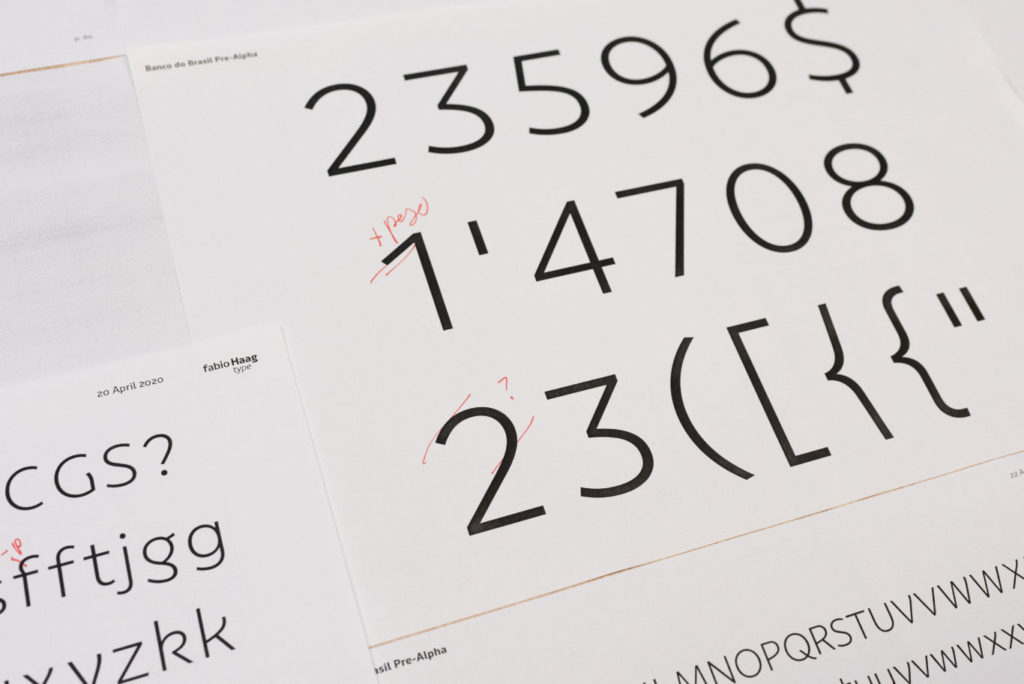
In its holiday campaign, Banco do Brasil leaves Arial behind after 25 years and presents its own custom and exclusive font. It was designed over 8 months by Fabio Haag Type, together with FutureBrand and Banco do Brasil’s Marketing and UX teams.
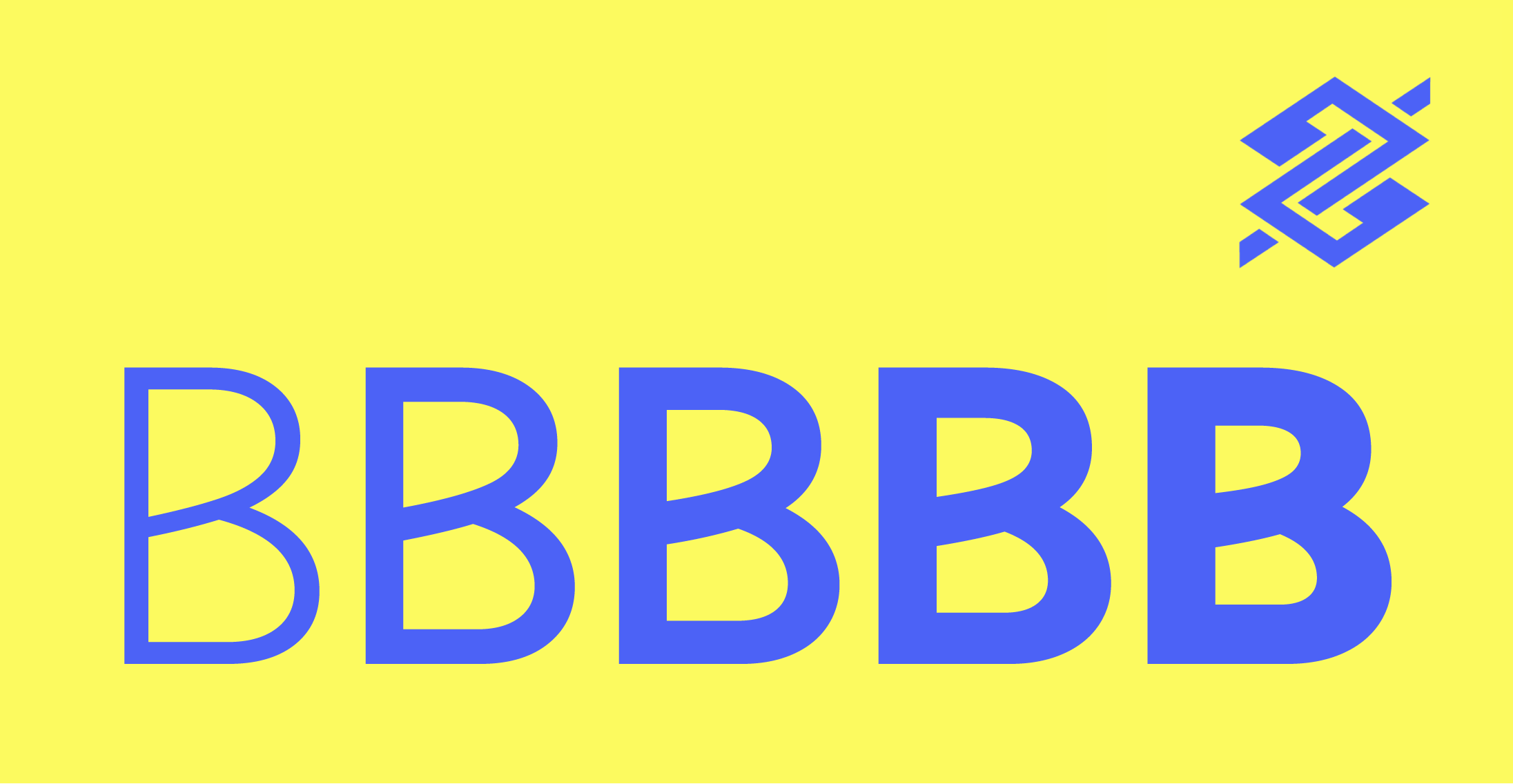
Alongside a new color palette, style of illustration and photography, the new typeface brings to life a more vibrant, lively and human identity. Based on the keyword “serotonin” — a hormone linked to happiness and well-being —, Fabio Haag Type designed letters with movement and energy.
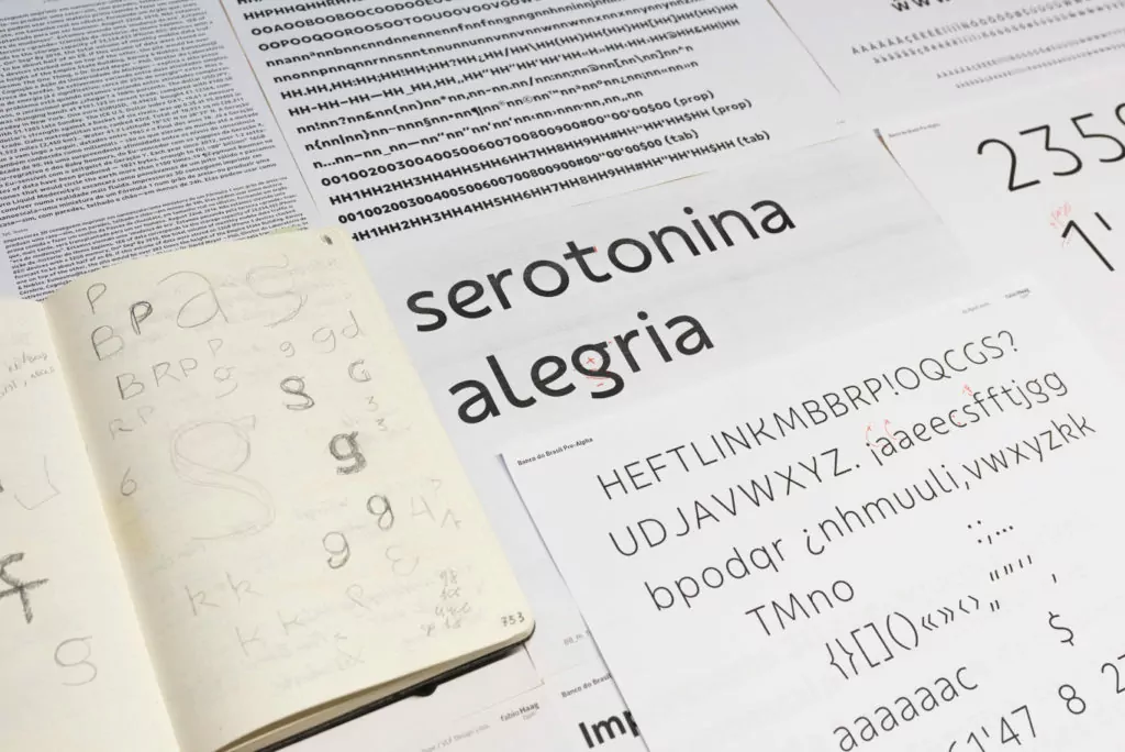
The new personality is manifested in the letters constructed with gestural movements, such as ‘e’ or ‘g’, for example, and also in details, such as at the top of the ‘f’ and in the outstroke of the diagonals, such as ‘v’, ‘w‘, ‘x‘ and ‘y‘.
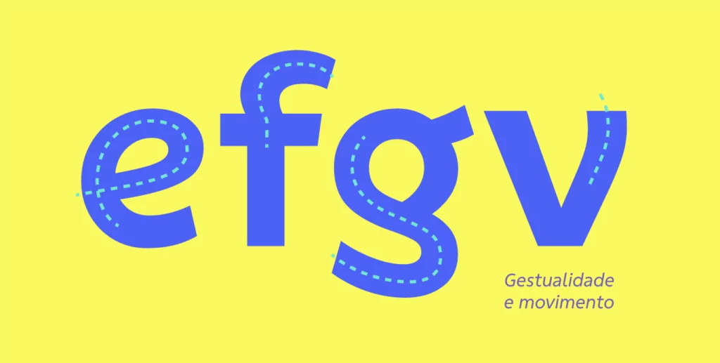
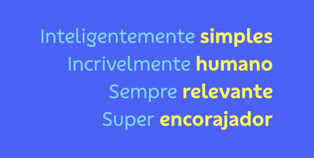
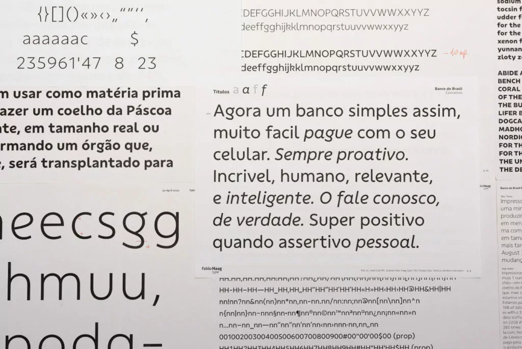
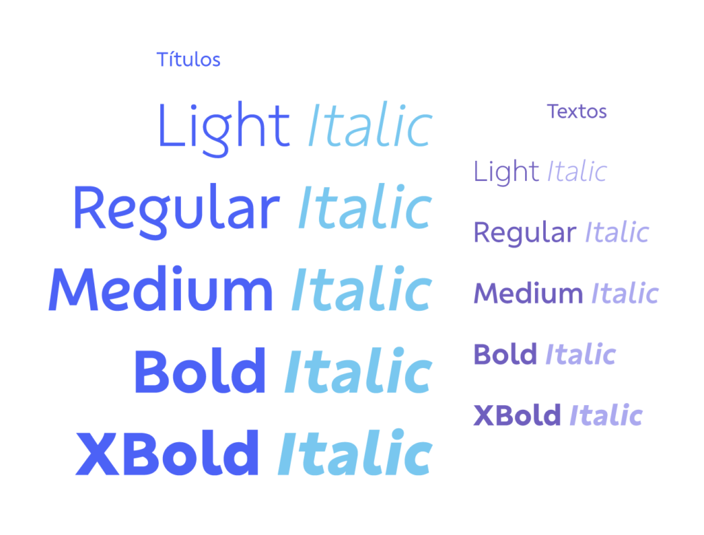
All this vividness shines at large sizes and now differentiates any message written by Banco do Brasil. In smaller sizes and long texts, a more functional design variation was created, where the bold elements give way to convention, favoring legibility and reading comfort.

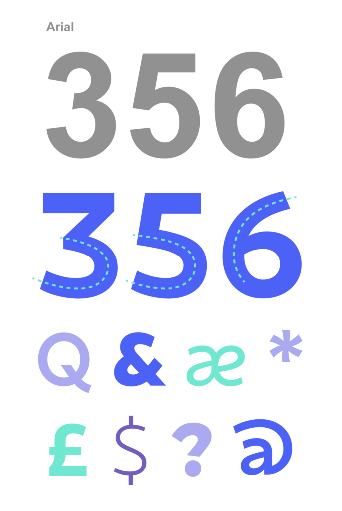
In typographic design, every detail is always considered and analyzed with rigor, but in this project, we paid even greater attention to the design of the figures. We knew that legibility, even in large sizes, was vital. For this reason, gestures are reflected in the numbers through very open constructions, such as ‘3’, ‘5’, ‘6’ and ‘9’. A comparison with Arial highlights this approach’s advantage, especially in small sizes on lower-resolution digital devices.
Gradually, Banco do Brasil’s communication began to implement changes in identity, starting with the color palette. In the most recent campaigns, the headlines, even in Arial, were bold. Now, with the launch of the new font, each word contributes to renew the image of Banco do Brasil.

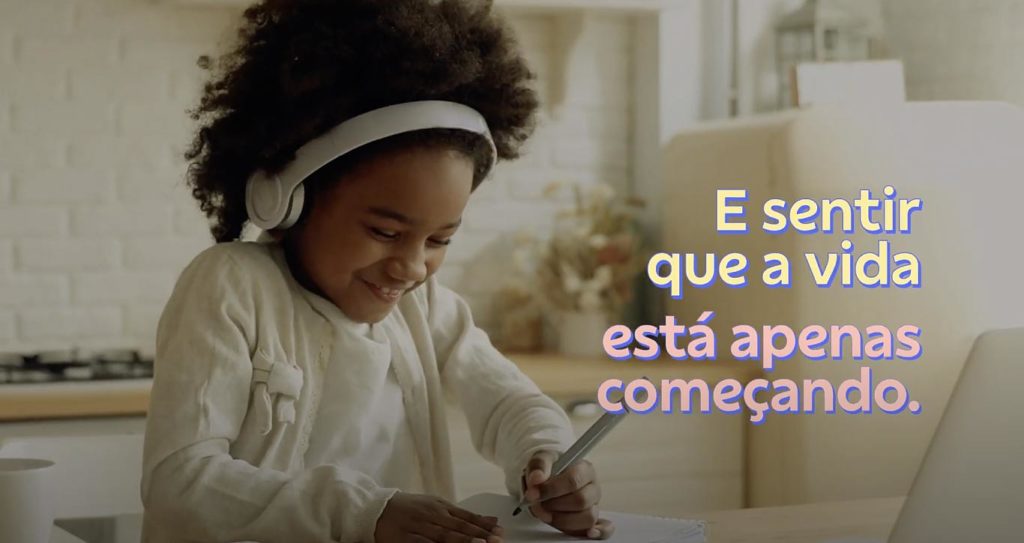
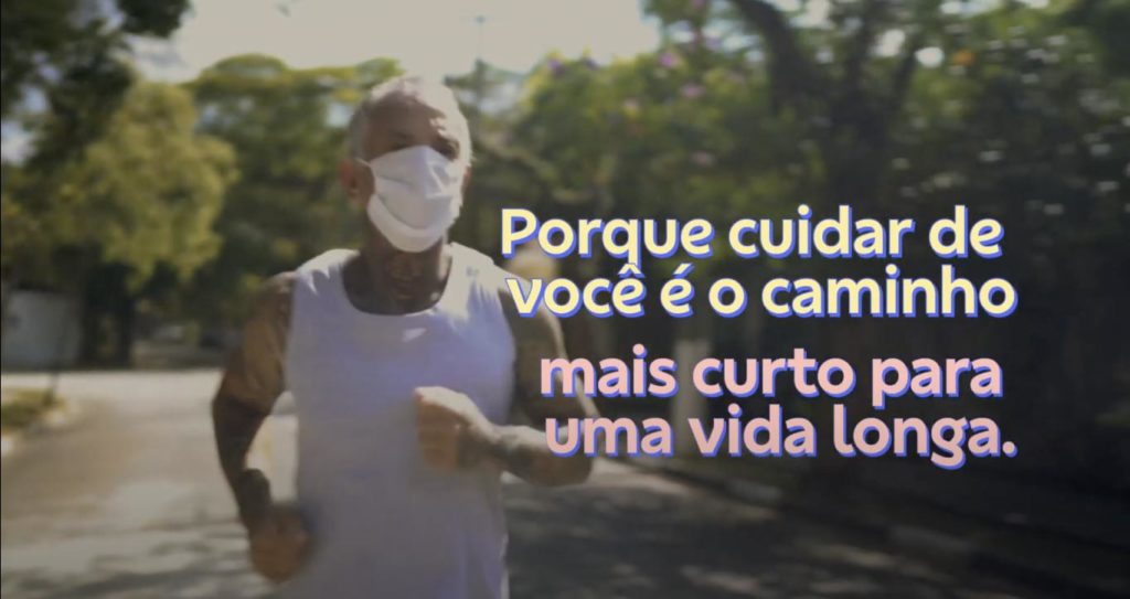
Confira alguns comerciais estrelando a nova tipografia:
Fabio Haag (Creative Direction and Design), Ana Laydner (Design), Luisa Leitenperger (Design) and Henrique Beier (Design and Engineering); FutureBrand: Ana Virtuozo, Natália Melo, Diego Oliveira, Gustavo Vasconcelos, Raissa Machado, Juliana Bezerra and Rodrigo Valdevite; Banco do Brasil: Juliana Souto, Luiz Fernando Rezende, Poliana Cunha and Thiago Padrão (Branding Team), André Costa, Erick dos Santos, Claudio Cologni and Lucas Barcellos (UX Team).
Custom fonts materialize brand strategies, carry their individual personality and DNA into every written word. Let’s talk?


