Tramontina: the pleasure of writing beautifully
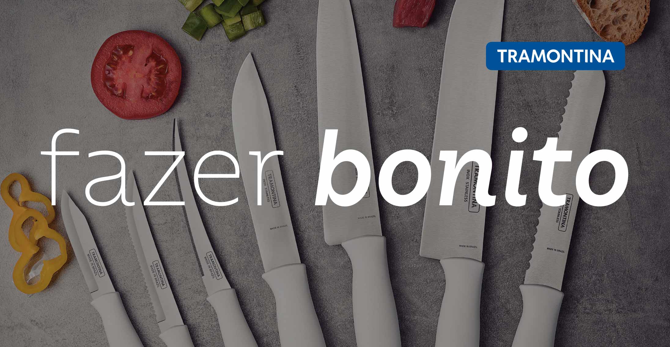
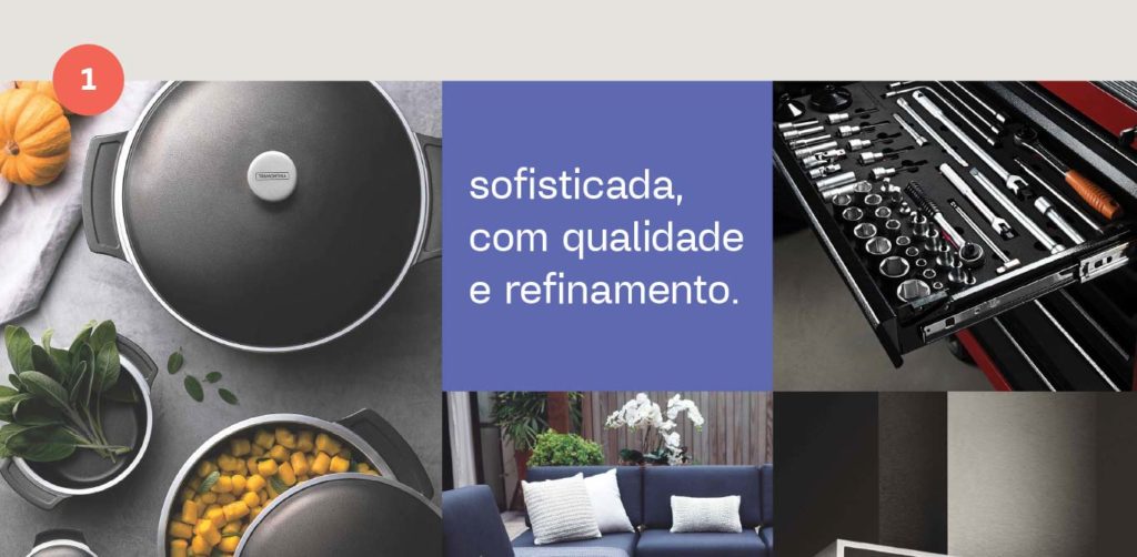
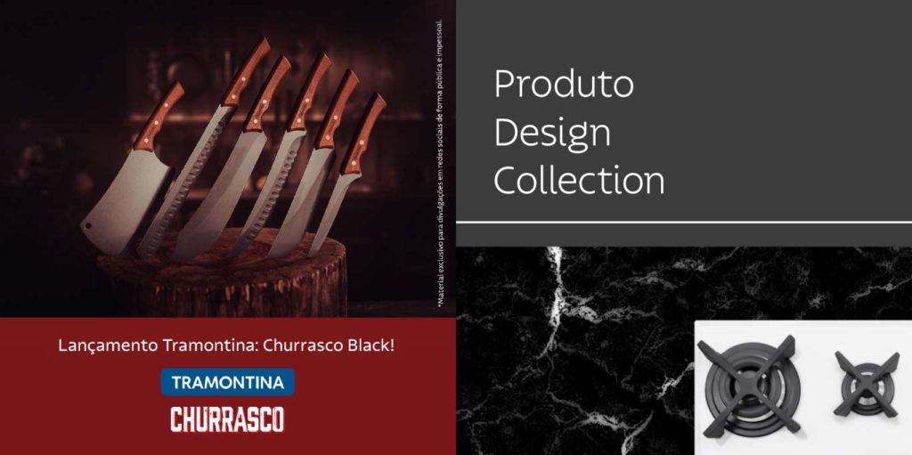
From kitchen utensils to garden tools, there are 22,000 products present in over 120 countries. This is the all-encompassing and enchanting universe of the Tramontina brand. Embracing all these segments can be a challenge for a typeface, which must work and excel in varied channels and applications.
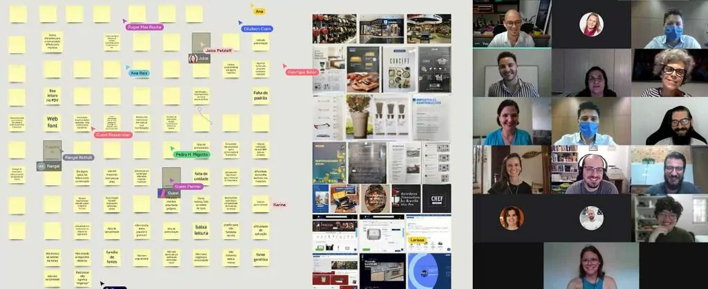
Aware of the challenge, Fabio Haag Type started as it always does in custom font projects: listening. In an agile and collaborative dynamic, honed by years of experience serving large companies and fast unicorns, we brought together Corporate Marketing, alongside different areas of Tramontina and the ZON Design studio, to discover the real typographic challenges present in the daily life of each one. Together, we were able to think about the potential that a custom-made typeface for Tramontina had to offer, from the point of view of the different areas of the company. This step is vital, as everyone needs to be aligned from the start to ensure that, in the end, the typeface is successfully implemented and serves the entire organization.
We arrived at two main premises. The typeface would need to have enough personality to, over time, evoke brand recall without the presence of the logo. At the same time, it would need to be flexible to perform, not only in different situations — from a TV commercial to the table of technical specifications on a package — but also to communicate about varied topics, whether advertising a line of premium cookware or construction tools. Among the challenges, there were also clear functional issues, such as legibility at the point of sale and in e-commerce, to more open questions: how to standardize without losing flexibility in the communication?
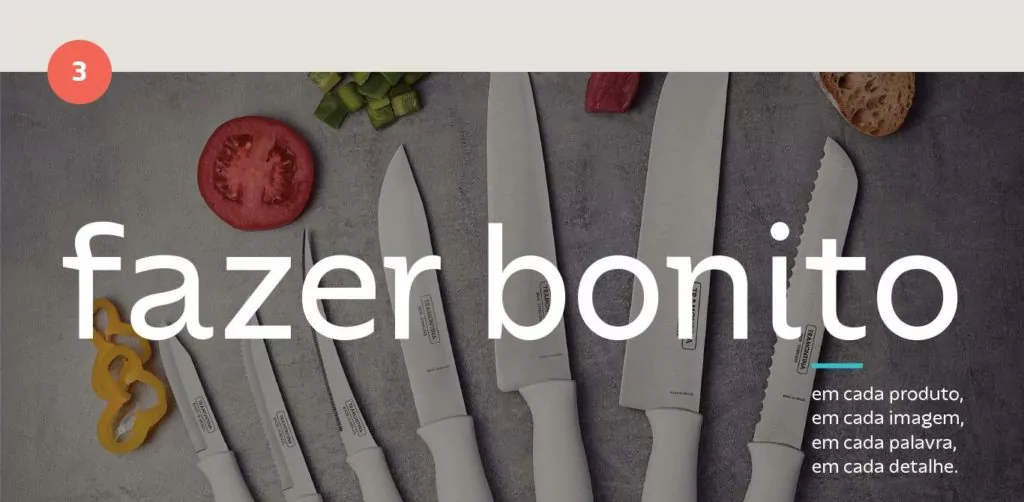
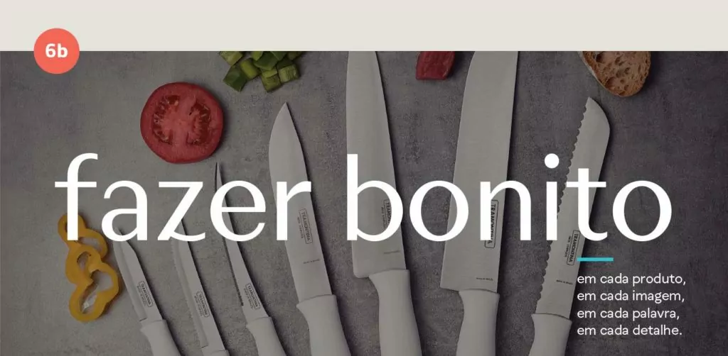
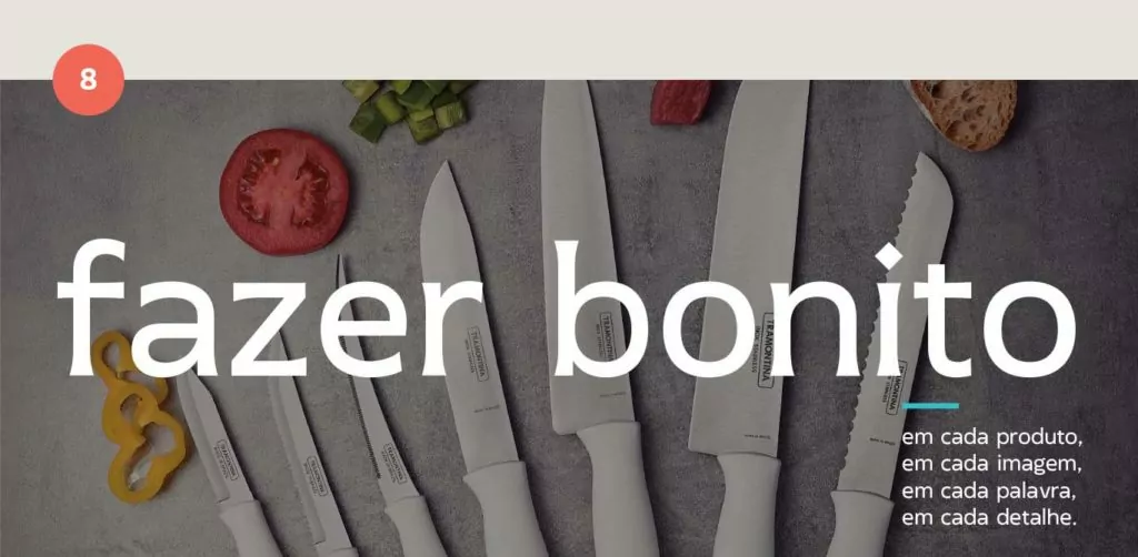
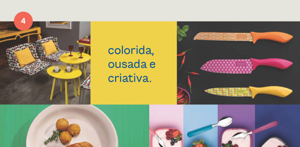

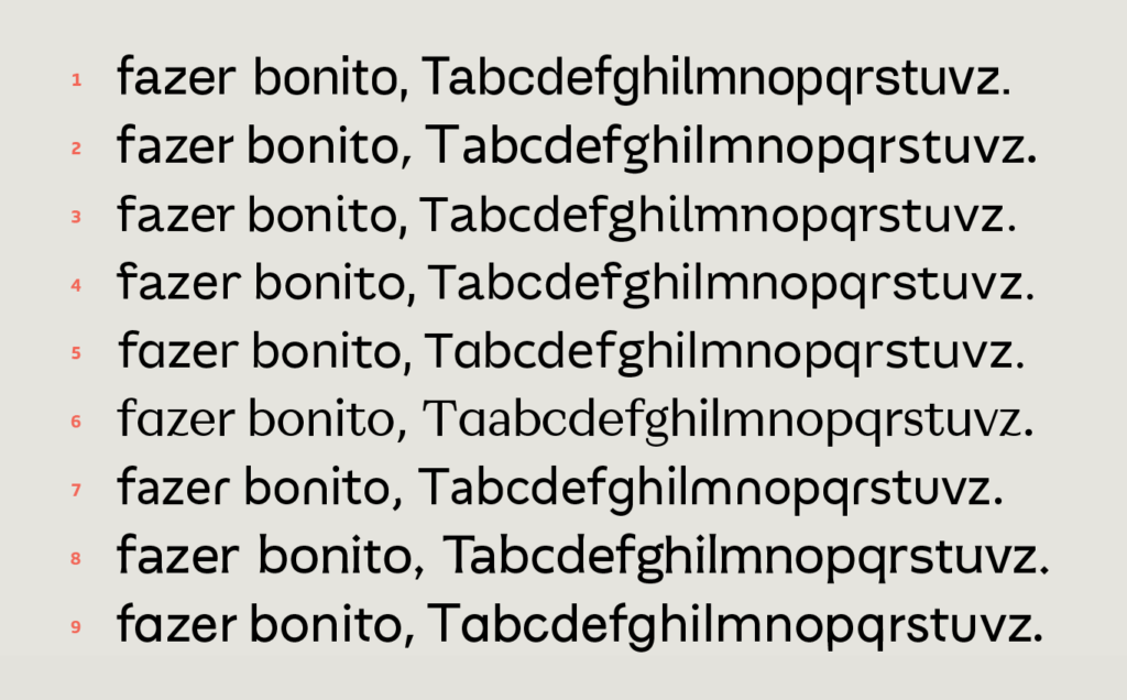
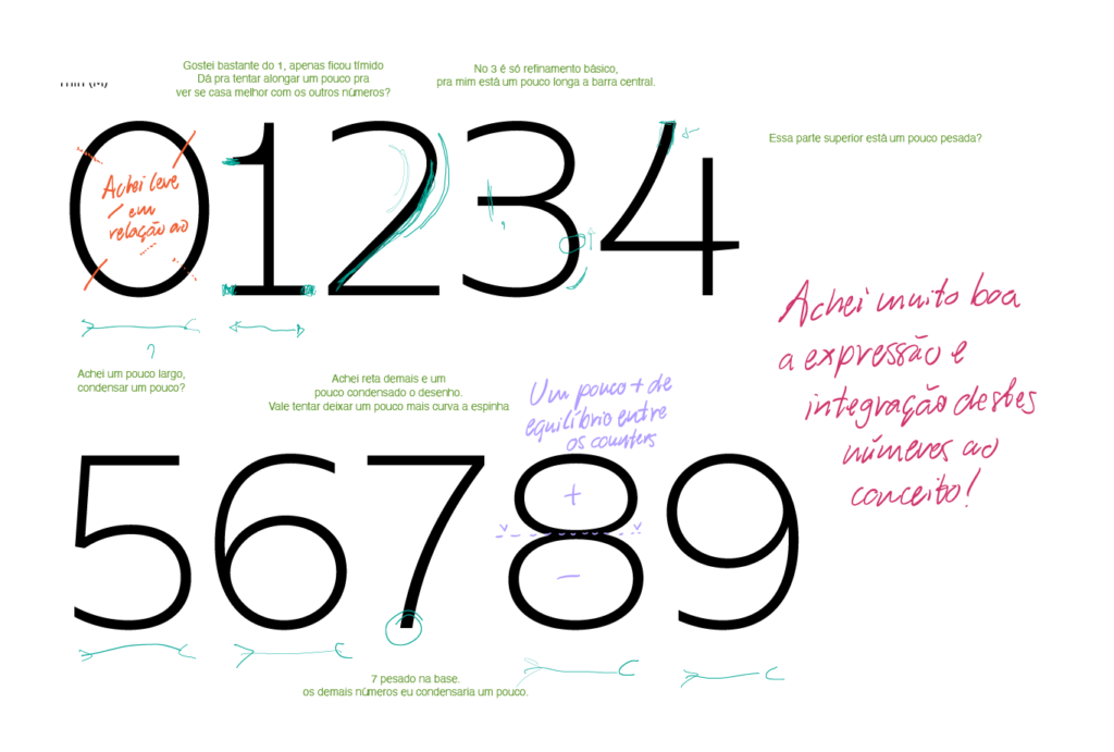
The Fabio Haag Type team came up with a total of 9 typographic ideas. Through another agile dynamic, the group could assess the strengths and weaknesses of each one together with our designers, always attentive to the project objectives established in the previous workshop. Two options were selected for the Concept stage, where ideas are expanded into different weights, new letters, numbers, and punctuation are designed in order to rigorously assess the solution’s functionality and flexibility.
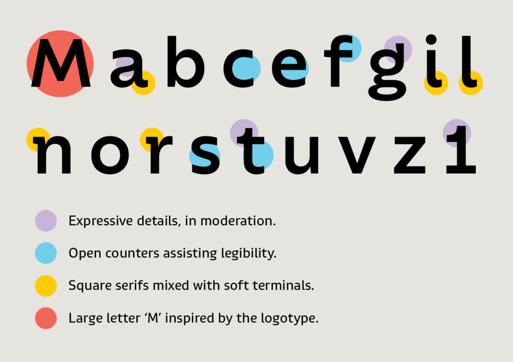
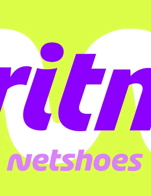
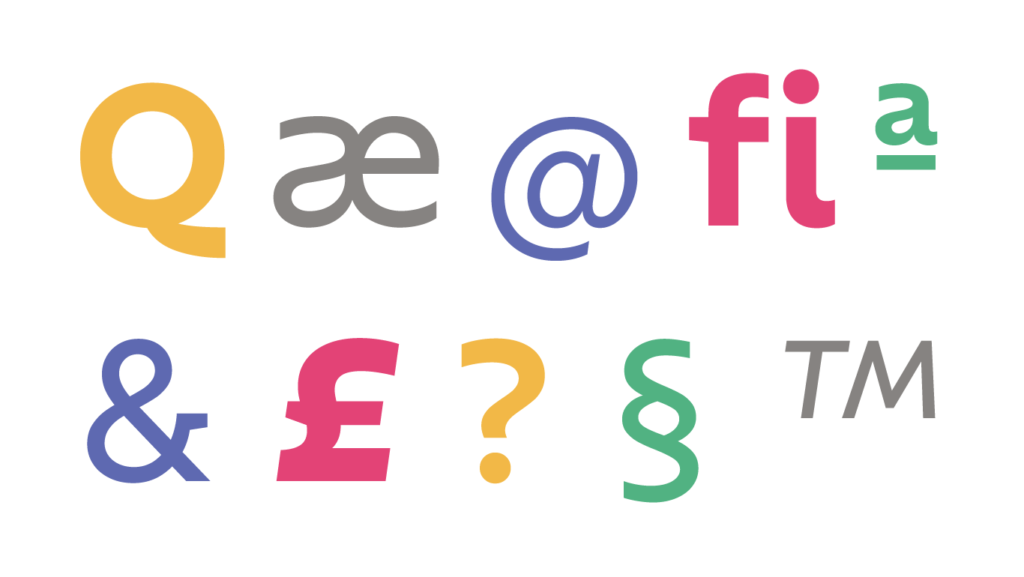
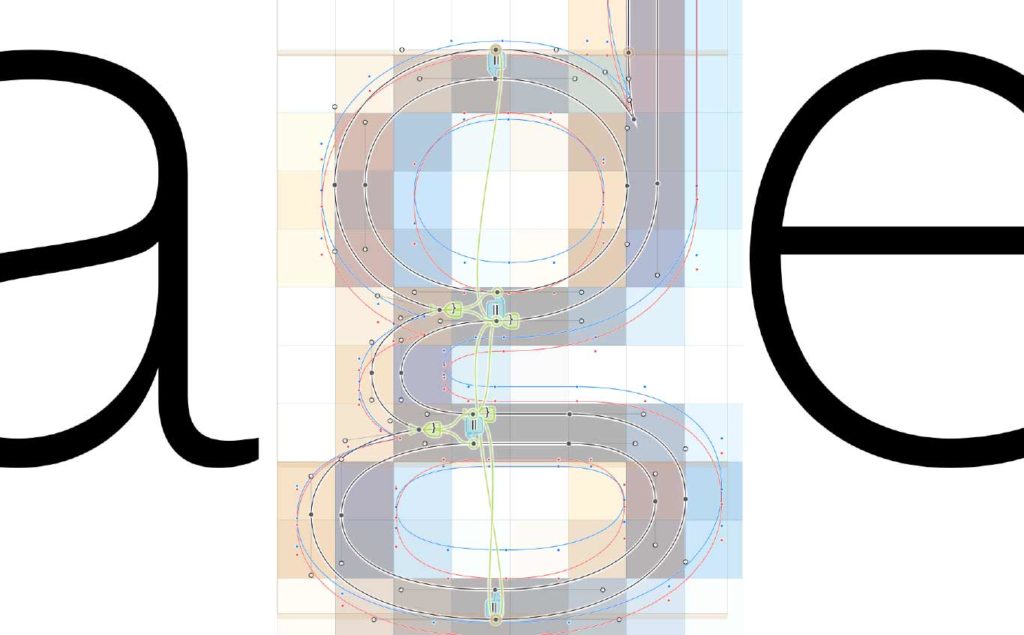
The approved design alternates the robustness of the ‘m’ and ‘r’ serifs with smooth and elegant lines, such as the ‘a’ and ‘i’ terminals, combining different expressions in singular harmony. The personality permeates the glyphs in a subtle way, but it is evident, like the belly of the letter’ a’, in the distinct construction of the ‘g’, or even in the details in the top of the ‘t’ and the figure’ 1’.
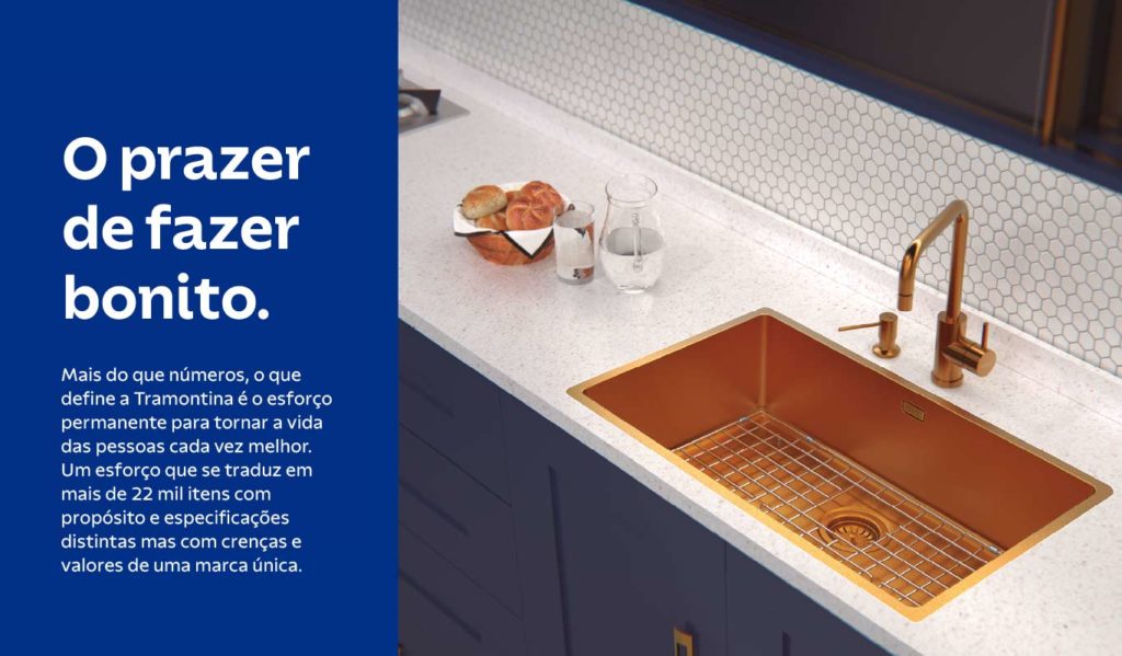
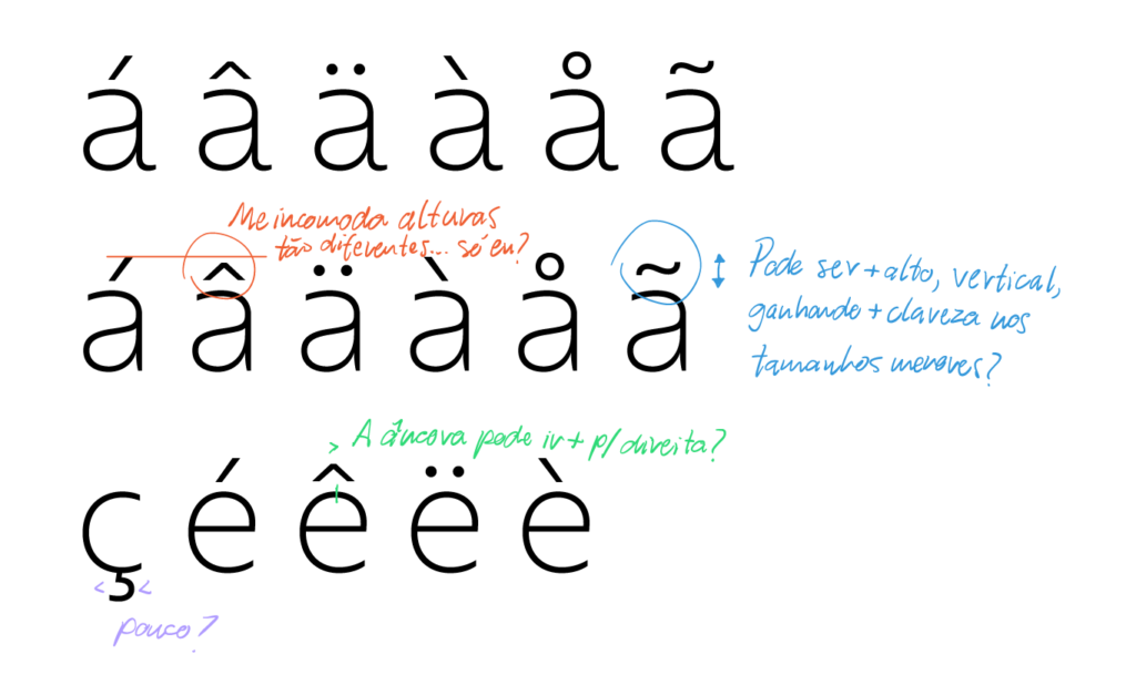
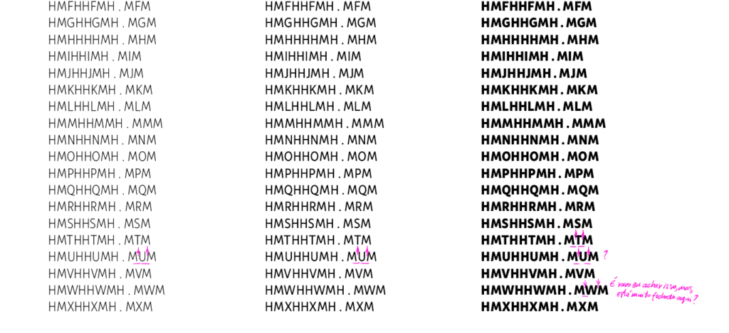
In texts, specific adjustments adapt the design for better performance, even on low-resolution devices. Among them, any serifs are eliminated for greater clarity, and subtle spacing and weight adjustments contribute to superior performance in small sizes.
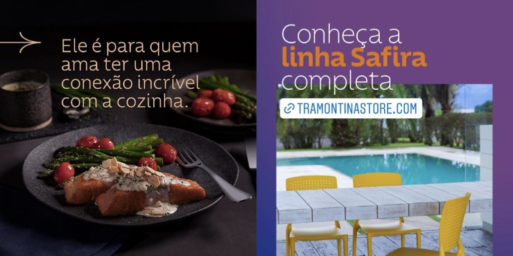
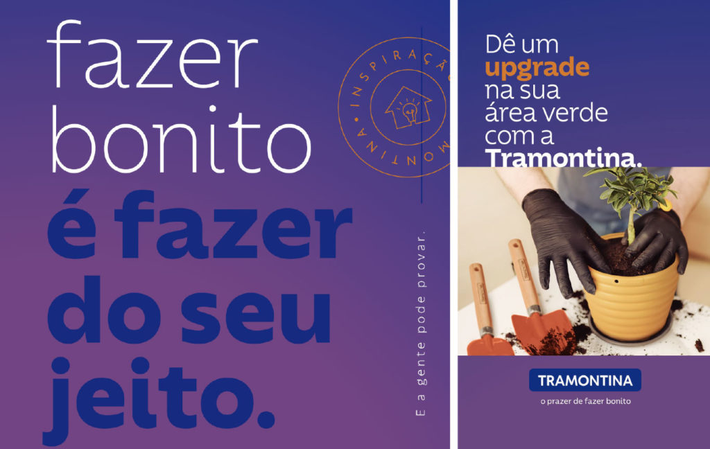
‘We are always looking to bring more personality to our brand and the partnership with Fabio Haag and his team was a very happy one. From now on, Tramontina has a very important design asset, which reinforces our identity and our way of being. The proprietary typeface helps us to present ourselves as a relevant, inspiring brand that values the pleasure of making things beautiful. The project had teams from different areas and the result is an exclusive typeface, which translates the brand in a coherent way, in all the segments in which we operate.’ — Rosane Fantinelli, Director of Corporate Marketing at Tramontina
Fabio Haag (Creative Direction), Eduilson Coan (Design Lead), Henrique Beier (Design and Engineering), Ana Laydner (Design) and Thiago Bellotti (Design); Tramontina & ZON Design;


