On the ground and in the sky: GOL’s new typeface ships 56 exclusive fonts
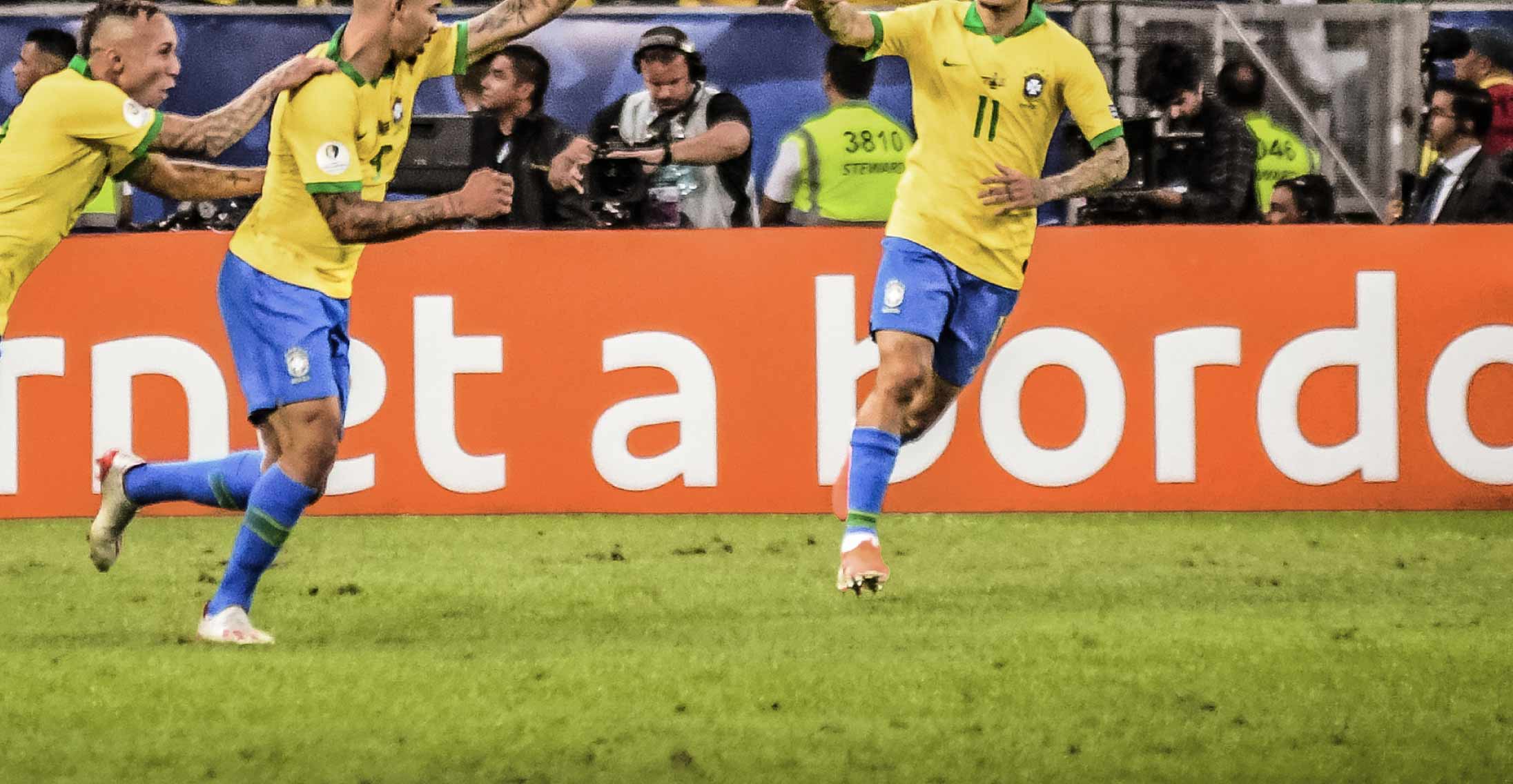
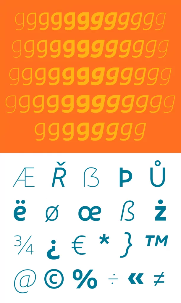
For months, its communication announced: #NovaGOL. A series of gradual improvements have been implemented, from operation to customer experience. Now, this new moment of GOL materializes in visual form, including an exclusive typeface. Designed by Fabio Haag Type in collaboration with FutureBrand, which signs the brand strategy and visual identity, the GOL Sans family has departed, shipping a total of 56 fonts.


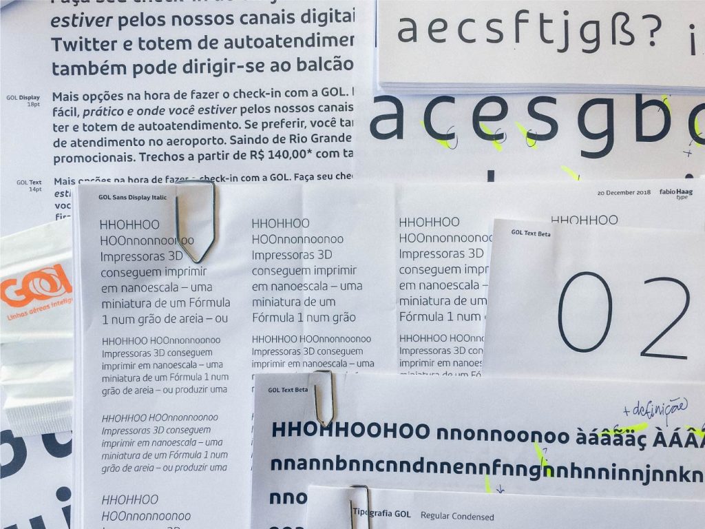
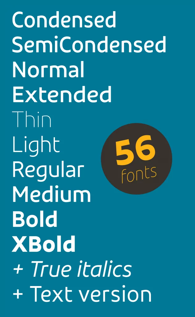
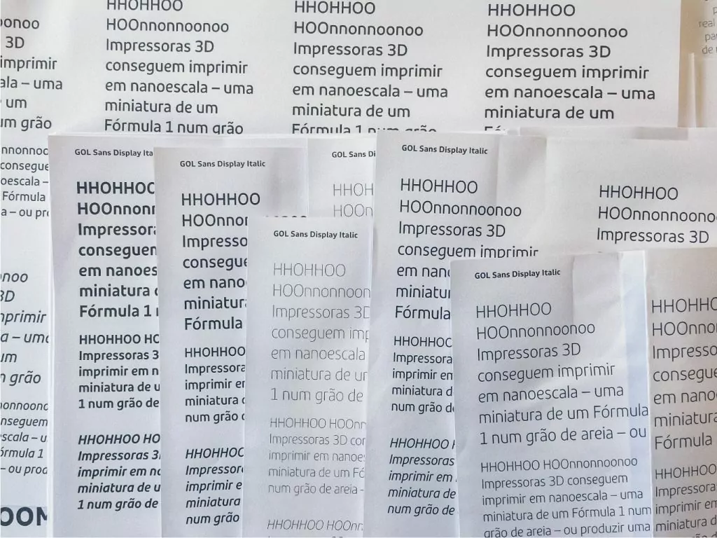
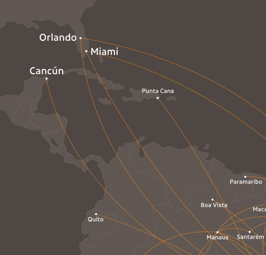
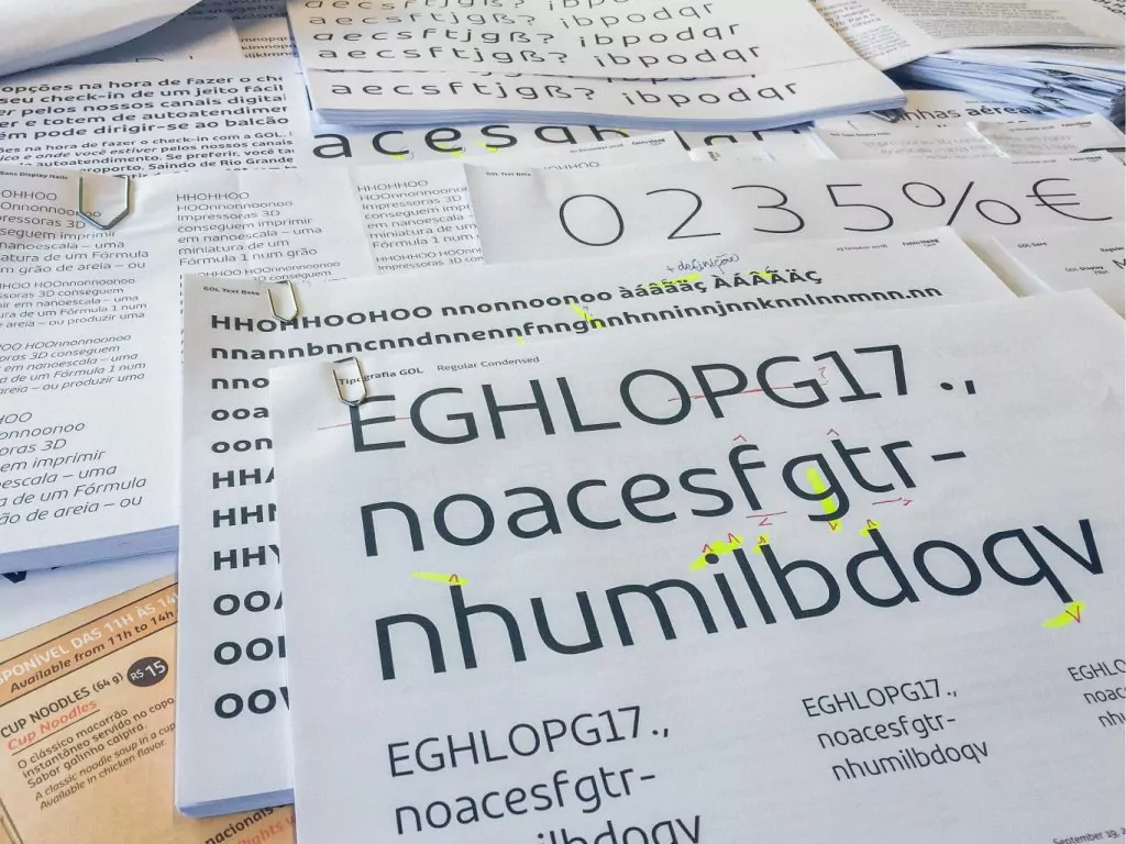
The digital-first mindset guided the design of the letterforms, which have simple and minimalistic shapes, as well as open counters, aiding legibility even in lower resolution screens. The variety usages – from airport signage to graphic pieces with limited space, such as an onboard food menu set in several languages – imposed the extension of this type family: six weight variations, four widths, true italics and specific versions for use at display sizes or smaller texts and UI.

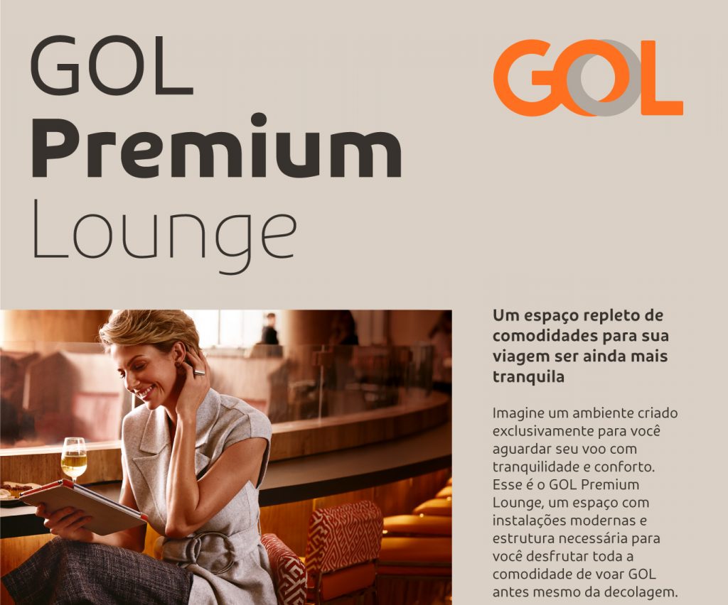
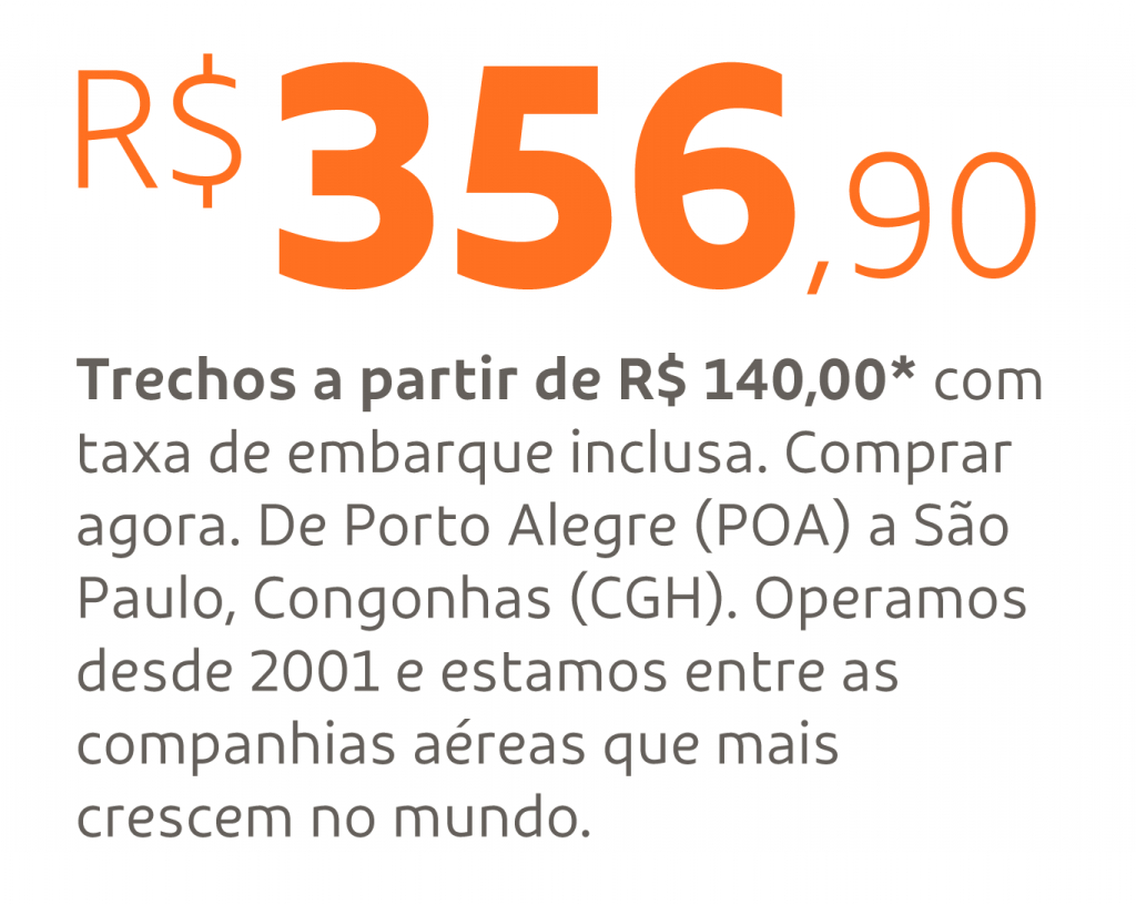
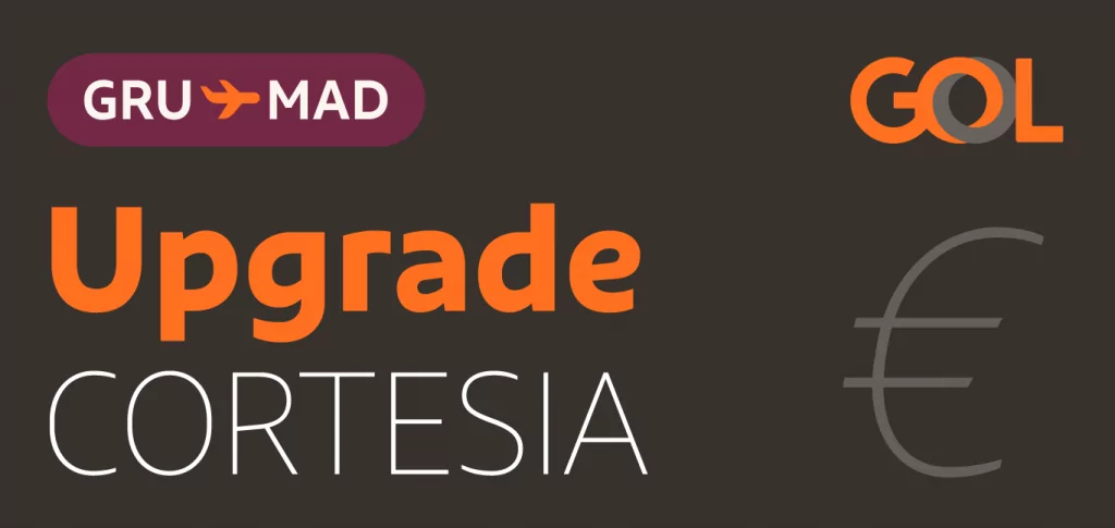
In the Display cut, the bar of the letters ‘e’, ‘P’ and ‘R’ is inclined – a subtle detail which gives a unique expression and does not impair legibility. Now, a simple price listing, with the Brazilian currency symbol R$ large enough, reveals that it is from GOL. On the Text versions, besides a few more conventional letterforms, the ascenders and descenders are taller, along with a looser letter spacing.


“This project highlights all the advantages of commissioning a bespoke typeface: it was created together with FutureBrand and with the customer’s design and technology teams; weights and styles were carefully considered to meet the specific needs of GOL. And besides, it is exclusive, of no-one else, a valuable asset for the GOL brand.” – Fabio Haag, type designer
“Another successful partnership with Fabio Haag, GOL Sans has the practicality of a proprietary typeface, powered by a unique aesthetic, born to the digital environment. GOL has now one more important asset to increase its brand awareness.” – Arnaldo Bastos, Team Leader, FutureBrand São Paulo
In addition to the advantages of a communication perspective, a custom typeface is an investment in itself, as it frees the client from paying for multiple licenses to use existing fonts, some with restrictions that difficult the correct implementation of the identity for a large organization such as GOL.
“We evolved various elements of our identity and the new typeface was developed as part of that process. GOL Sans brings more ownership to brand communication and visual consistency at all our points of contact. The whole creative process was collaborative and we are happy with the result.” – German Goytia Carmona Junior, Marketing Manager, GOL

Team: Fabio Haag (Creative Direction and Design), Henrique Beier (Engineering); FutureBrand: Alexandre Rizzuti, Arnaldo Bastos, Carolina Horita, Helio Carvalho, Isabel Sobral, Jonas Pacheco, Nathalia Fuzii and Thiago Cruz.
Visit FutureBrand’s website.
Custom fonts materialize brand strategies, carry their individual personality and DNA into every written word. Let’s talk?


