Suzano Sans: a typeface to bring different audiences together
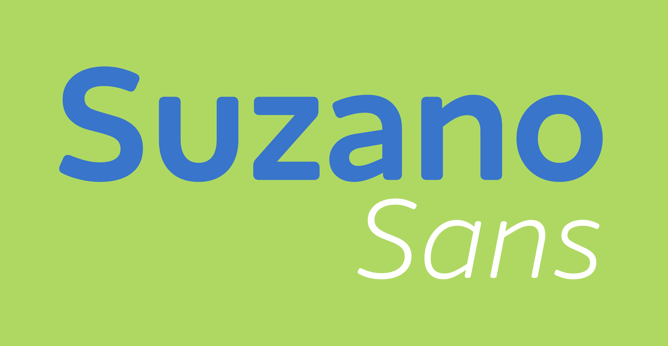
From the merger between Suzano and Fibria, the largest pulp and paper producer in Latin America is born, along with an exclusive typeface. The strategy and visual identity of this new Brazilian giant were conceived by IN Gestão de Marcas, which commissioned Fabio Haag Type to create a typeface tailored to the needs of this project.


One of the goals was to change the brand perception of a B2B company to also include the B2C segment, close to people’s daily lives. For this reason, the letterforms have subtle round corners, soft and friendly, and a contemporary structure, with distinct details that impart personality, notably in the letters ‘g’, ‘E’ and ‘L.’
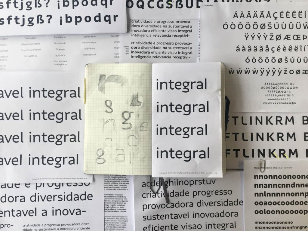
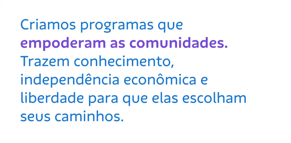
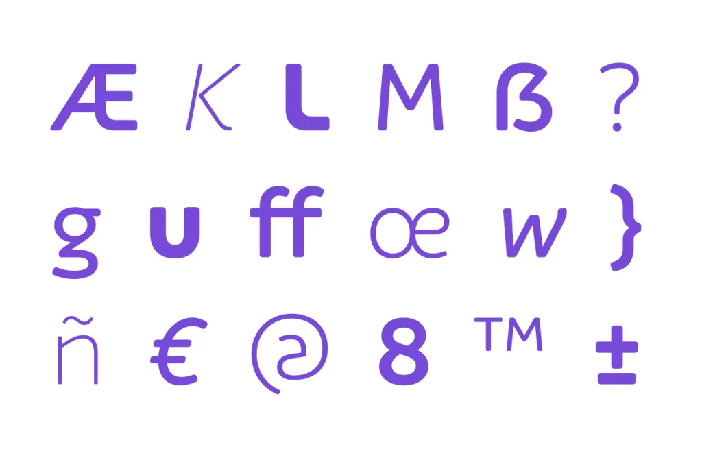
“This is a practical example of the bridge between the brand strategy and the actual shapes of the letterforms, essential for the effectiveness of any corporate typeface. Here, the subtle round corners – which if exaggerated would look like the traces from a childish felt tip marker – break the perception of the rigidity of a large corporation, welcoming the final consumer audience, a new segment defined by the strategy.” – Fabio Haag
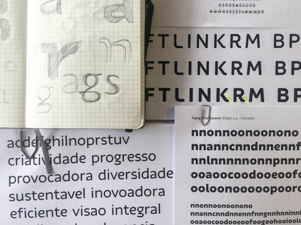
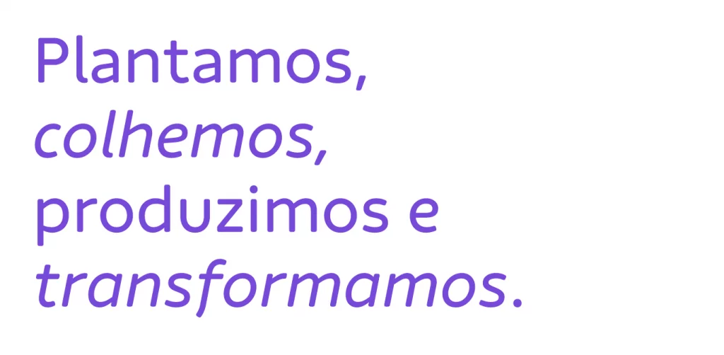
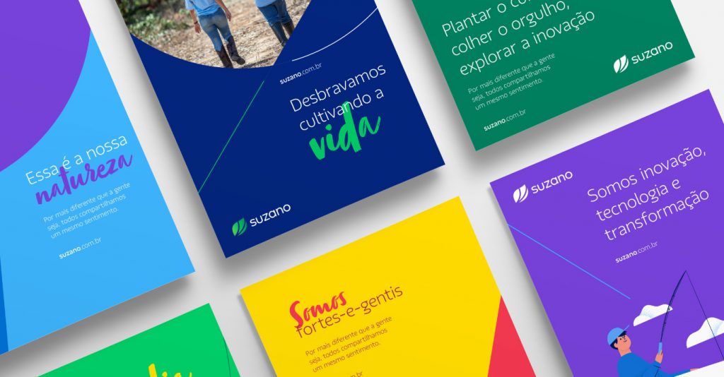
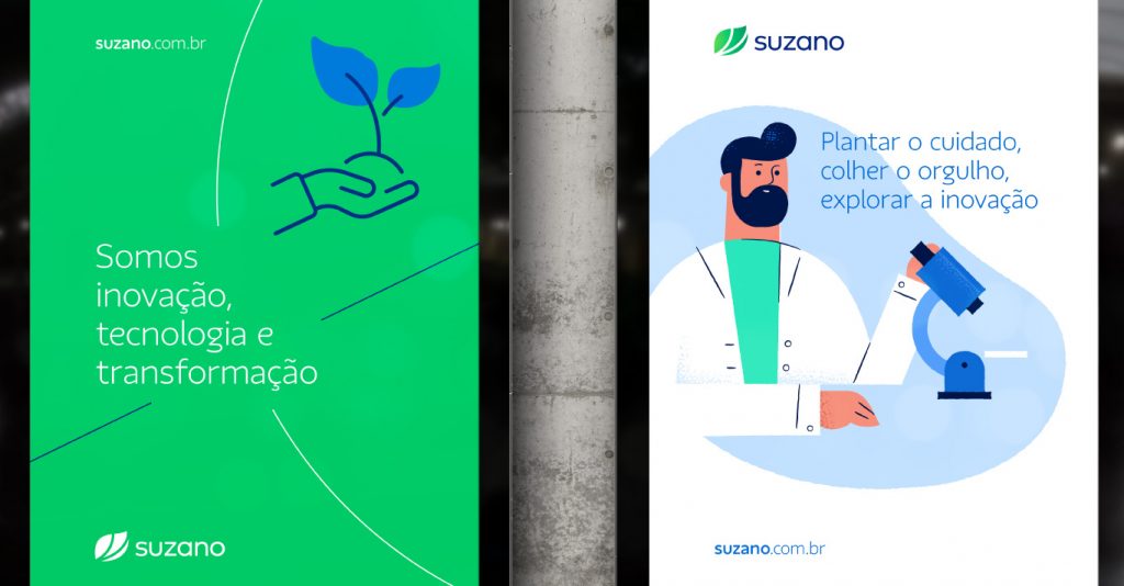
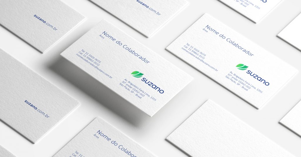
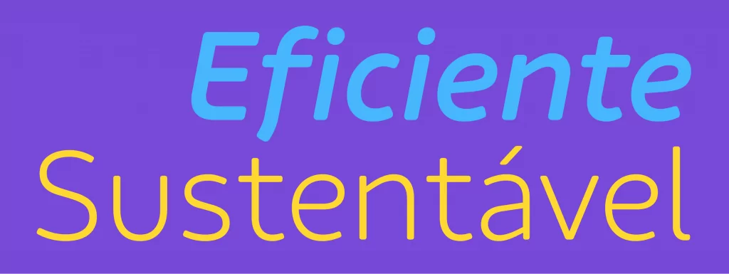
Result of four months of collaborative work, Suzano Sans has 6 weights, from Thin to XBold, and true italics, with gently curved endings in the diagonal letters ‘k’, ’v’, ’w’, ’x’ and ’y’ – a unique feature of the italics, inspired by handwriting.
Team: Fabio Haag (Creative Direction and Design), Henrique Beier (Engineering); IN: Caio Campana (Design Direction), Felipe Takashi and Pedro Cury (Design); Suzano: Marcela Porto and Talita Sato.
Meet the studio IN Gestão de Marcas
See typeface in action on Suzano’s new website


