Between the hurricane and the ball control: a typeface for Athletico Paranaense
Sports brands do not have customers; they have fans. They literally wear the shirt. They will vibrate, scream and even cry hugging the brand close to their chest. This makes every project for sports both fantastic and scary. There are many emotions. One passion, many generations.
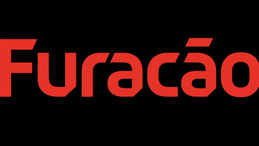
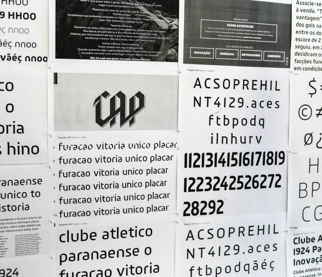

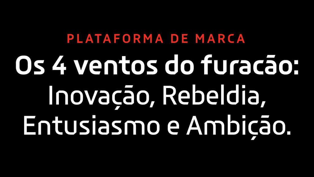
Clube Athletico Paranaense is the first Brazilian club to have its own typeface – an exclusive and bespoke font. From now on, every written word and even the numbers on the back of the players’ jerseys will portrait the club’s values, or, as they say, the four winds of the hurricane: innovation, rebellion, enthusiasm, and ambition.
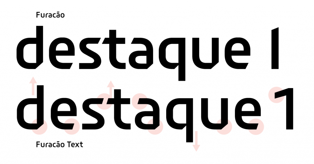
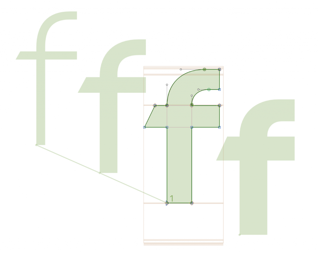
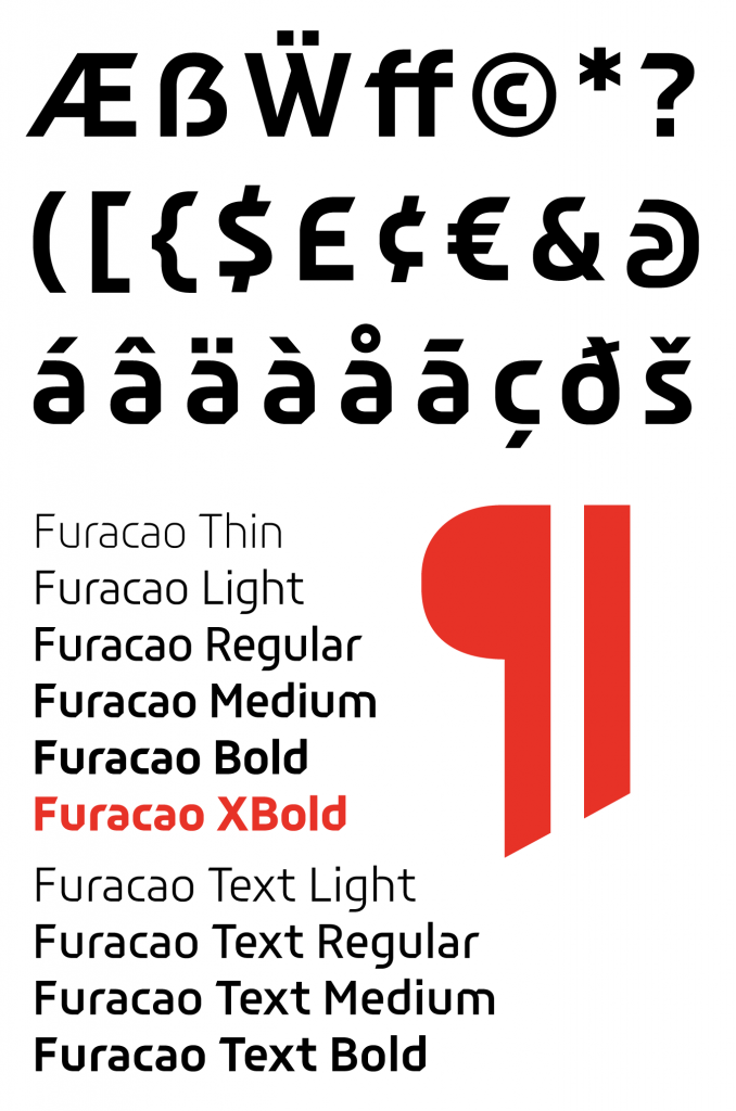
It is innovative the very fact that the club commissioned an exclusive typeface. Rebellion and enthusiasm are vivid on the design, with rising diagonal cuts, suggesting fast pace. At large sizes, the voice of the Hurricane – as the team is also called – screams out loud. At the same time, fonts need to be legible and this enthusiasm needed to be controlled; ball dominance is critical. For this reason, a specific version for smaller texts was created with wider letters and spacing, as well as design adjustments to attenuate the striking features of the Hurricane font. That is, picking legibility first, when the game demands, in smaller sizes.
“If the typeface is the voice of the brand, the Hurricane font screams out loud. Screams for everyone to hear. And to recognize that this voice is from the Hurricane alone. Those letterforms are only theirs.” – Fabio Haag, type designer
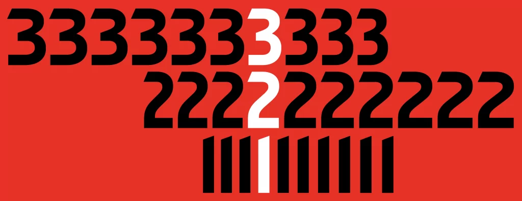
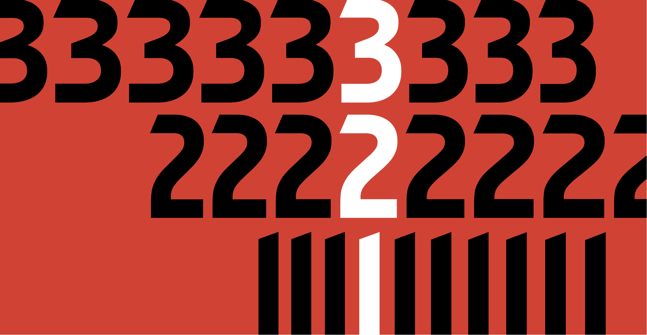
We used Variable Font technology for jersey’s numbers. Variable fonts allow an infinite range of widths, which is ideal for such a situation, where the number 23, for example, needs to occupy the same space as the number 2 or 3 alone. In the Hurricane font, the width is adjusted to the exact area available, depending on the context, preserving the quality of the original drawing.

In just two months, along with Oz Strategy + Design, which signs the positioning and new visual identity of Athletico Paranaense, we created this unique typeface which lifts the design of Brazilian soccer with the strength of a hurricane.
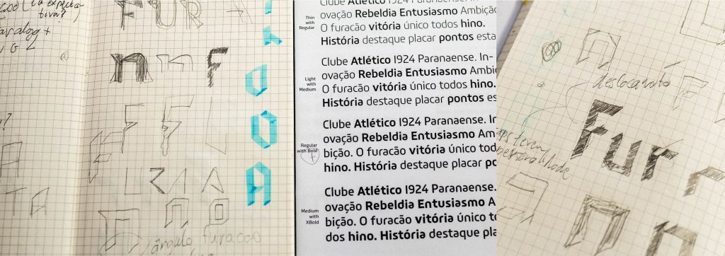
“Designing a proprietary typeface is a powerful tool in building a solid identity. In the case of Athletico Paranaense, the importance is even greater, since the main expression of identity of a soccer club is its uniform. The number on the back of the players, therefore, has a relevant role in the image. Therefore, having a unique design becomes a great advantage, different from all the opponents that you will face in the field.” – Giovanni Vannucchi, Managing Partner of OZ Design + Estratégia
Team: Fabio Haag (Creative Direction and Design), Henrique Beier (Engineering); OZ Design: Giovanni Vannucchi (Director) and Alexandre Mazzini (Senior Designer); Athletico Paranaense: Mário Celso Petraglia (President)


