A Russian accent for SporTV
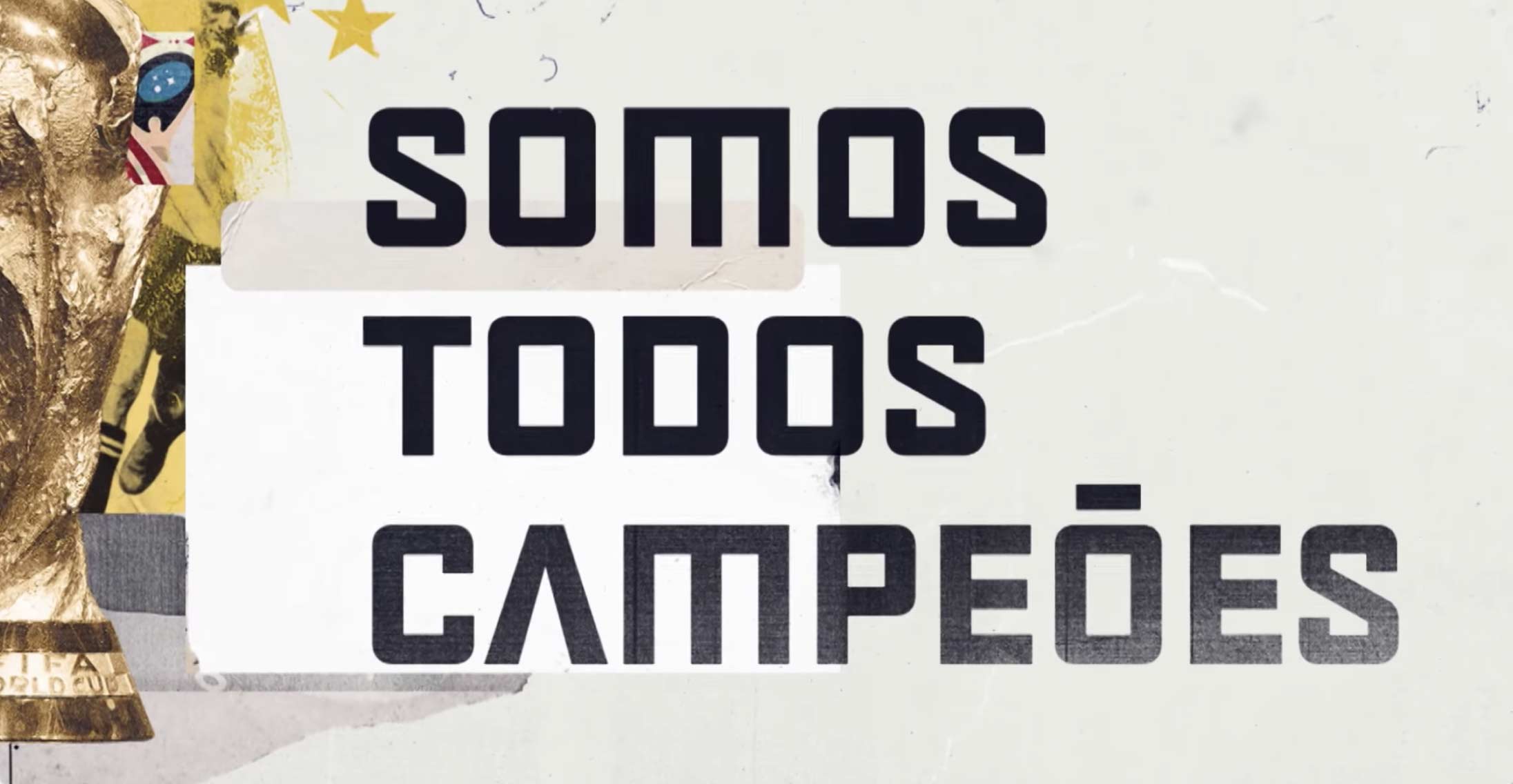
One of the most beautiful aspects of the World Cup is the integration between several countries around the same passion. There is a spontaneous cultural exchange that brings surprises, discoveries, memes (of course!) but also homages. During the 2018 World Cup, the SporTV font will adopt a proudly Russian accent.
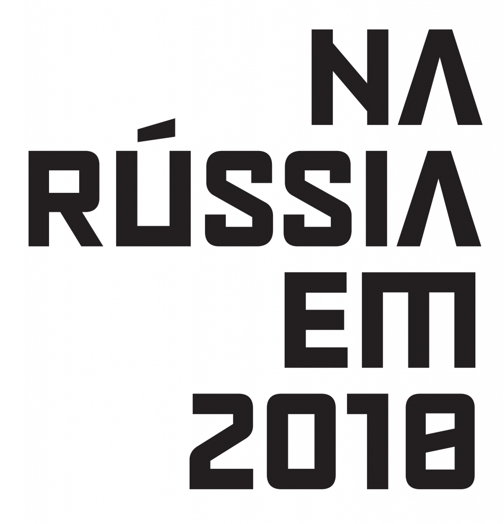
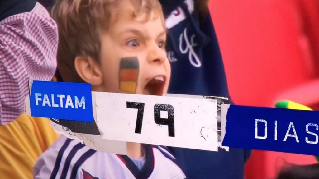
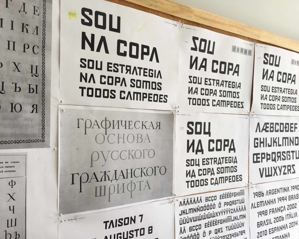
The exclusive typography, developed by Fabio Haag Type in collaboration with Globosat’s Communication & Branding team, is a central element of the SporTV ‘Sou Na Copa’ campaign, which also featured the talent of Firmorama.
The alphabet used in Russia has many similarities with ours, after all, the Cyrillic – like our Latin – descends from the same ancestor, the Greek alphabet. Finding forms similar to both was the starting point to express the integration of these two worlds, with attention to preserve the essence of SporTV’s own visual language.
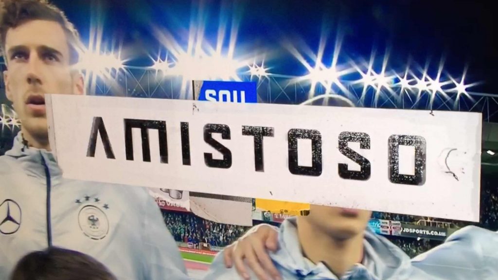
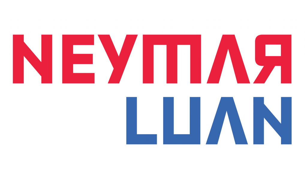
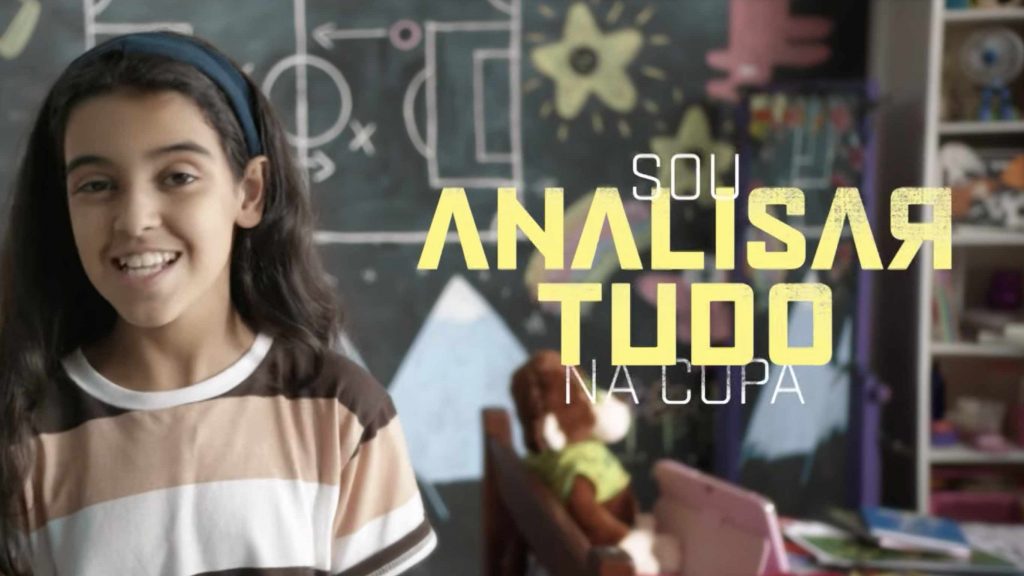
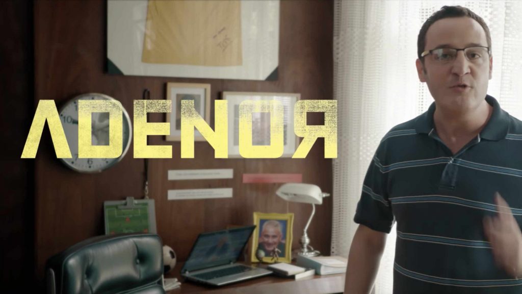
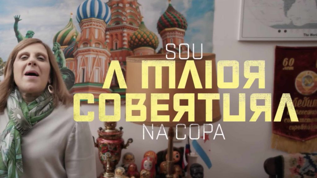
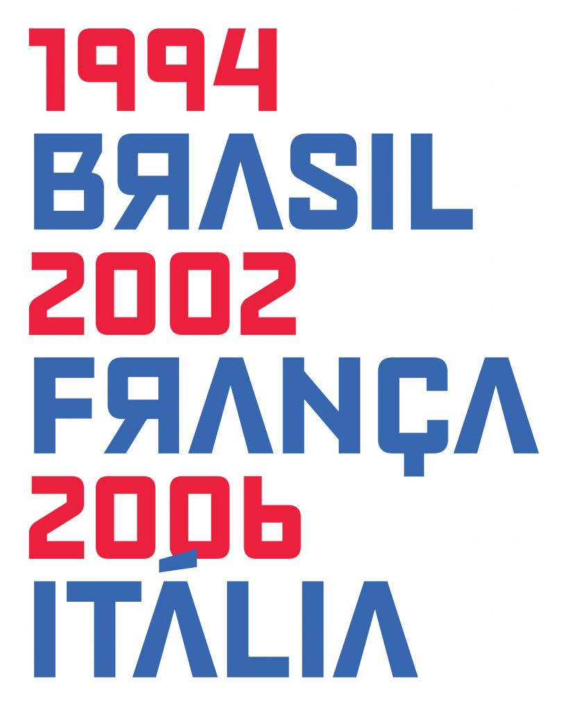
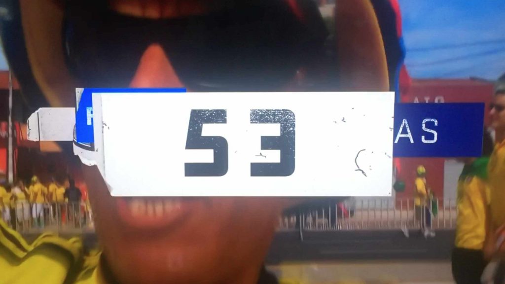
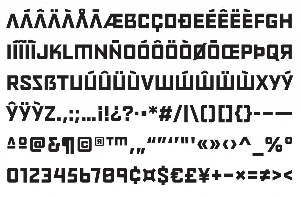
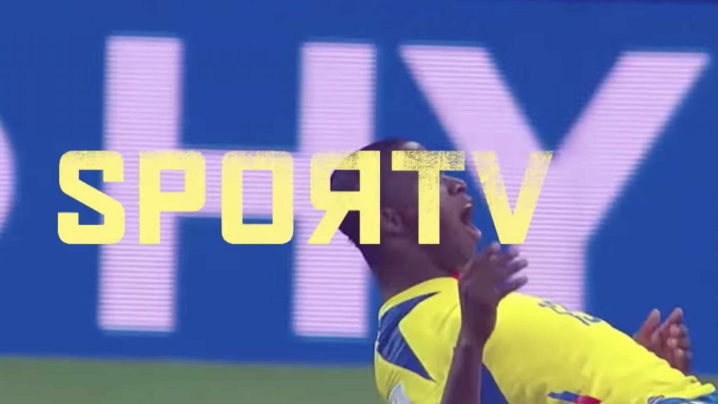
There is courage in the simplified geometric forms. There is irreverence in the mirrored letters… there is a party, after all, there is a World Cup \ o /
Equipe: Fabio Haag (Fabio Haag Type); Leon Vilhena (Globosat);


