Bradesco Sans: a guaranteed investment
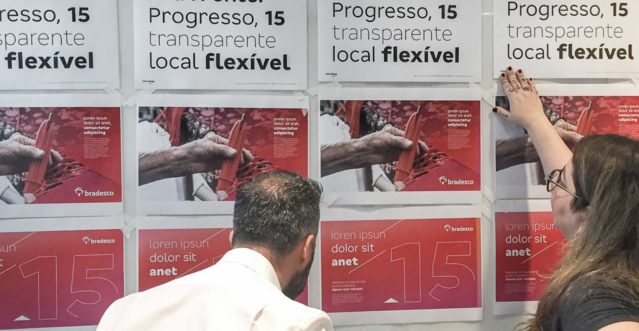
Brands with the reach of Bradesco — more than 70 million customers and 76 thousand service points across Brazil — have a challenge as extensive: present themselves consistently, easing recognition, across all points of contact with their audiences. A corporate typeface helps to solve this problem by carrying the brand identity within each written word, from the TV ads to the ATM’s interface.

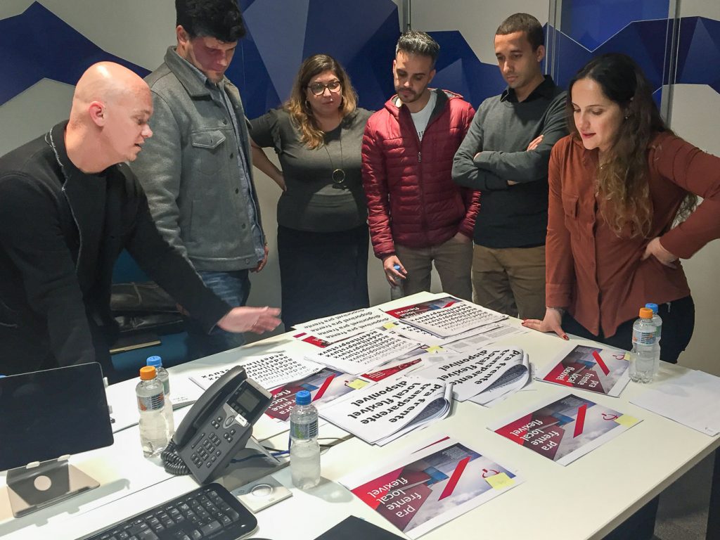
Fabio Haag Type faced the challenge of creating Bradesco’s typographic voice, together with the studio Superunion, the agency Publicis and directly with Bradesco’s Design Team.
Bradesco Sans is the result of year and a half of development and a total of 14 typographic ideas considered. Its design respects the geometric spirit of the previous typeface, however, with less rigidity. There is a better balance between geometric precision and the intuition of the human hand.
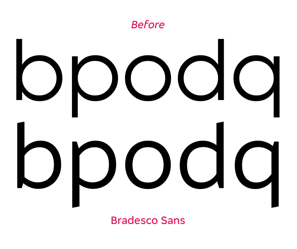
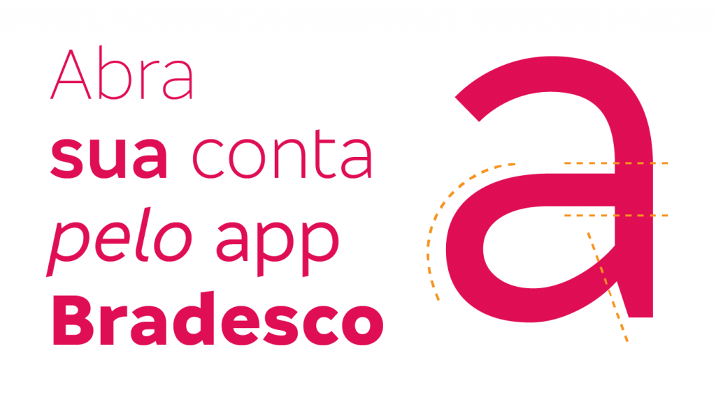
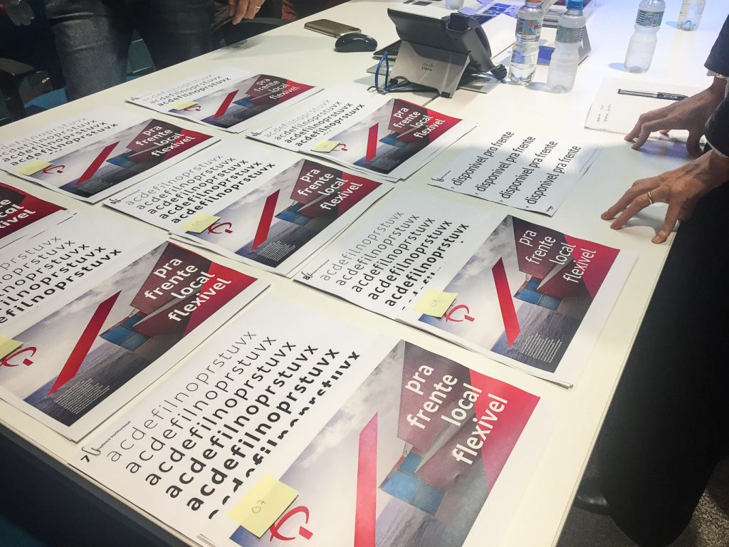
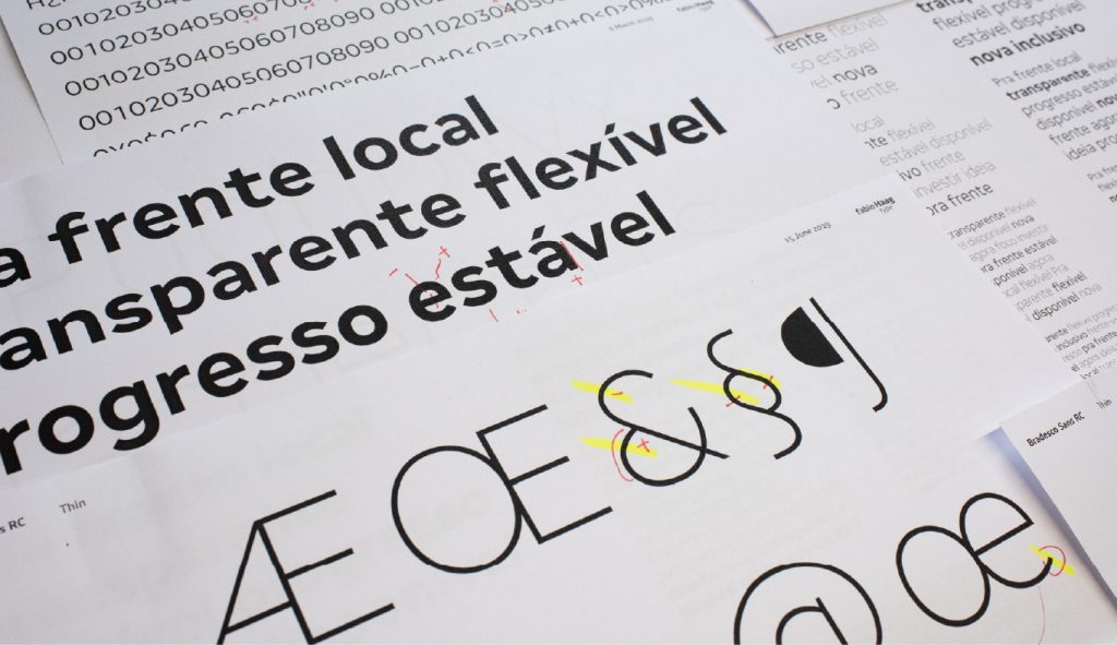
We looked for expressiveness in the context, where angled terminals of the letters ‘c’, ‘e’ or ‘s’ live in harmony with vertical terminals, as in ‘l’, ‘r’ or ‘y’. Individually, ascenders and descenders (letters ‘b’, ‘d’, ‘h’, ‘k’, ‘l’, ‘p’, ‘q’ and ‘t’) end angled, derived from Bradesco’s symbol, and also present in its various sub-brands.
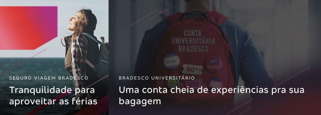
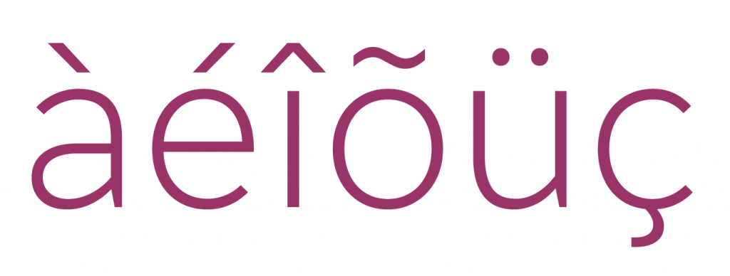

Each detail, from the design of period symbol to the diacritics, across all weights, as well as each weight itself (how heavy should the Bold be? How light should the Light be?) has been considered and tested to work from a large billboard to a small UI in an app’s interface.

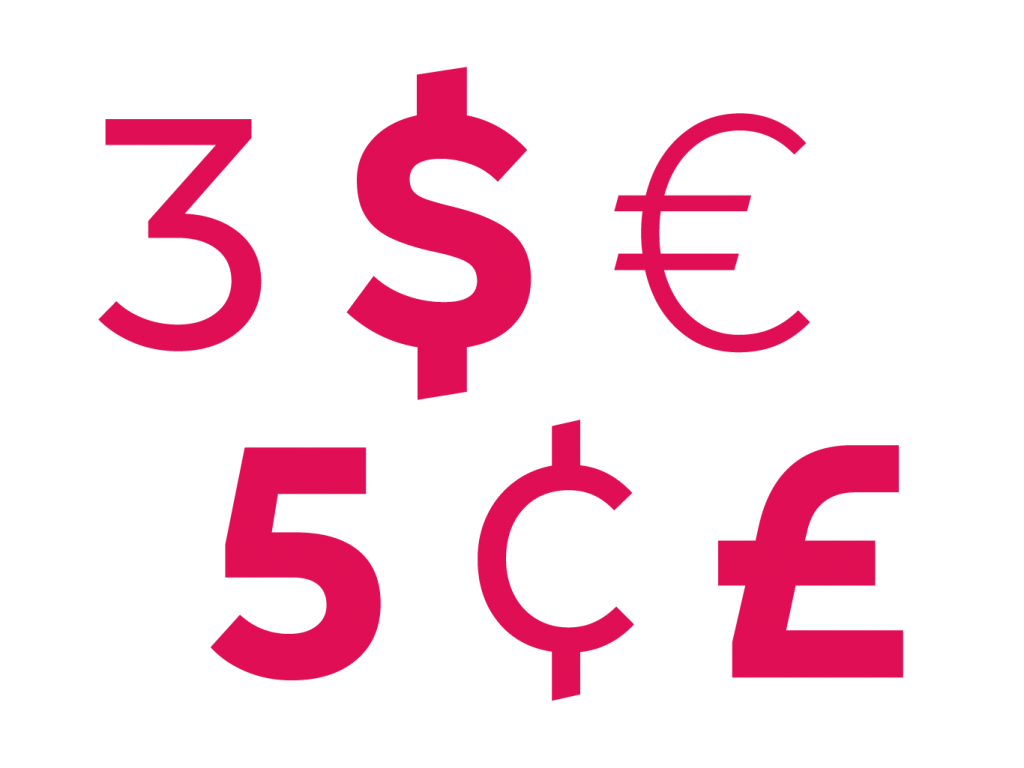
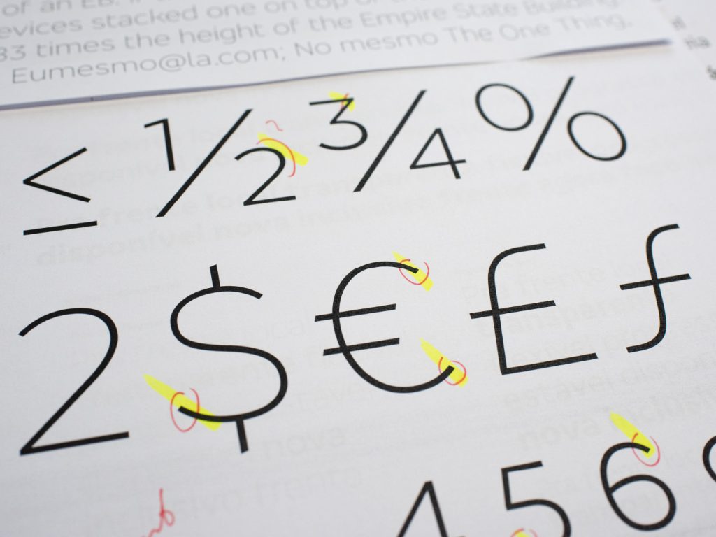
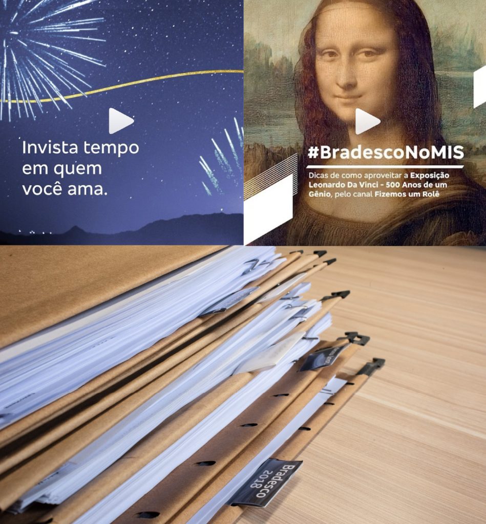
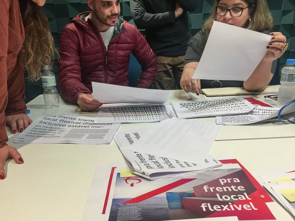
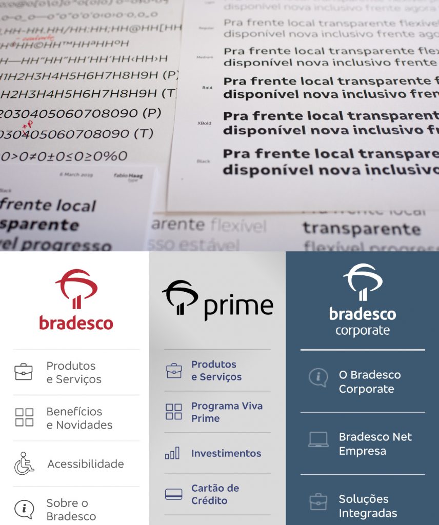
Besides the brand-building advantages, the exclusive Bradesco Sans brings logistical and financial benefits: the fonts can be distributed to the entire internal public and suppliers without any restrictions or licensing costs, perpetually. The fonts are real assets of Bradesco. They are a guaranteed investment.

The new typeface premiered on Bradesco’s beautiful end of year campaign:
Team: Fabio Haag (Creative Direction and Design), Henrique Beier (Engineering); Superunion: Marcelo Bicudo (CEO), Janet Riddell (Strategy and Project Management), Shingo Sato, Bruno Souza, Rodrigo Munhoz, Sauê Ferlauto, Édipo Zolini (Creatives). Bradesco: Márcio Parizotto e Daniela Ugayama (Marketing Directors), Dulce de Oliveira, Rodrigo Nunes e Sérgio Belmonte (Design Team).
Find out more about Superunion and Publicis.


