The Certainties I Had

White hairs have started to appear.
The book Change, by Édouard Louis, moved me deeply.
Even some lashes, in my eyebrows, have started to come in white.
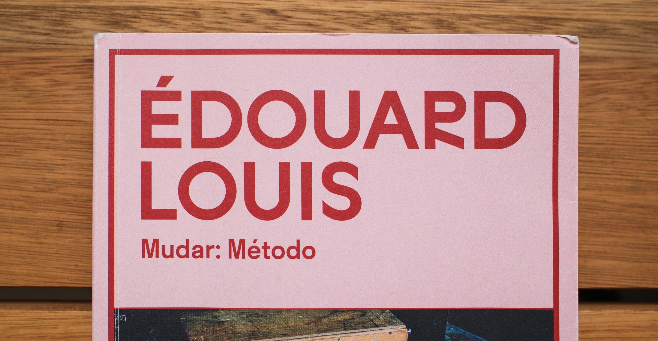
Unlike the thousands of fans the young Frenchman has won around the world, what touched me, too, was carefully observing the details of the typeface used on the cover of the Brazilian edition, from Todavia.
I pluck them with the precision of tweezers.
The cover’s typeface displays what my masters would call fundamental errors in typographic design. Clear errors that I point out in lectures and workshops.
But once white, they return white again.
When do we age in our profession?
It seems natural to me that after decades of practice, we start to believe we understand something. This is how it works. This is how it’s done.
A futurist friend of mine, Tiago Mattos, warns: beware of those who say they have 20 years of experience; perhaps they have 1 year of experience repeated 20 times.
If there’s something in common among the great creatives throughout history, it’s that they challenged the rules of their time. They challenged the ‘right way to do things.’
Monet’s brushstrokes were ridiculed as unfinished, half-done. Picasso’s fragmented faces horrified even his friend Matisse. Pollock’s paint splatters were dismissed as a ‘mop of tangled hair’.
In graphic design, Carson provoked fury by ignoring all the rules of legibility. Paula Scher’s work was once considered “ugly” for abandoning grid systems. Sagmeister shocked everyone by making design on his own flesh.
But we don’t need to be that iconic. It’s natural that new generations come programmed to subvert our foundations. To make mockery of our sacred rules.
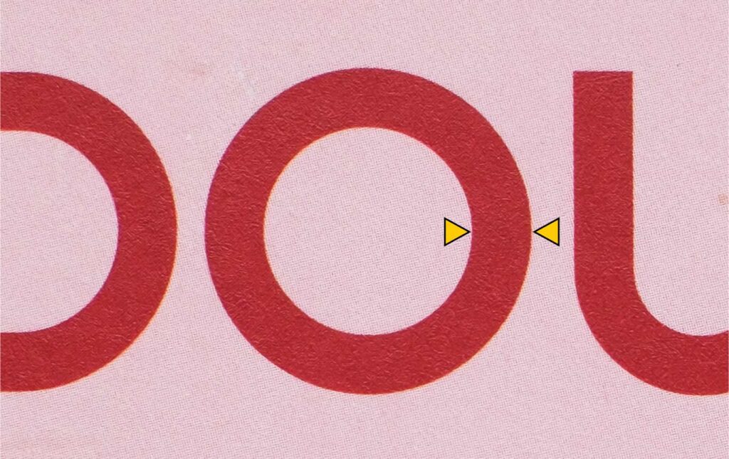
Looking at the cover of the book Change, I see an O drawn as a perfect circle. “Everyone” knows that an O is never a perfect circle. Because writing comes from calligraphy, and in strokes made with a calligraphic pen, verticals become heavier than horizontals, even in a geometric design like Paul Renner’s classic Futura. Otherwise, the sides of the letter O appear thinner than the top or bottom. It looks “wrong.” Exactly as I see it before me.

Futura, come to think of it, is from 1927. And this cover is beautiful. What is this I’m feeling?
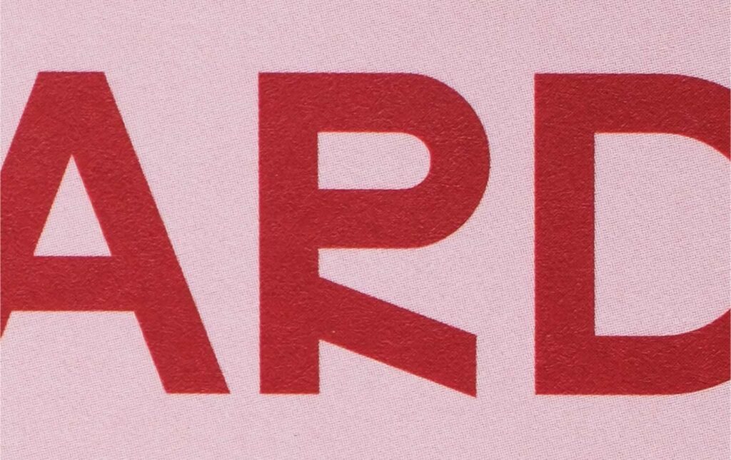
Look at this R — how wonderful!

Years and years of practice learning to refine my “typographic eye” — what we expect to be a little thinner, a little thicker, a little higher or lower.
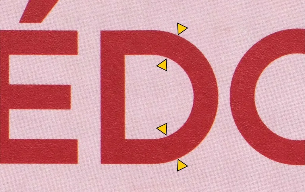
Back to the typeface on the book cover, notice that at the top of the D, the connection between the horizontal and the circle is somewhat abrupt.

This is very subtle if you’re not a typeface designer. But it’s as if a perfect circle were cut in half and welded to the horizontal strokes of the D. My masters would say those areas, where they meet, need to be smoothed so the design flows more naturally. Natural, according to the act of drawing that stroke by hand. It would happen in one continuous movement.
Now, if calligraphy is increasingly distant from our daily lives, perhaps the pixel, a perfect square with no difference between horizontals and verticals, represents a new world order.
The people who expect to see subtle contrast adjustments will, in time, disappear. But before that, they’ll denounce these errors. The times, they are a-changing.
It will happen very slowly, because typography is convention and evolves at very slow steps.
Both forms will coexist and also give birth to countless intermediate variations. They will shock, or merely seem strange, or pass completely unnoticed, by different people. And that’s okay.
Different projects will demand different solutions.
Or, none of this will happen, and it’s just a passing fad.
Either way, some truths remain timeless:
Sensitivity, contextual awareness, and the advantage of not holding absolute certainties will remain perpetual.
That’s what makes Luciana Fachinni’s cover, and the typeface Studio Feixen Sans, brilliant, especially for a book called Change.
Fabio Haag
🔗
Todavia Publishing House
Luciana Facchini Design
Studio Feixen Sans


