OMg’s
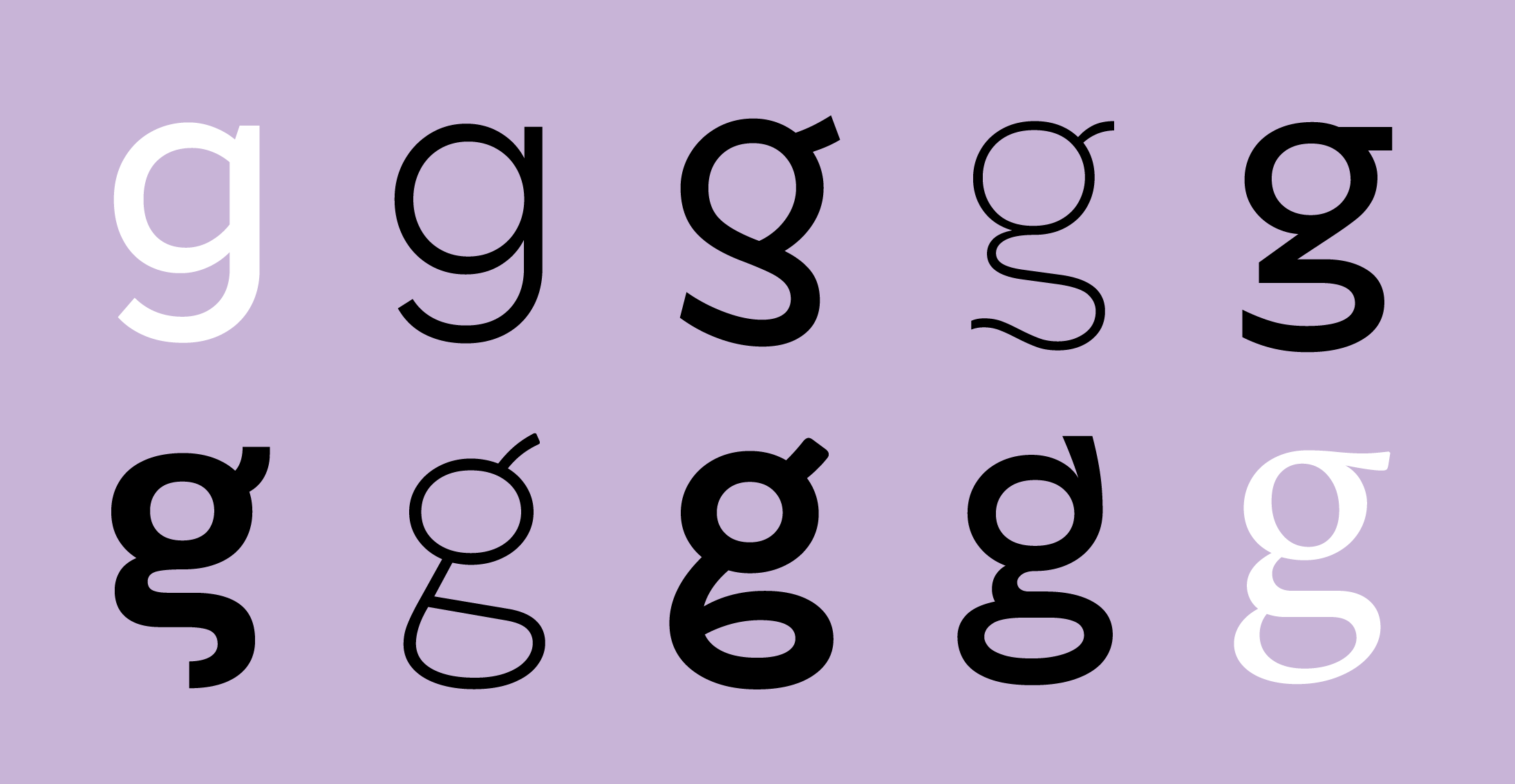
The ‘x’ factor in corporate typeface design often is the ‘g’.
People don’t want to see fonts. They really just want to read. That’s it. To read. But here we are, designing different typefaces every day, living in an apparent contradiction. On the one hand, people want to read, but on the other, brands want to be recognized through any written word. We don’t need quantum physics to reconcile these two opposites, which need to coexist in a corporate typeface. One that exists to be seen and read at the same time.
Theories and science of the reading process explain that these are, quite literally, opposites: legibility comes from the familiarity with which the letterforms are within what we are used to reading, and as such, the typeface will be invisible, transparent as a crystal goblet. To get our attention, it needs to do the exact opposite: escape convention. The distinct shapes spark our attention, and precisely because they are different, they make the letterforms less legible.
The letter ‘g’ allows us to escape convention, to draw attention, but with controlled damage to readability. A study by John Hopkins University pointed out that most people are unaware that there are two constructions for the letter ‘g’ in everyday life. The ‘one-story’ construction is best known because it is the one we learn to draw in school and the one we use in handwriting. As for the ‘two-story’ construction, despite being extremely common around us since the 15th century, people have great difficulties even pointing out which is the correct form.
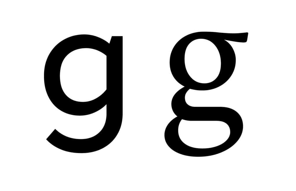

“They don’t entirely know what this letter looks like, even though they can read it,” said co-author Gali Ellenblum, a graduate student in cognitive science. “This is not true of letters in general…”, which is exactly why it becomes such a wild card to play in a corporate typeface. In the letter ‘g’, we can explore designs different from the usual construction because there is more than one. Exploring intermediate routes between the two is an exciting recipe.
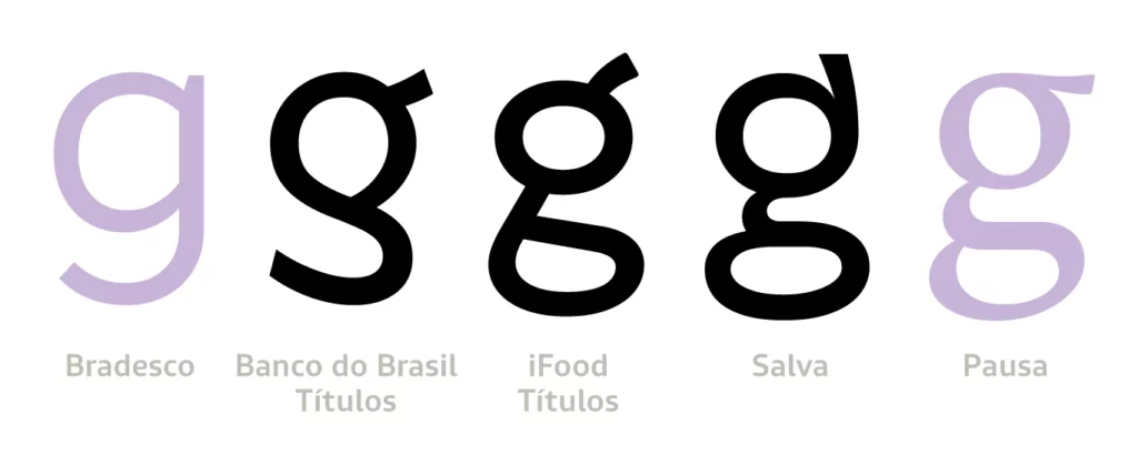
The letter ‘g’ also has the advantage of always being used within a word, and not in isolation, between sentences, as many vowels often are. Because the entire shape of the word has priority in the reading process (and not the ones of each separate letter), even if the letter ‘g’ is unusual, the damage to readability is reduced by its context within the word.
It is true that the letter ‘a’ also has two constructions, with one or two stories, of similar origin to the ‘g’. However, the one-story version of the letter ‘a’ can easily be mistaken for the letter ‘o’, and to make matters worse, it is often used alone in many languages.
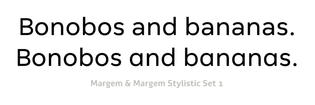
It might work well for display and headlines, but poorly at small sizes. You’ll be able to see it, but it won’t be as easy to read. Which is, after all, why you’re still here.
A Guide to Understanding What Makes a Typeface Accessible. Gareth Ford Williams, Medium, 2020.
The Crystal Goblet, or Printing Should be Invisible. Beatrice Warde, 1930.


