Ipiranga: Generating brand value through typography
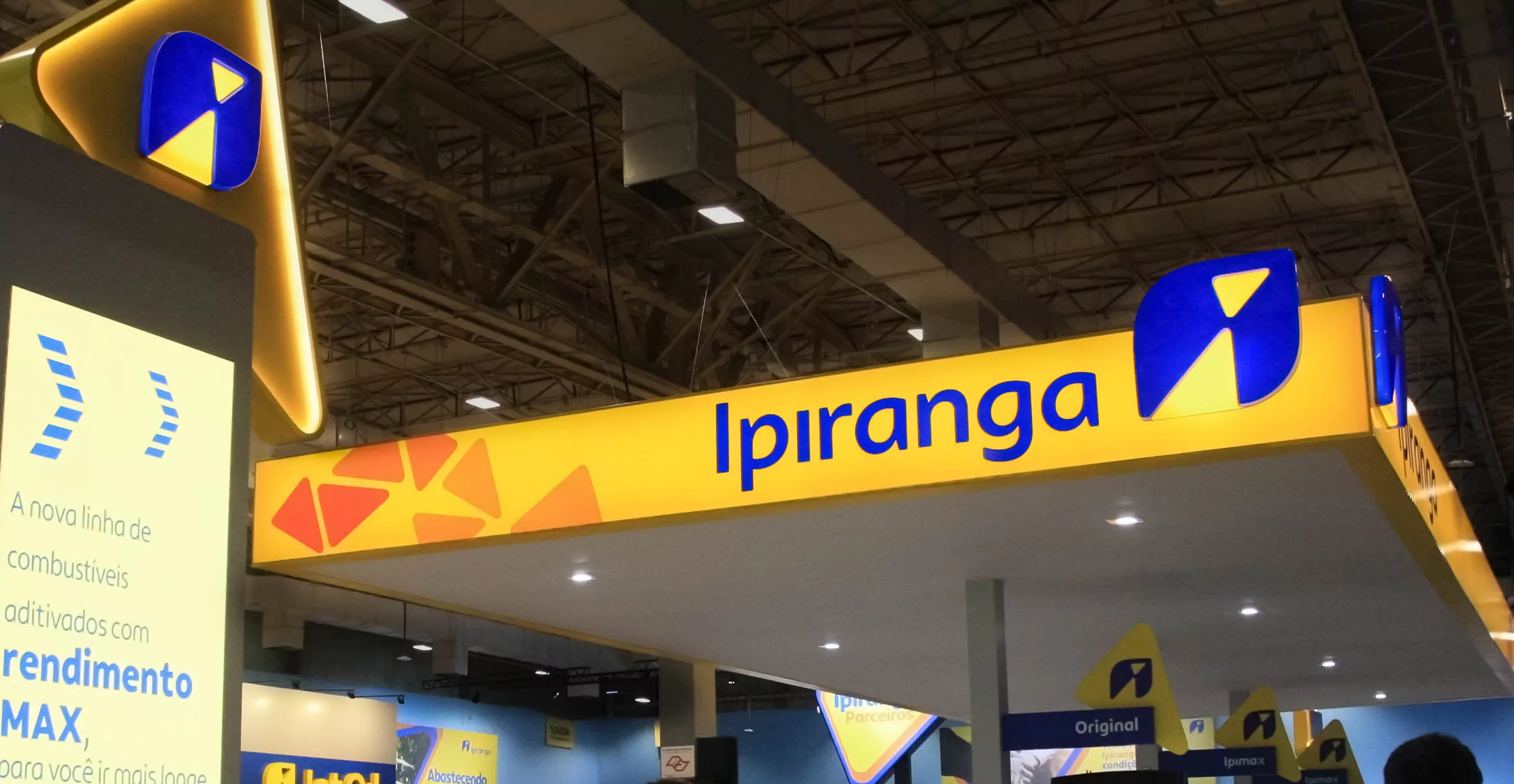
Ipiranga repositioned its brand to offer a new experience for consumers at the service stations. With the new purpose of “supplying for life on the move”, the company wants to be present in the different mobility journeys of people. At the invitation of Superunion, we tagged along for the ride and helped them by working on the new logotype and designing an exclusive custom font.

To connect typography with design and the business of Ipiranga, we started with our workshop mapping with Superunion and representatives from different areas of the client, the road ahead, the challenges and our final destination. We illuminated points of improvement based on the previous typefaces, mapped the brand’s personality in typographic terms, discovered how these concepts are translated into visual forms by the client and agreed on the project’s success criteria.
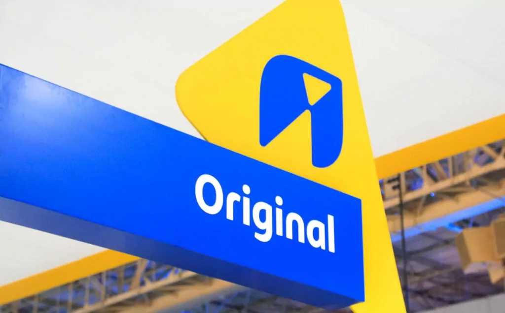
With this itinerary well aligned, the trip was a smooth ride. The personality of the new typeface needed to be human with a touch of playfulness. To be bold enough to, over time, generate brand recognition; by reading a word, Brazil would know that it is Ipiranga speaking. For this, the visual unity across all touch-points is vital — from the bakery menu to the fuel price, in the app interface and posts on social networks, as well as on billboards on soccer fields. The typeface needed to be versatile and perform well in different situations.
In the presentation of 12 typographic ideas, where Ipiranga could choose two to advance in the project, they were precise. There was one idea that shone in everyone’s eyes and delivered everything that was needed. We continued our journey safely.
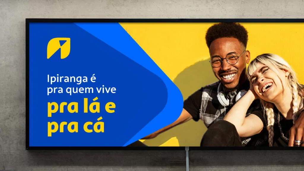
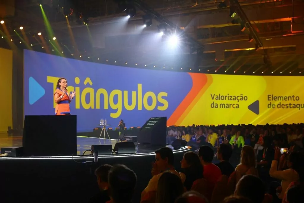
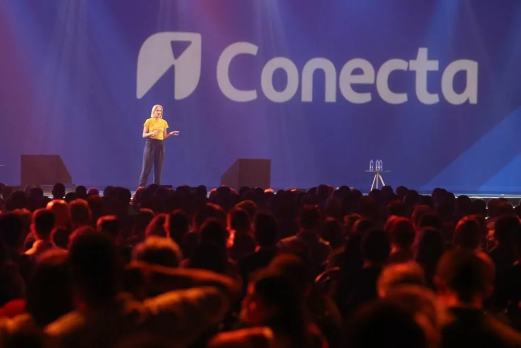
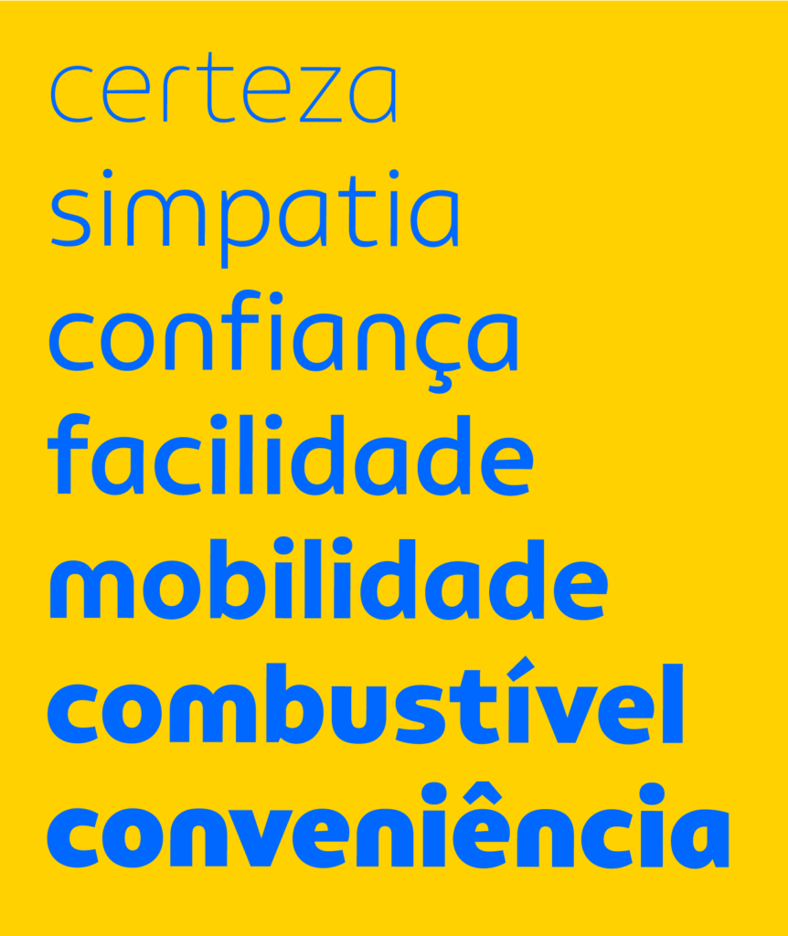
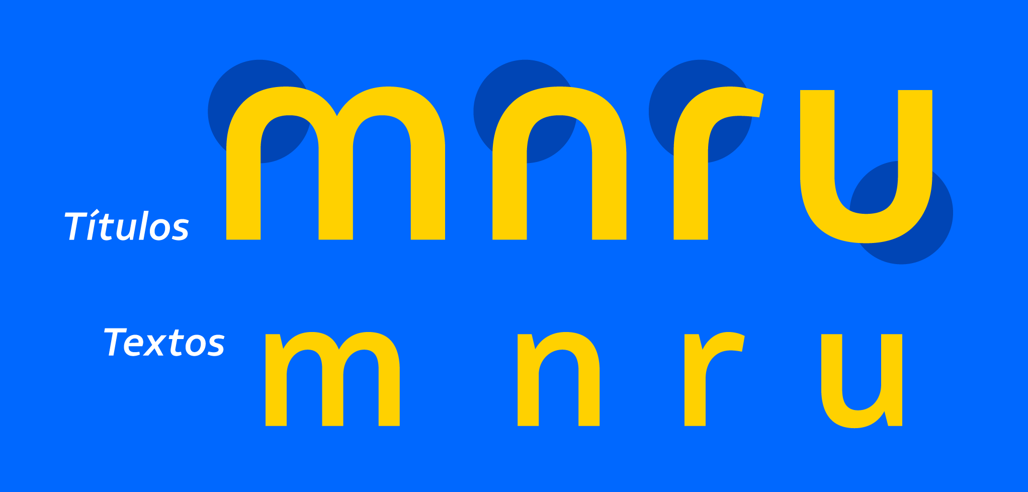
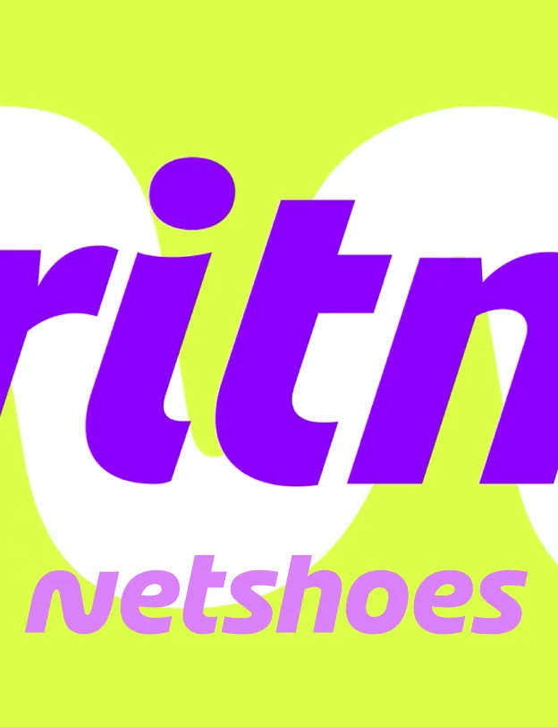
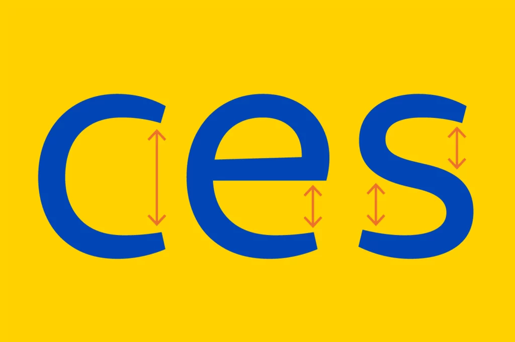
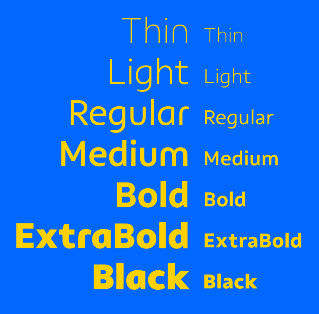
The simplified construction, without spurs on the letters ‘m’, ‘n’, ‘r’ and ‘u’, catches the eye and reveals a certain informality and practicality. The tapering terminals reveal a difference in thick and thin contrast resulting from the handwriting gesture, a strong human element. The wide open construction of letters like ‘c’, ’e’, ‘r’ and ‘s’ facilitates legibility at small sizes and clarity when rendering on digital devices.

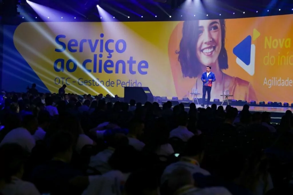

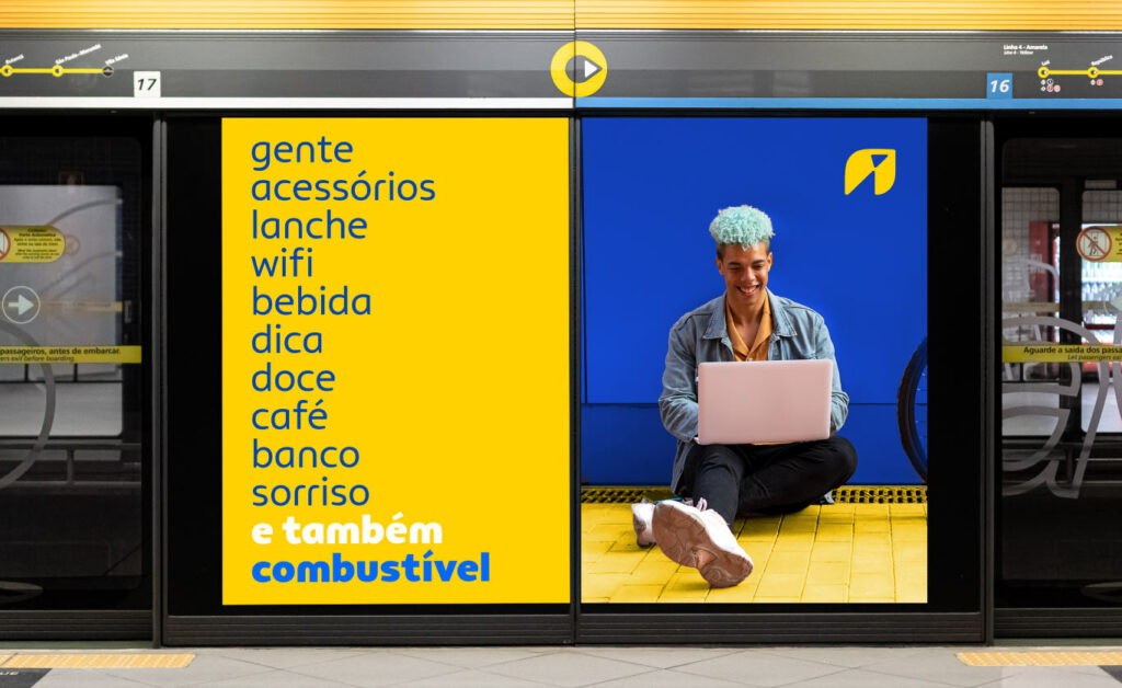
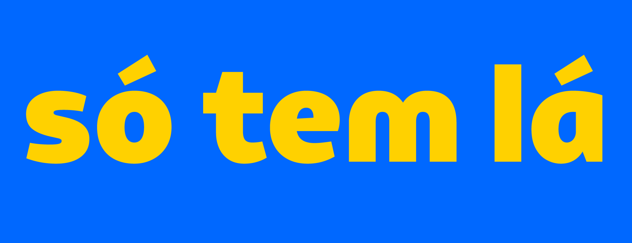
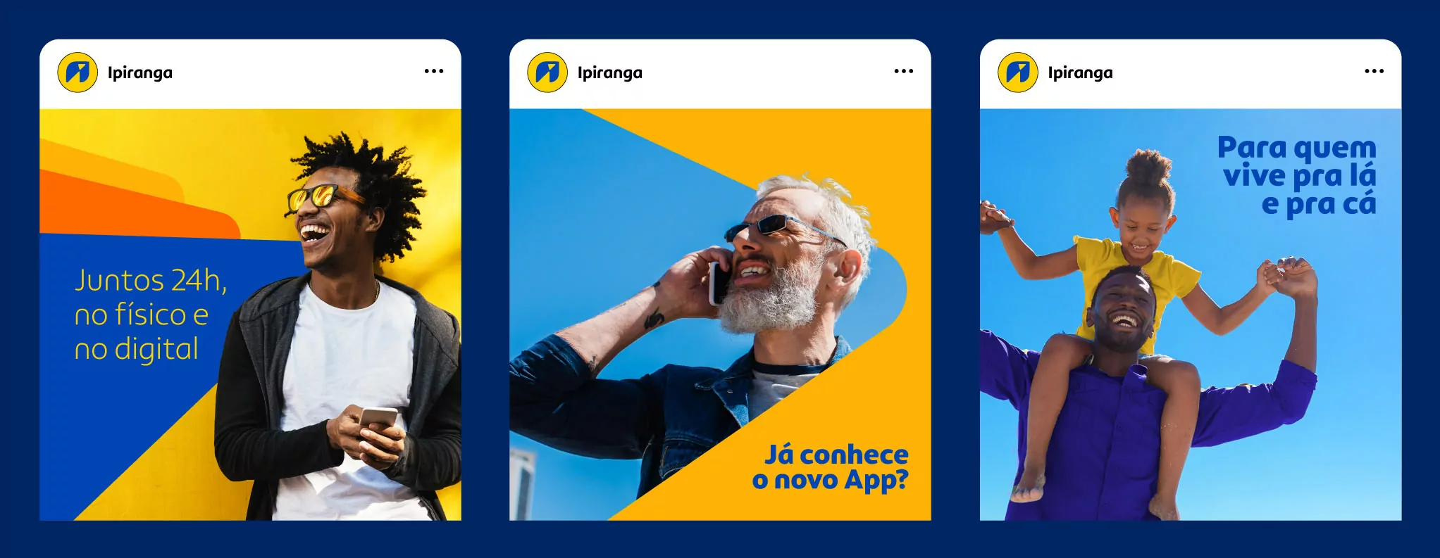

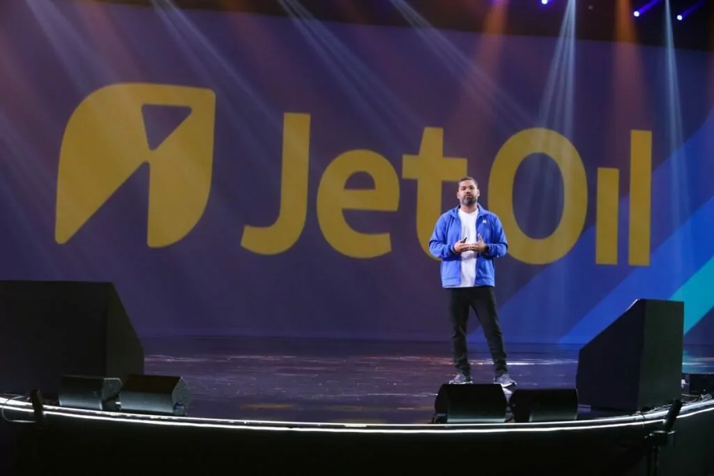
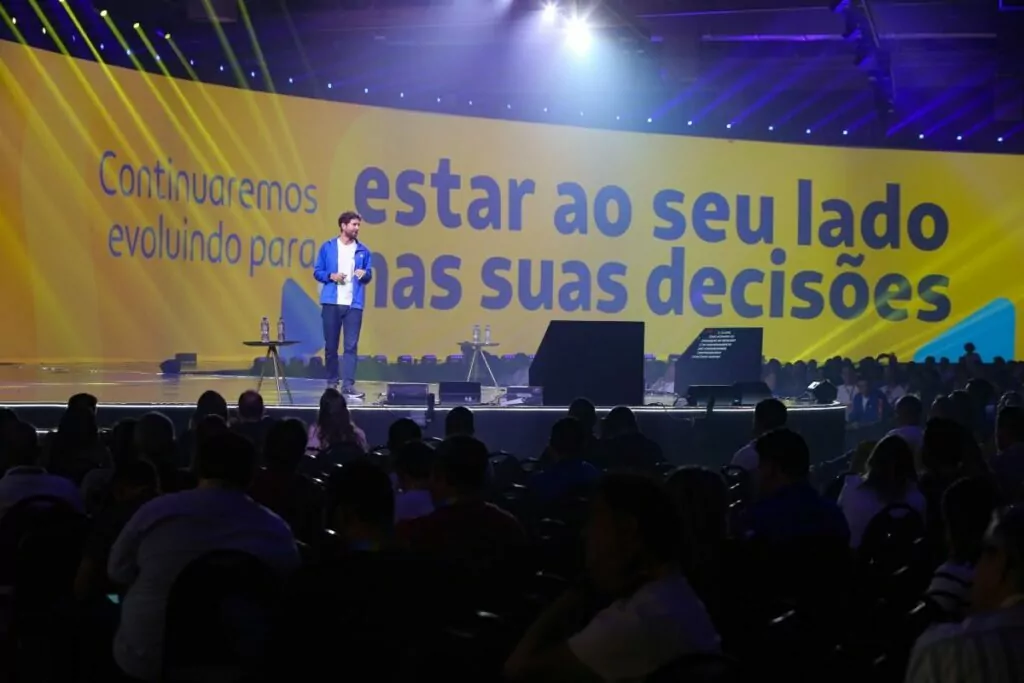
Expressiveness and legibility are precisely balanced across two variations of the typeface family: Display and Text. In the latter, as the priority is legibility and accessibility, the letters ‘m’, ‘n’, ‘r’ and ‘u’ gain spurs in a more conventional construction. While in the Display version, the letter ‘a’ speeds up the process of generating recognition by replicating the shape present in the logo, in the Text version, it has a more legible design, distancing it from other round letters.
Now, every word written by Ipiranga is an opportunity to accelerate the differentiation of its image, safely generating value for the brand.
Ana Laydner, Eduilson Coan, Henrique Beier and Fabio Haag; Superunion: Marcelo Bicudo (CEO and sponsor), Fernanda Klebis Dias (Head of Business Dev.), Aline Farkuh Mazini (Project Manager), Raquel Sztejnberg (Head of Strategy), Janet Riddell, Felipe Ribeiro and Luis Moreira (Brand Strategy), Heitor Piffer (Executive Creative Director), Shingo Sato, Amanda Bellani, Paula Robinson, Nicole Rauen, Gabriel M. Ramos, Gabriel Gonçalvez and Antonio Werneck (Design), Juliana Machado and Giulia Machado (Copywriting), Giovanna Falconi (Architecture), Rafael Barnete (Motion) and Gomus Music (Sound branding).


