
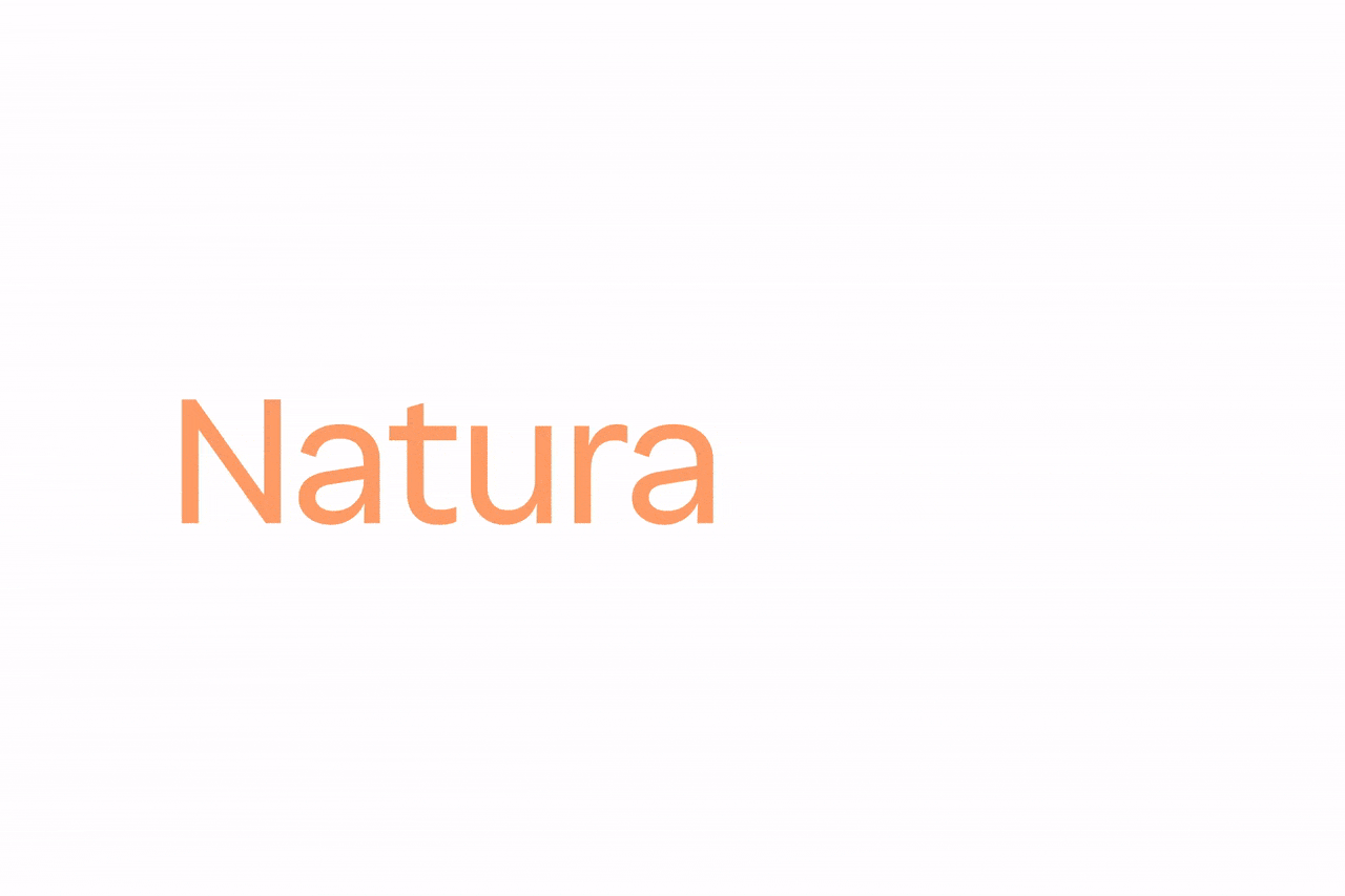
Natura Typeface: Excuse Me, Neutrality
“Fabio Haag’s studio is our greatest reference, and this admiration materialized in the new Natura typeface project: a creative process of excellence, with deep discussions and a delivery that not only met but exceeded all our expectations.” — Marcel Vieira, Senior Global Manager of Branding & Creative Direction
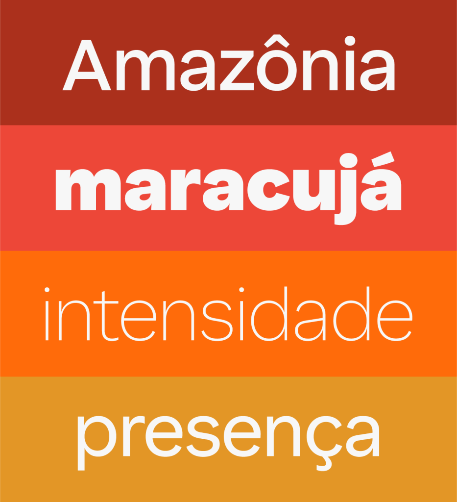
Natura is a 100% Brazilian brand that, since its founding, believes in the power of relationships and cosmetics to awaken wellbeing. It combines the best of science with the potency of Amazonian sociobiodiversity ingredients to create products that unite performance, sensoriality, and positive impact. With a global presence and a vibrant community of over 3 million consultants, it is proof that beauty and social responsibility go hand in hand.

A traditional sans-serif typeface served Natura well throughout its global expansion. Now, in seeking a proprietary solution, the goal was not to start from scratch, but to evolve. An opportunity to bring a touch of Brazilian warmth into every word written by Natura.

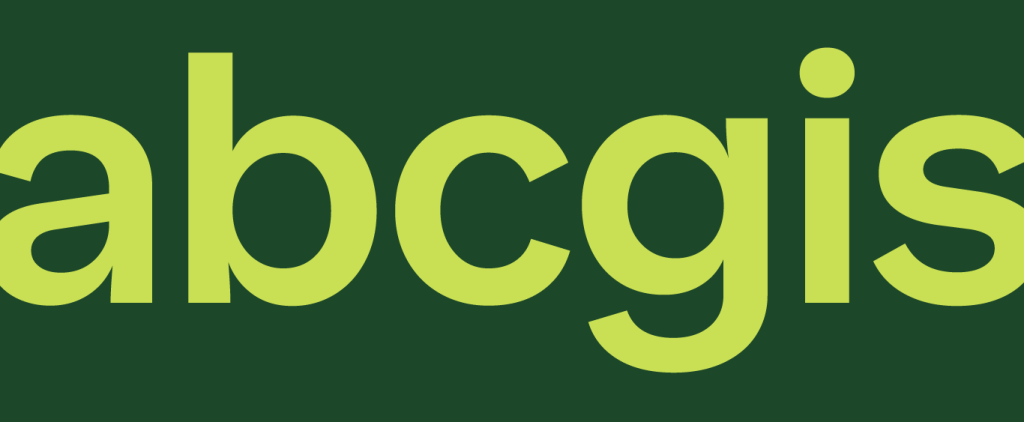
Behind the conventional sans-serif structure lies an exquisite refinement of the letterforms, balancing shapes and countershapes, providing a solid foundation of neutrality and legibility — essential for it to perform fully across the brand’s diverse contexts of use.
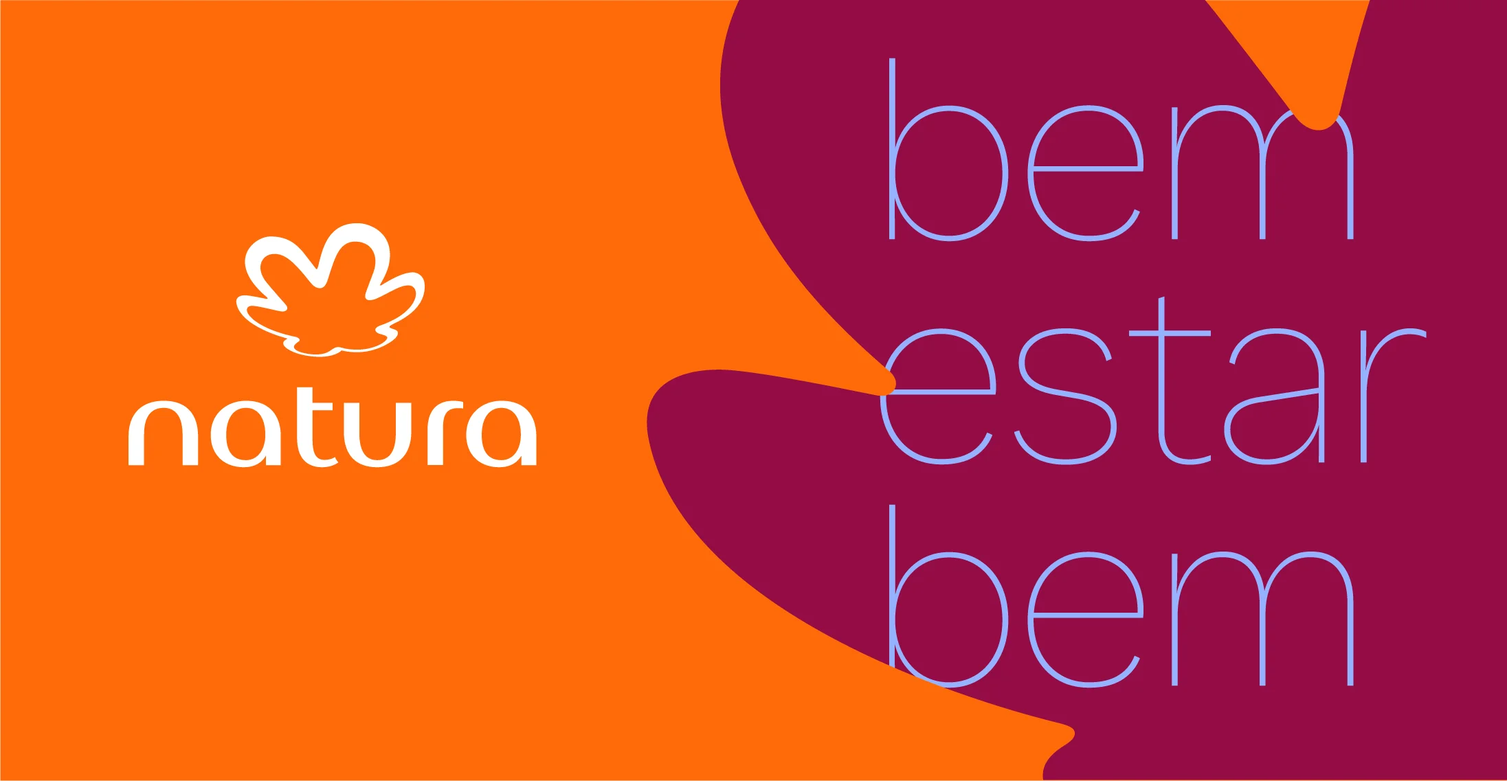
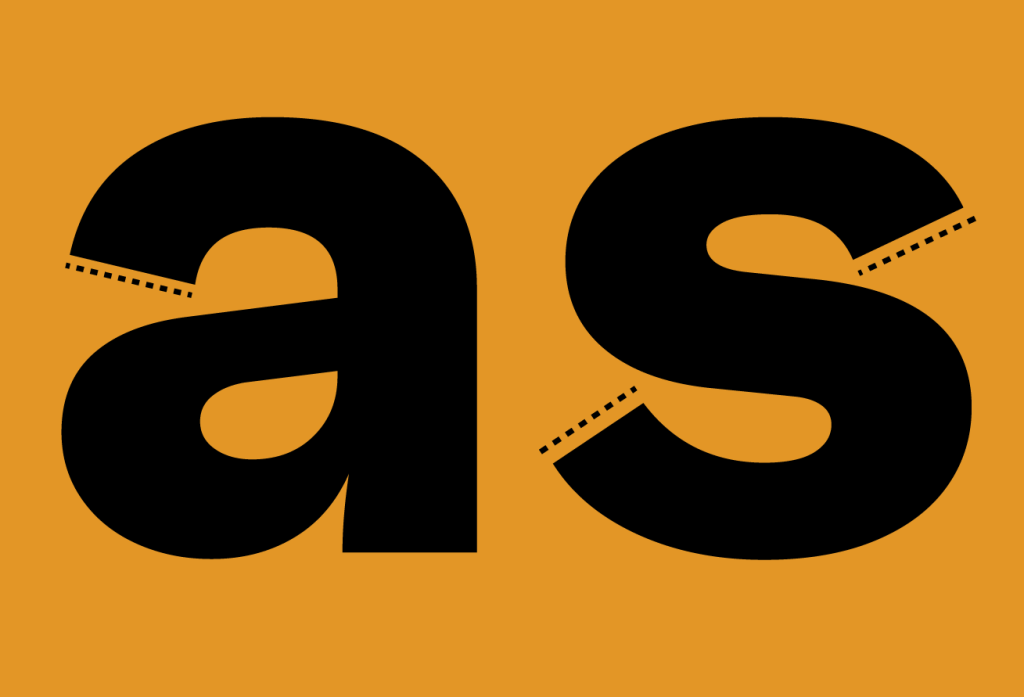
A touch of human warmth appears in the terminals of the letters a, c, e, and s, which now open at an angle, bringing a subtle expressiveness derived from the calligraphic pen. The dots of the i and j, along with punctuation marks — once square — are now round and fluid. These are small details, but together they break the neutrality with kindness.

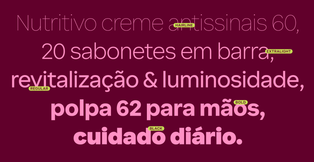

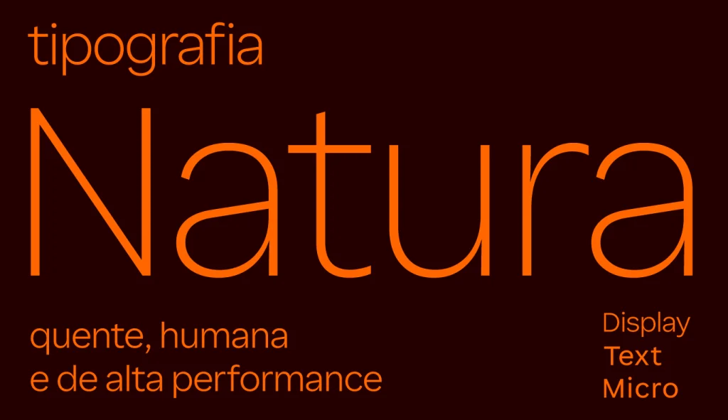
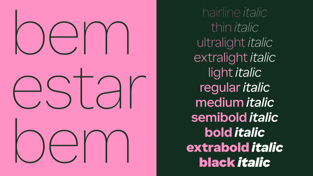
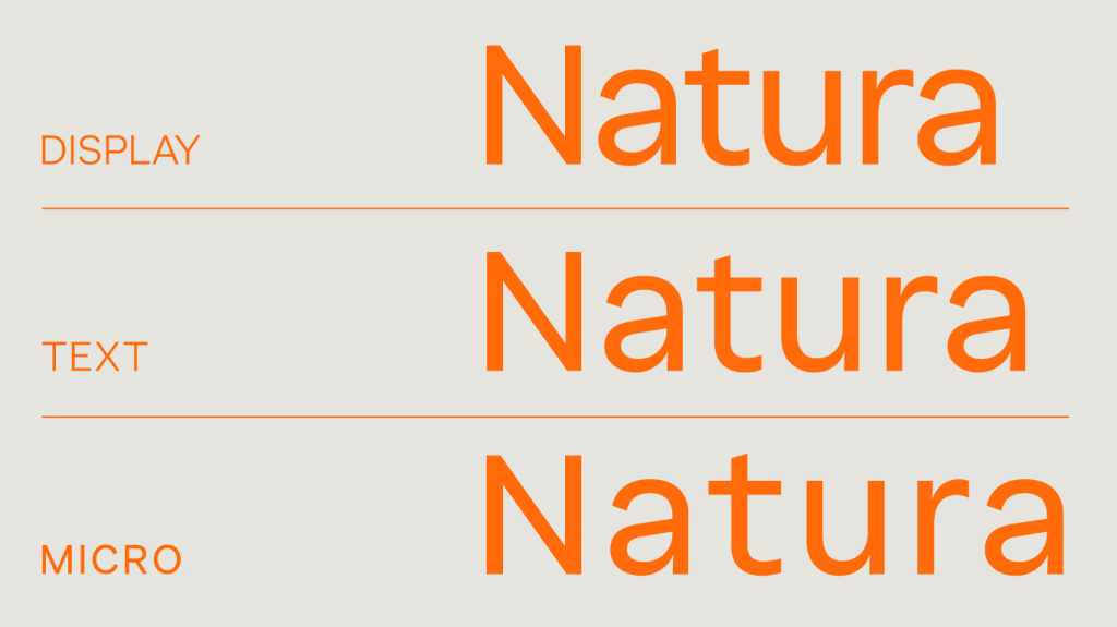
To ensure performance across all touchpoints, we developed three optical sizes: Display to delight at large sizes, Text prioritizing reading comfort, and Micro for maximum clarity in very small applications. A robust typographic system with 40 fonts, including weights from Hairline to Black.


Alongside the Ana Couto studio, we also worked on the typographic exploration of the logotype letters and the meticulous refinement of the forms, weights, and curves of the iconic rosette symbol.
The result is letterforms that respect the existing heritage while evolving the brand’s messages by bringing more warmth and humanity. A sensitive and trustworthy tone of voice that reflects the sustainability and wellbeing values of a global brand with a Brazilian heart.
Fabio Haag Type Studio: Henrique Beier, Ana Laydner, Eduilson Coan, Sofia Mohr, Luciana Haag and Fabio Haag; Natura: Isabela Massola, Felipe Braz, Marcel Vieira, Beatriz Silva and Lissa Magnago. Ana Couto: Danilo Cid, Rafael Torres, Gabriel Martoni, Luiza Vaz and Renata Príncipe.


