FONT > COLOR

If I told you that the font is more important than color in a visual identity, you’d find it suspicious coming from a type designer, wouldn’t you?
But what if it’s a marketing professor, at the Cannes festival, backed by a study that analyzed 1,250 campaigns and data from 200,000 people?
I didn’t go to Cannes—I watched it online, in the cold of South Brazil. I remember this talk was quite early, before 6 AM here. But when I heard that, I jumped of joy.
Because the order of importance had always been: the brand design, the colors, and finally came the font. It was the last concern, since college days. For many, it still is.
We know that the right font is critical to building a brand, but now we have data.
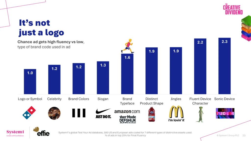
It’s more effective than color at creating what in marketing is called fluency—how easily and quickly people recognize a message as being from a particular brand.
About the study
Who explained this at Cannes was Mark Ritson, with quite comprehensive research that analyzed the creative quality of ads, making correlations with the return on investment, using data from System1 and the Effie Awards.
He listed the impact that each type of brand asset has on generating fluency/brand recognition:
And there it is, the font ahead of colors.
Typography can multiply the effectiveness of investment by 60%.
It’s more effective than putting a celebrity in the campaign (before hiring a celebrity, hire a type designer!).
Why the font wins
The font is even more important than the brand design itself, and here’s why the study found that: they analyzed commercials, both from TV and online. The brand either appears only at the end of the video or, if during the video, it appears very small in a corner. The font, however, appears in every written message—it’s the clothing that all words wear; it carries the brand in every word that appears anywhere in the video. It generates faster recognition.
But not just any font
I’ll make a caveat here: it’s not enough to use Roboto and think it will generate brand recognition. And I’m sure Mark agrees, because he talks a lot about the importance of brand asset distinction.
It needs to be a typeface with a very proprietary look that isn’t being used by everyone. Or at least not in your category.
Large brands commission custom and exclusive fonts, but there are also retail fonts that are different, that aren’t on Adobe, MyFonts, or anywhere else everyone looks: fonts that are only on independent foundries’ websites.
Download one of ours to try on your next project.
Even before thinking about colors.
Fabio Haag


