It’s Time to Talk About Chiquinho’s Typeface

For Brazil’s largest ice cream chain, we developed an exclusive typographic family that captures the brand’s popular and accessible essence while maintaining the quality that has always been Chiquinho’s commitment.

The challenge was to create a special, custom typeface that would easily connect with Chiquinho’s audience. The solution came through a distinctive detail: the upper curve endings are delicately rounded, while the lower ones form creamy points that evoke the texture of ice cream — bringing the product’s essence into the very design of the letters, numbers, symbols, and even the comma.


The letter ‘g’ is our favorite, irresistible, to the surprise of zero designers who follow us. Even the accents received the “creamy” treatment, with shapes that resemble small ice cream drops — a subtle surprise when discovered.


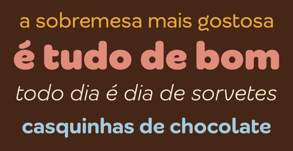


The complete typographic family offers 9 weights in 2 styles (Display and Text), totaling 18 fonts that provide communication flexibility. The personality is more pronounced in the Display version, ideal for drawing attention. In the Text version, several letters were subtly altered to ensure greater legibility at reduced sizes.
The result is a typography that reflects the brand’s popular and accessible origins while remaining contemporary and functional in any application — from storefront signage to digital menus in the most modern locations.

For Chiquinho, now every written word connects consumers with the brand’s essence, proving that the specific design of letters has a significant impact on brand perception and the experience that begins long before the first spoonful.
Fabio Haag Type Studio: Sofia Mohr, Henrique Beier, Ana Laydner, Eduilson Coan, Luciana Haag and Fabio Haag. Chiquinho Sorvetes: Ana Maria de Araújo, Gustavo Azevedo, Jun Ricardo Nakahata and Rízia Bernardes.