A very special order prepared for and with iFood
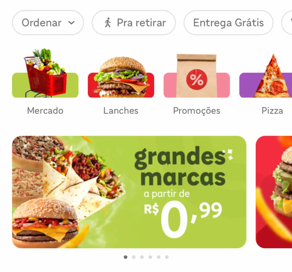
When we think about typography for digital products, it is common to fall into generic fonts; very functional, and therefore, conventional. But when the app is the key touchpoint with the brand, it must also deliver its personality to consolidate the brand identity.
How much spice is the right amount for this recipe? We need to invite everyone to the kitchen, and that’s exactly what we did for iFood, together with FutureBrand São Paulo.

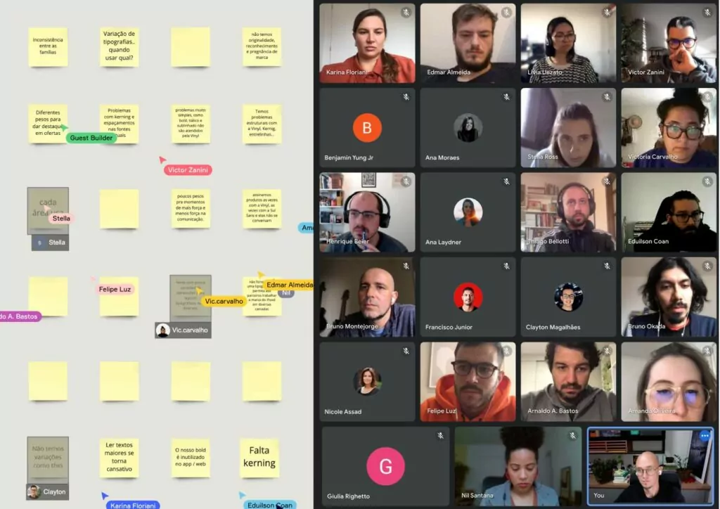
Collaboration is more than a value in our culture, it is a practice that is the foundation for the success of our projects. Before anything else, we brought together leaders from different areas of iFood, the agency Suno and FutureBrand, for a two-hour structured dynamic. In this immersion, we heard the pain points when using the previous fonts from different perspectives. In addition, we found the points of convergence in the expectations of each department, which made it possible to build together the project’s success criteria so that it would serve the entire organization.

To trigger brand recognition through typography. To ensure consistent usage, bringing the product and communication closer together. With these premises, we presented 11 typeface ideas — keywords in Regular weight — for joint evaluation.
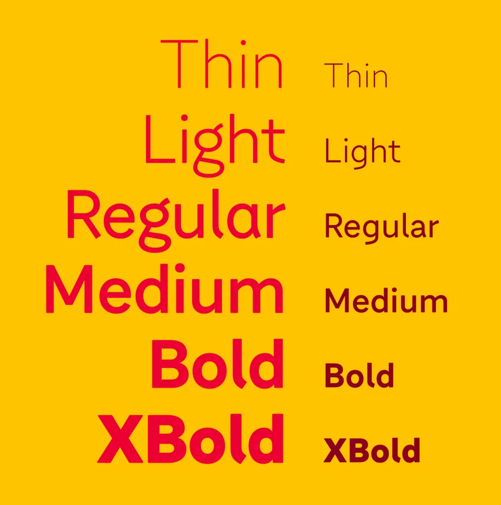
With the personality sliders agreed upon in the immersion, three ideas ticket the boxes to meet the challenges, emphasizing different aspects. Expanded into Concepts, analyzing across all weights, the client could make a well-founded decision about which letterforms would become iFood’s visual tone of voice.
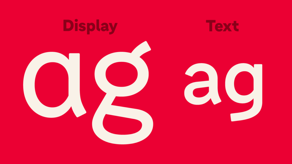
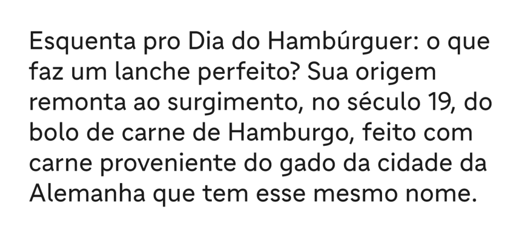
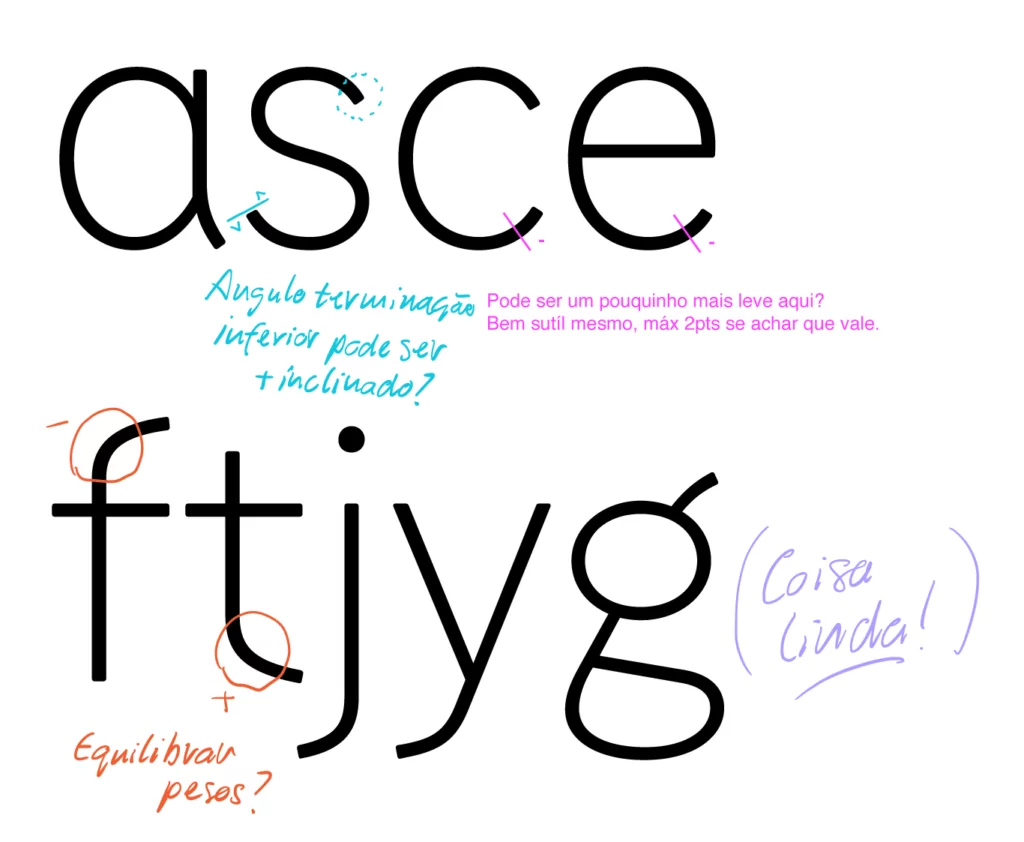
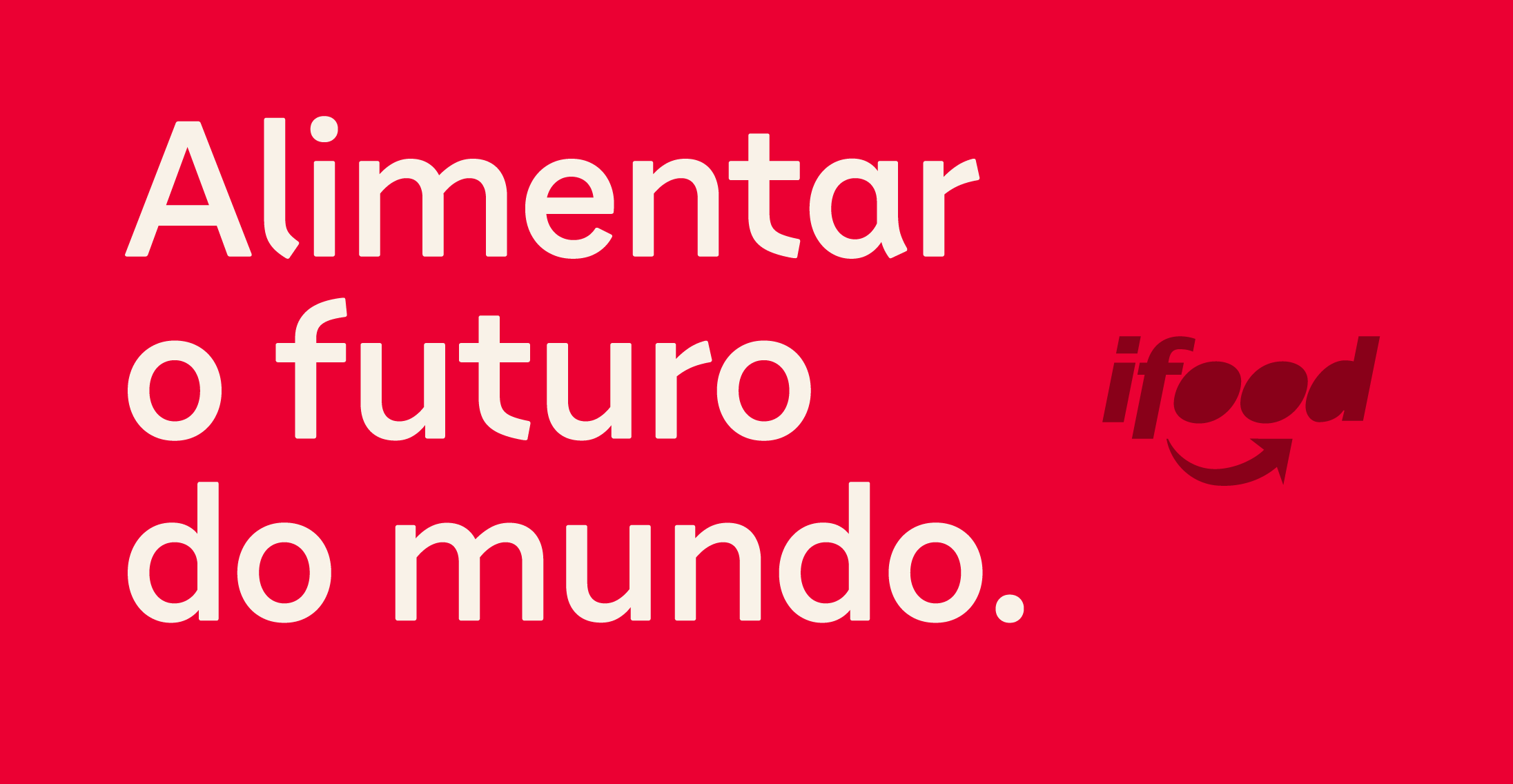
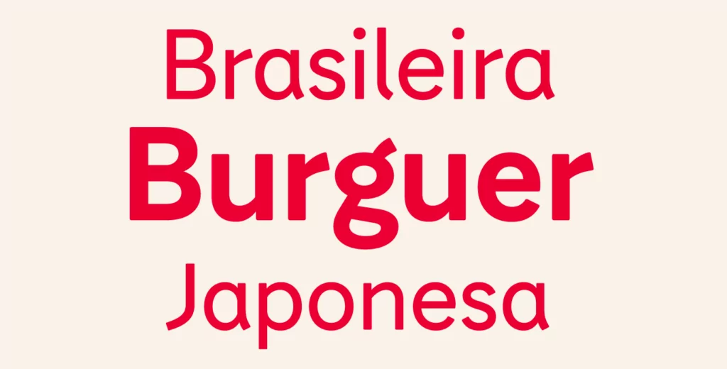
The wide open and unusual shapes of letters like ‘f’, ’t’ and ‘r’ inspire technology without the coldness usually associated with it. In addition, they confer distinction (seeking to facilitate brand recognition) while the other, more conventional ones, guarantee a balance in the set and general readability (reading comfort). Still, a specific version for texts changes the design of letters like ‘a’ and ‘g’ prioritizing individual legibility in small sizes.
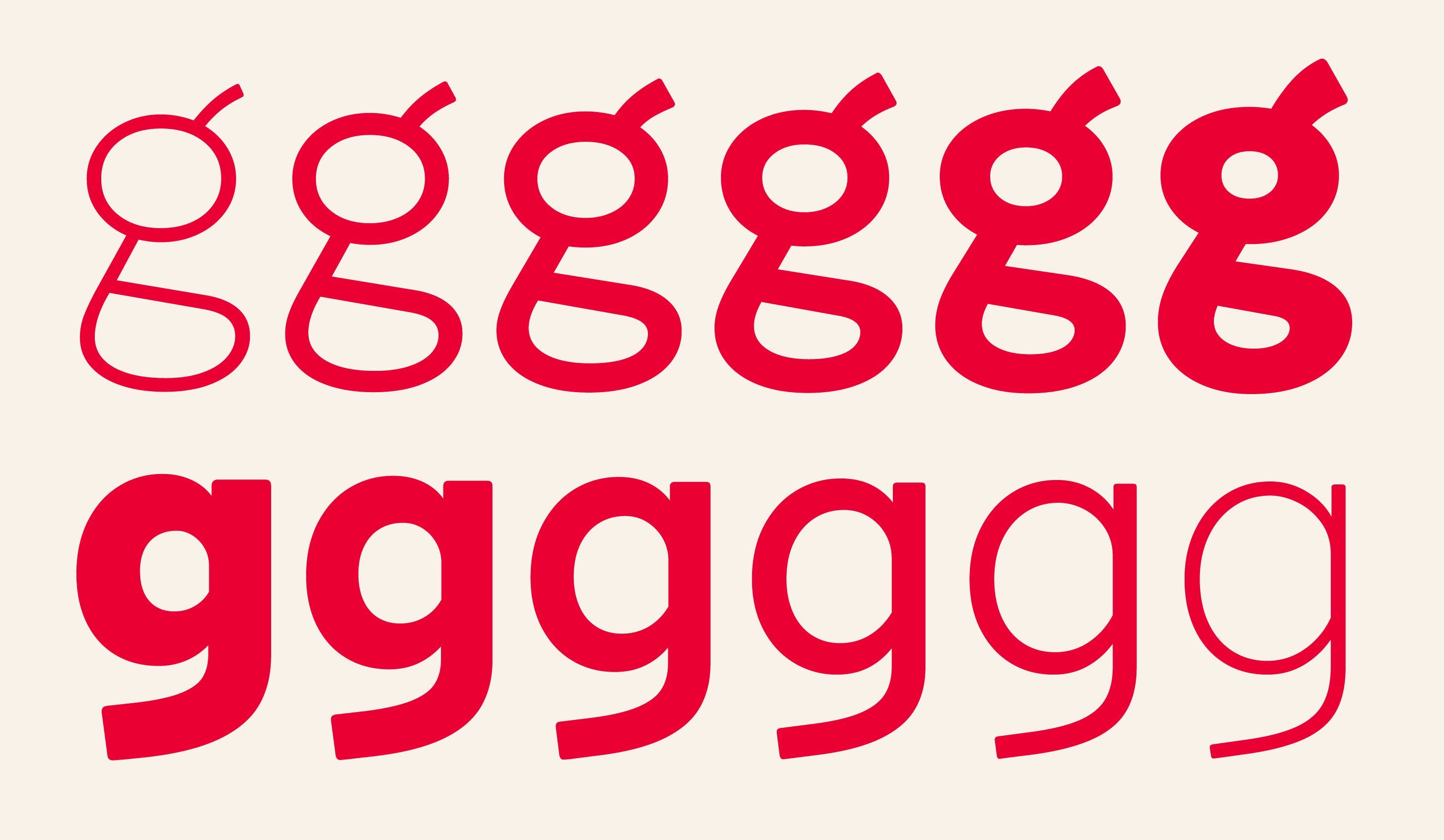
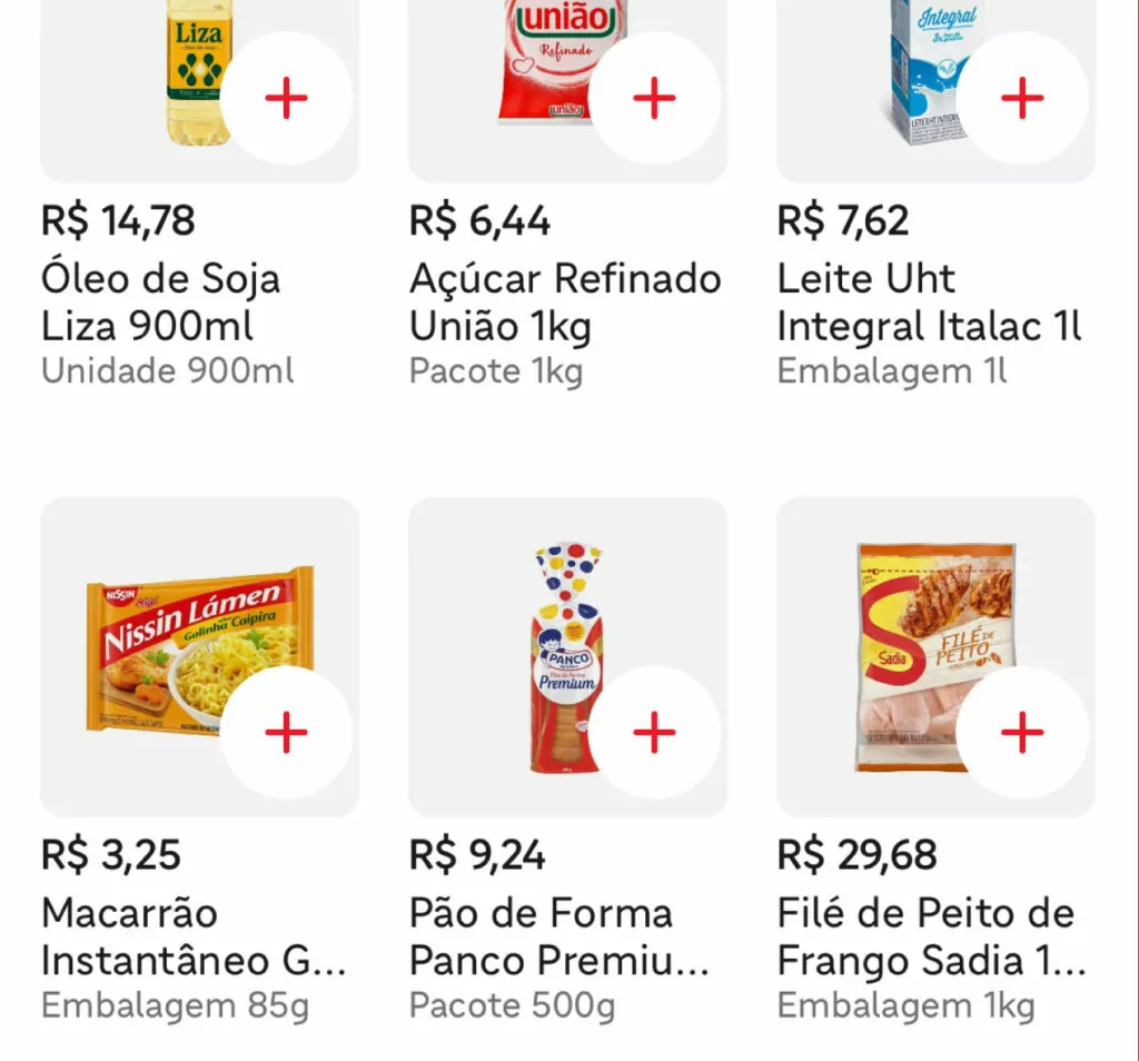
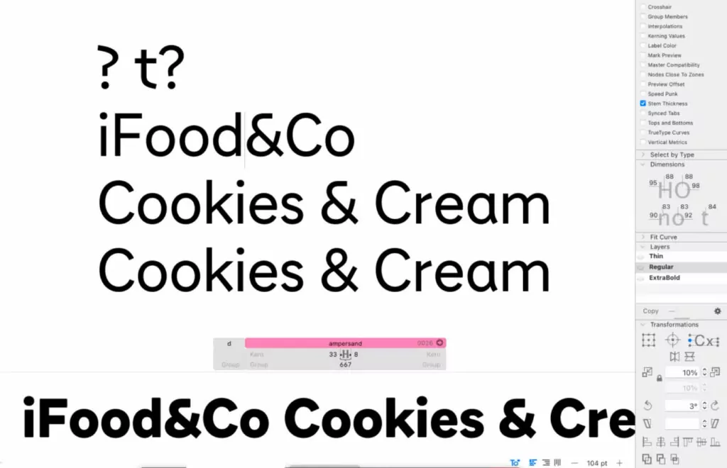
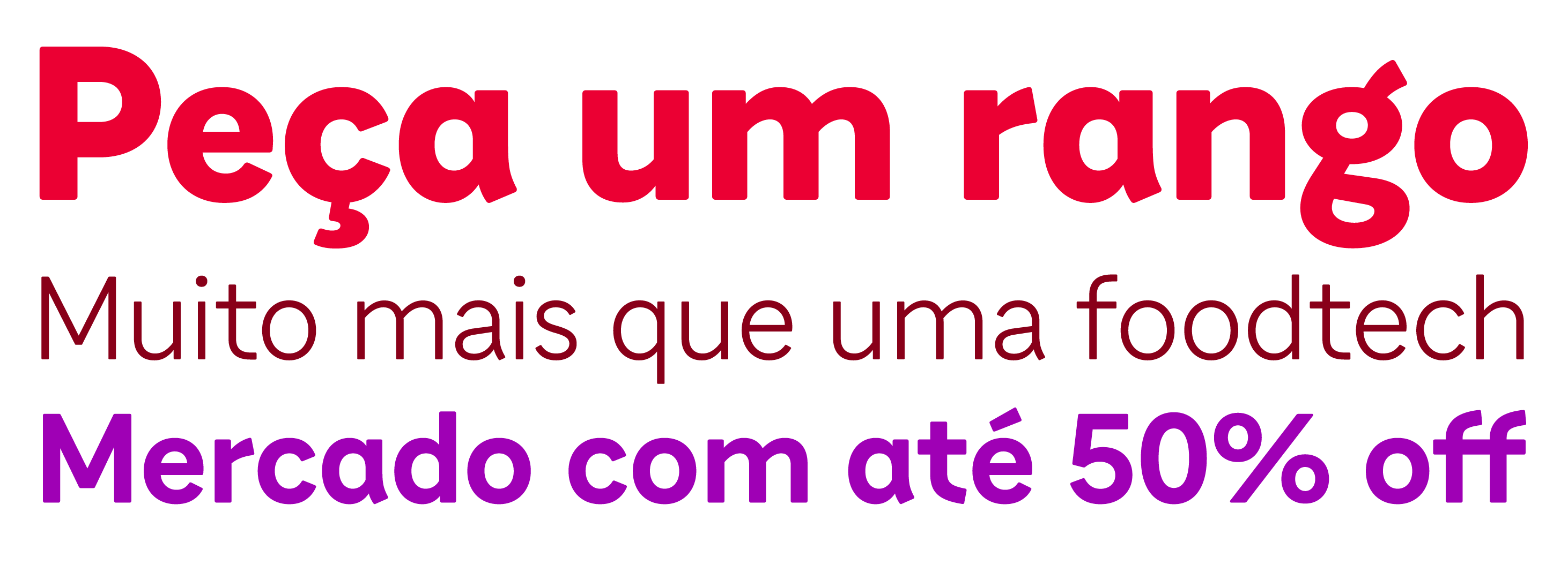
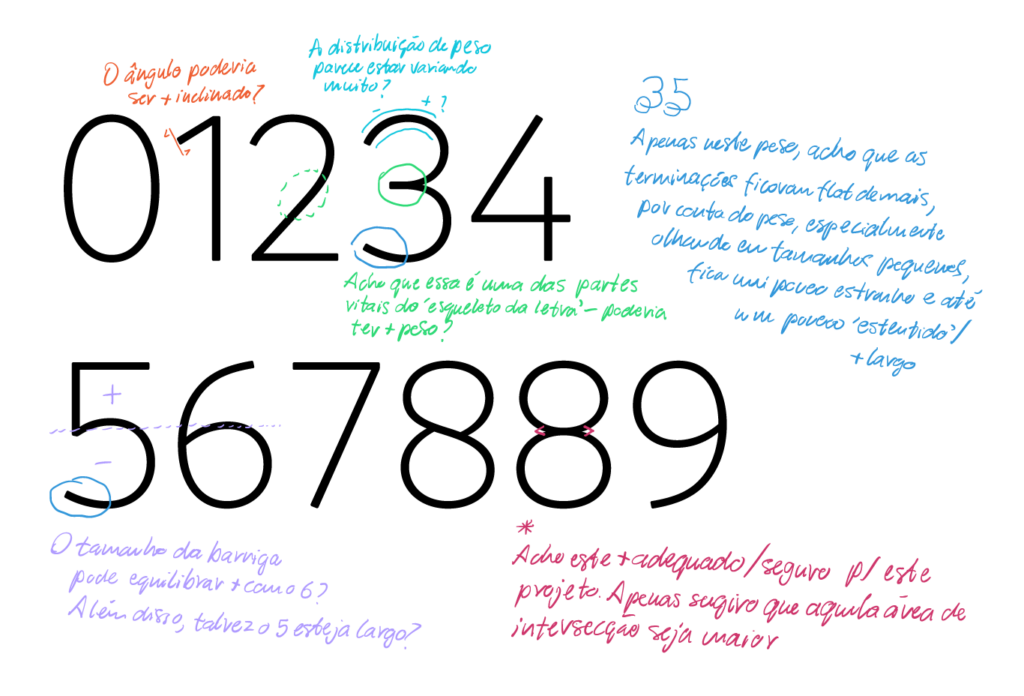
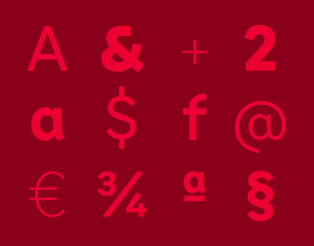
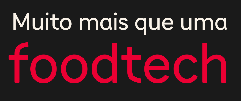
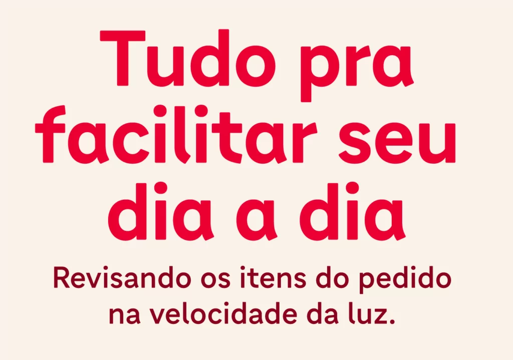
The Tipo iFood font family generates distinction without falling into clichês; it is authentic, carries the brand’s personality and delivers, in the user’s experience, the attributes present in the communication.
“With several exchanges, workshops and tests, we created a typeface that embraces our visual universe and translates our positioning, while being very functional and responding to our challenge of scale.” — Victor Zanini, Head of Design Ops, iFood
“Our challenge was not only to translate the positioning into the typeface design and visual elements, but to see in each letterform and word the potential for connecting iFood with its audiences, balancing aesthetics and functionality, enchanting in every detail.” — Felipe Luz, Partner and Director, FutureBrand
Fabio Haag Type: Henrique Beier, Eduilson Coan, Ana Laydner, Thiago Bellotti and Fabio Haag; FutureBrand: Ewerton Mokarzel, Arnaldo Bastos, Felipe Luz, Amanda Oliveira, Nicole Assad; iFood: Ana Moraes, Bruno Montejorge, Bruno Okada, Cako Martin, Clayton Magalhães, Edmar Almeida, Francisco Júnior, Karina Floriani, Lívia Uezato, Marina Moreira, Nil Santana, Stella Ross, Victor Zanini, Victoria Carvalho, Vivian Jung; Suno: Benjamin Yung.


