Balancing Lightness and Confidence: The Design of Flash Sans
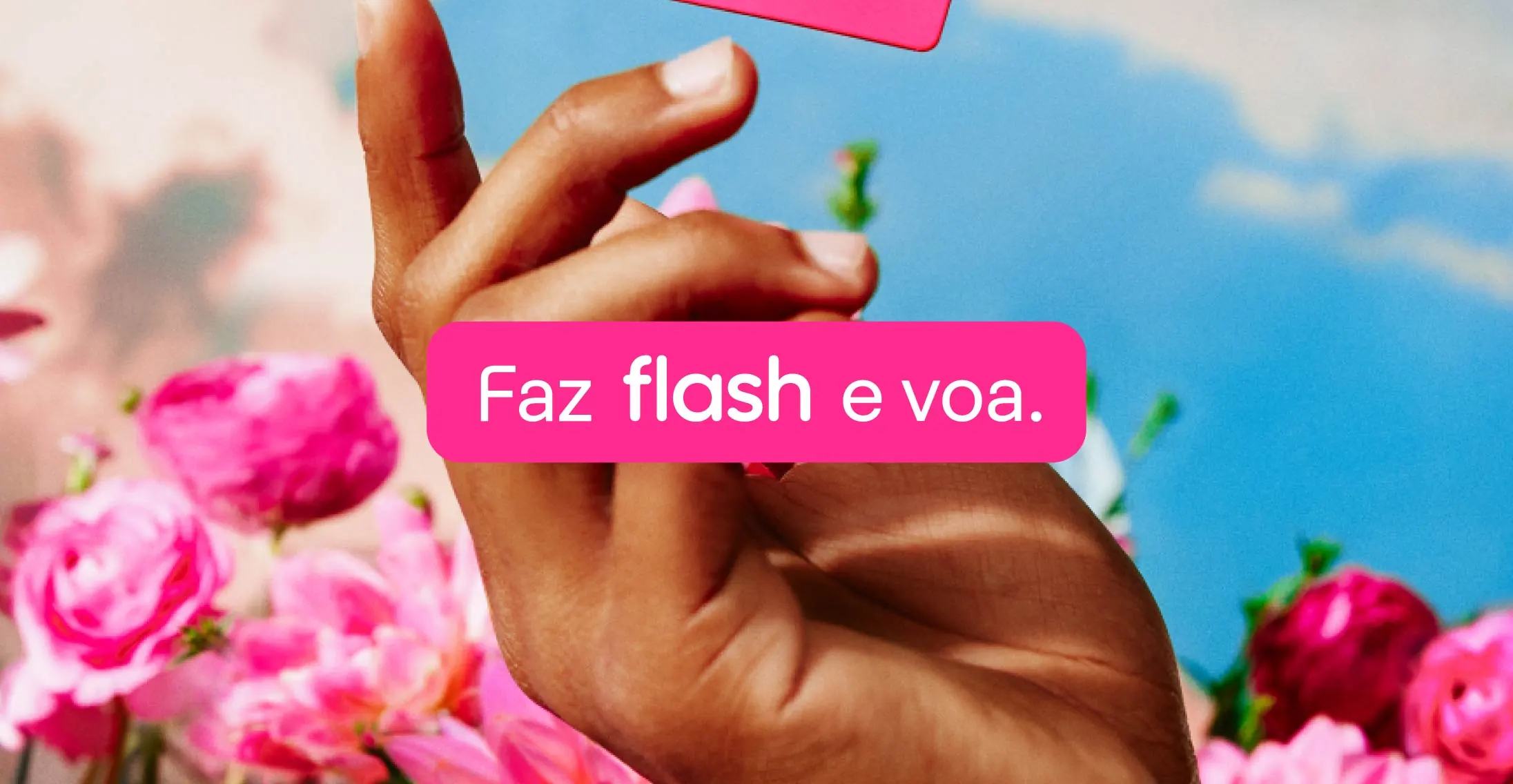
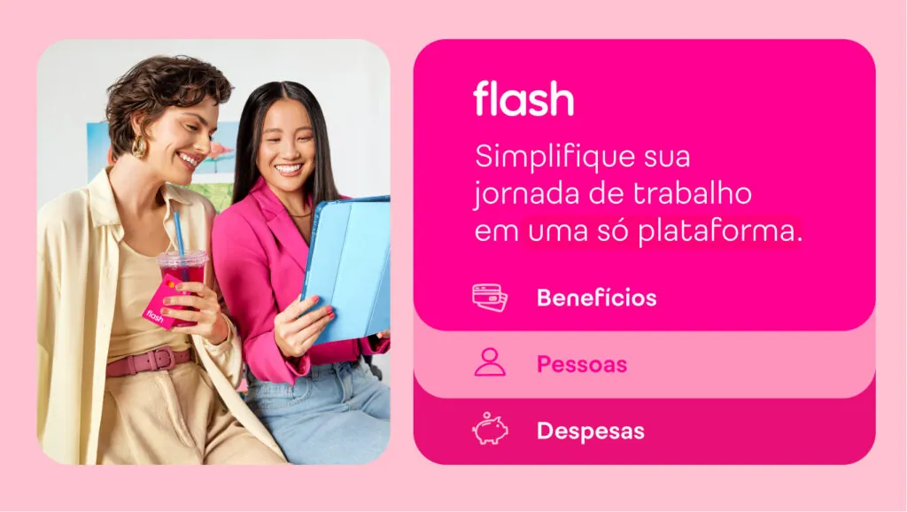
Initially focused on benefits, Flash expanded its operations to become a complete work journey management platform, providing solutions ranging from benefits management and corporate expenses to people management.
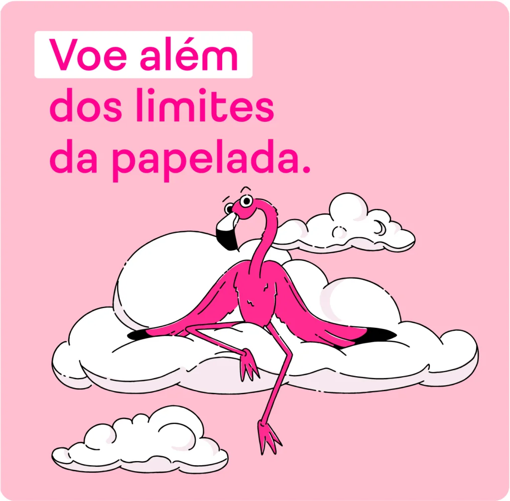
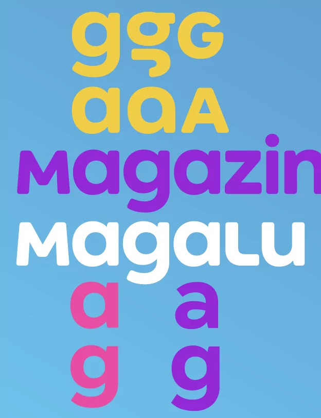
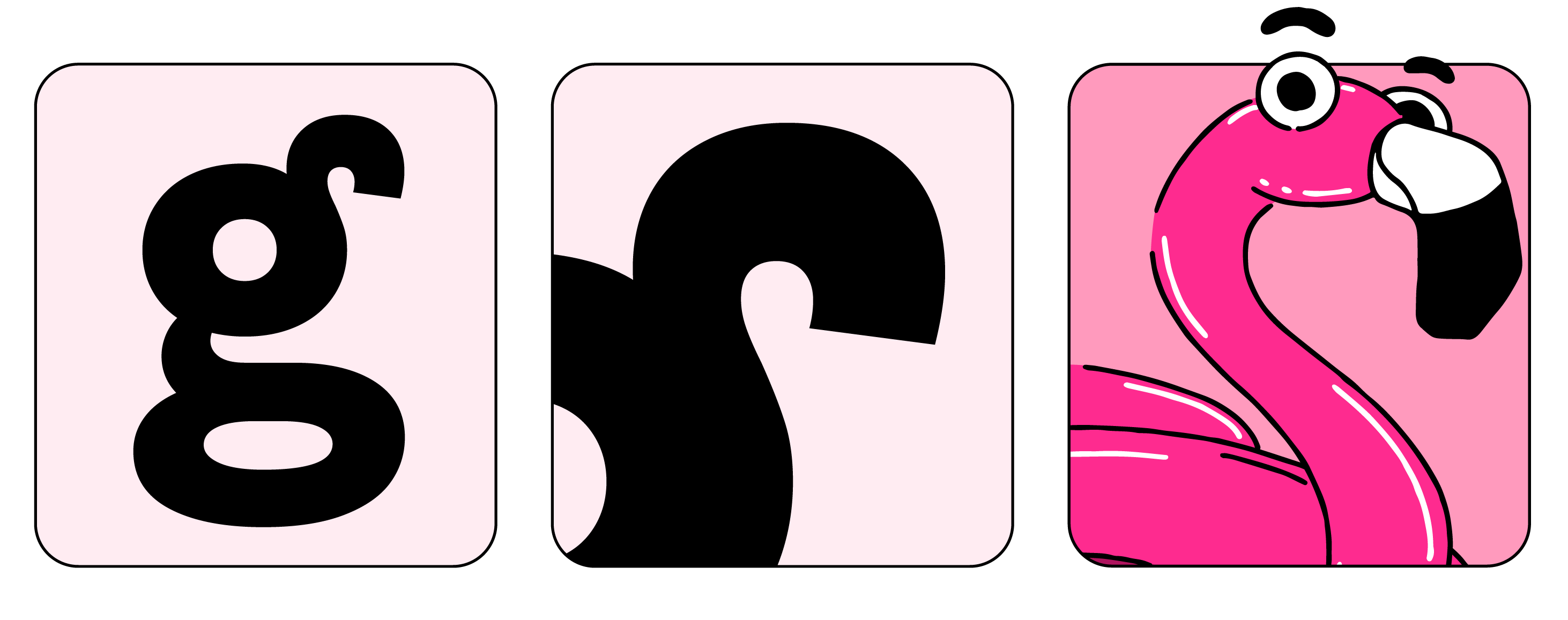
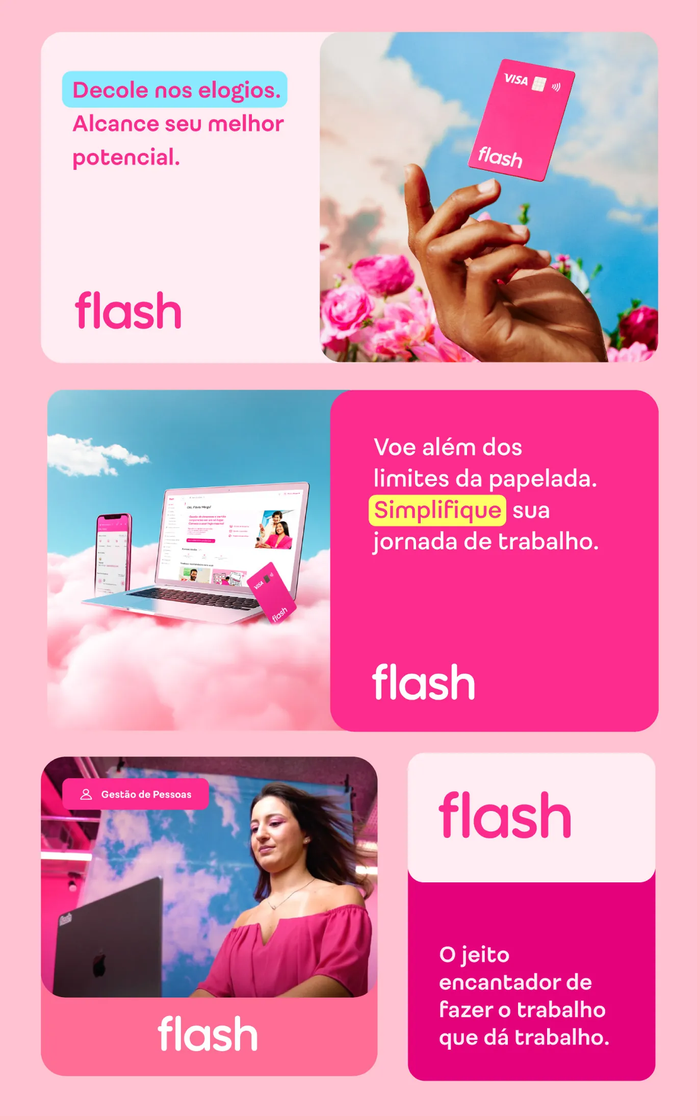
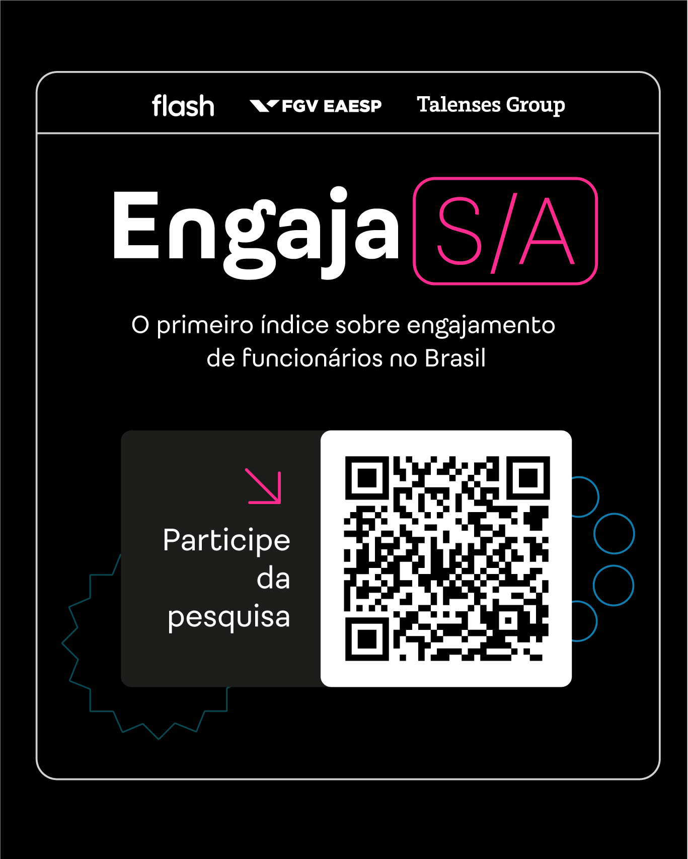
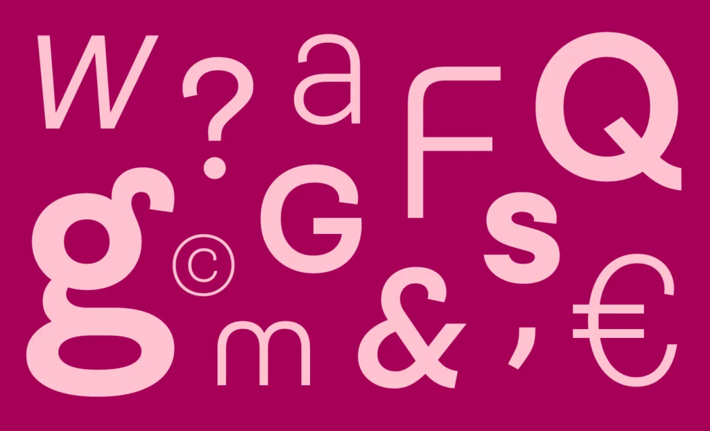
To reflect this new phase, it was vital to evolve the brand’s expressions. Under the leadership of the internal brand and design team, various touchpoints were updated: the physical card layout, colors, illustrations, animations, and of course, the typeface. By the way, do you see a flamingo in that letter g?
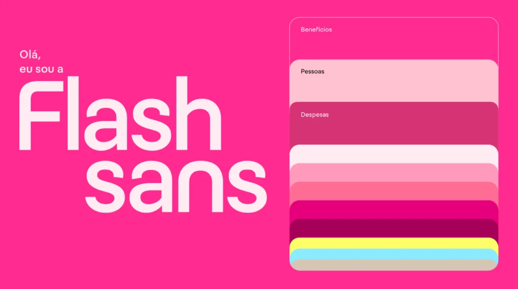
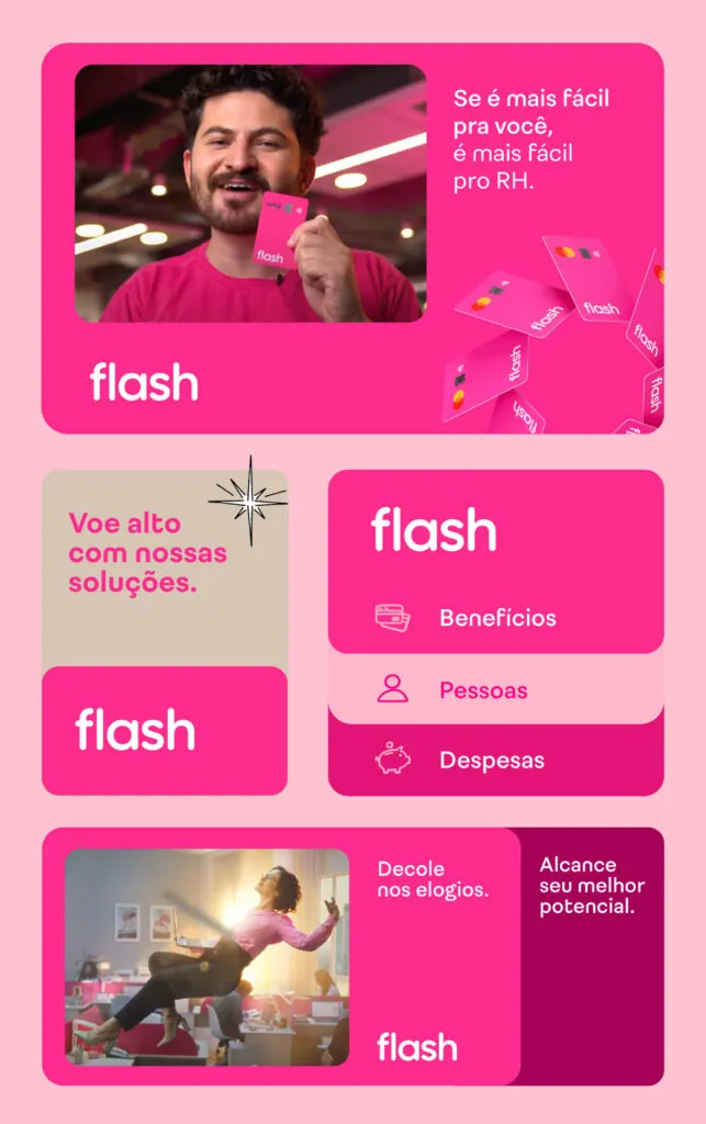
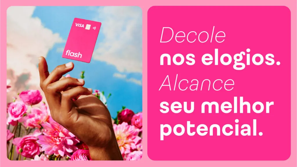
The challenge was to convey a lightness in communication with employees while maintaining the necessary confidence for the financial audience.
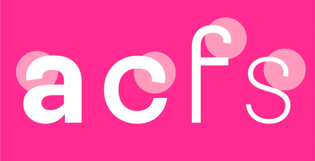
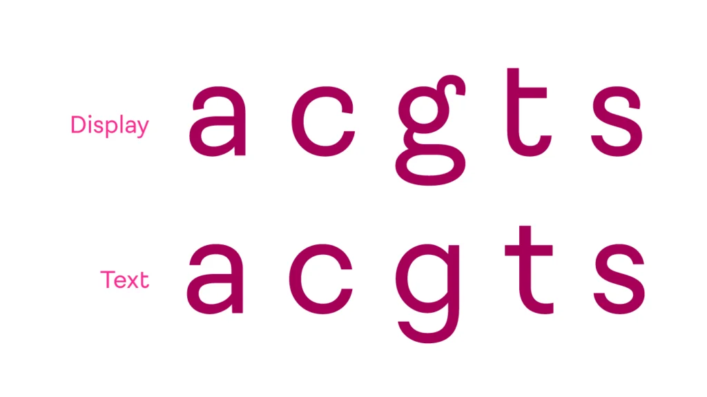
Flash was inspired by human hand gestures, visible in the terminals of letters such as a, c, f, s, C, G, and S. The construction of letters without spurs in m, n, and u stands out, while the conventional sans-serif structure favors legibility. In fact, there is a specific variation for text sizes, where the bold form of the letter g and the gestural details of various others give way to a more neutral and readable design.
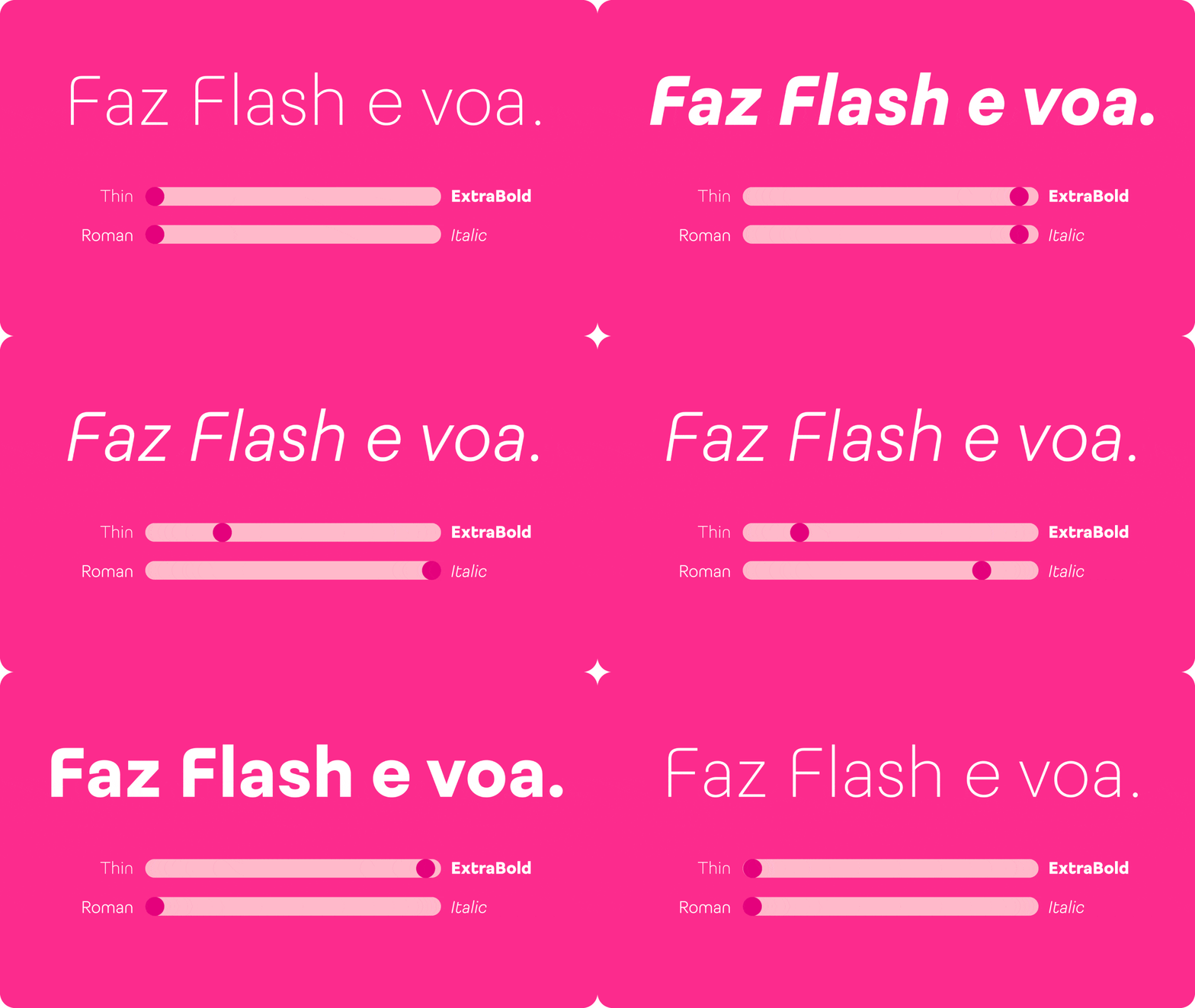
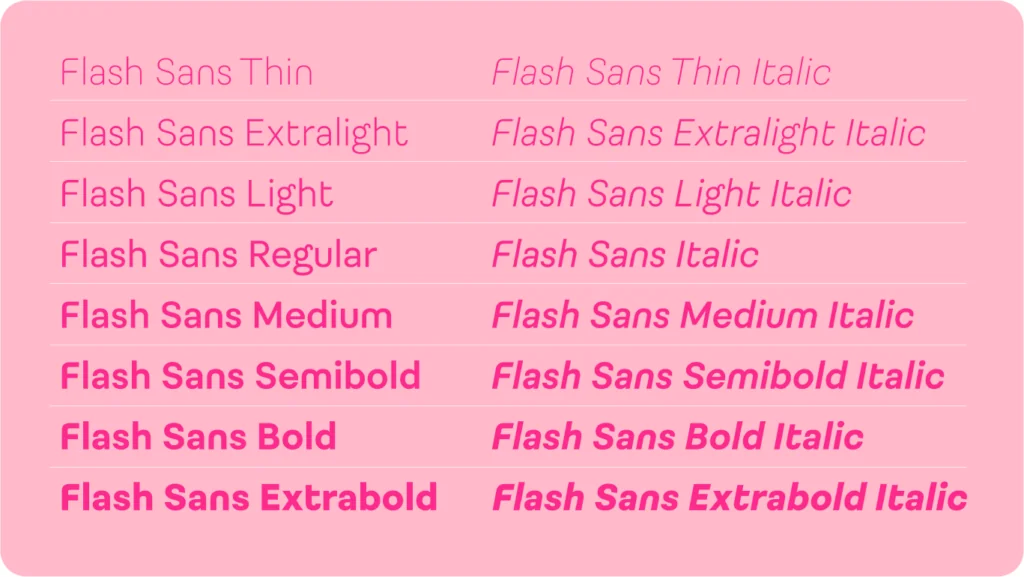
There are 32 styles to accompany people at each stage of the journey.
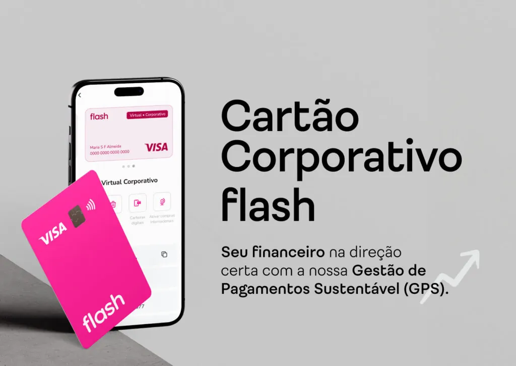
“In an extremely collaborative and rich process, our new typography came to seal an important moment of evolution and maturation for Flash. The Fabio Haag Type team masterfully translated the lightness, movement, and personality that are so much a part of our way of being, further enriching our visual identity.” — Camila Engel, Creative Coordinator at Flash
Fabio Haag Type Studio: Henrique Beier, Ana Laydner, Sofia Mohr, Eduilson Coan, Luciana Haag, and Fabio Haag.


