SporTV Icons

There are many icons readily available, just as there are many existing fonts. And just as some brands are not content with existing solutions, there are those who want their icons be their own.
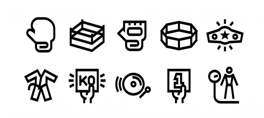
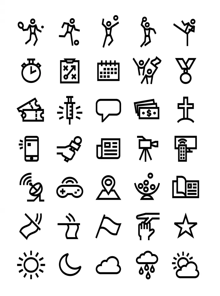
SporTV channels now feature more than 100 icons exclusively developed by Fabio Haag Type. From soccer to tennis, from climate to fights, all themes have icons aligned with the visual universe of the channels.
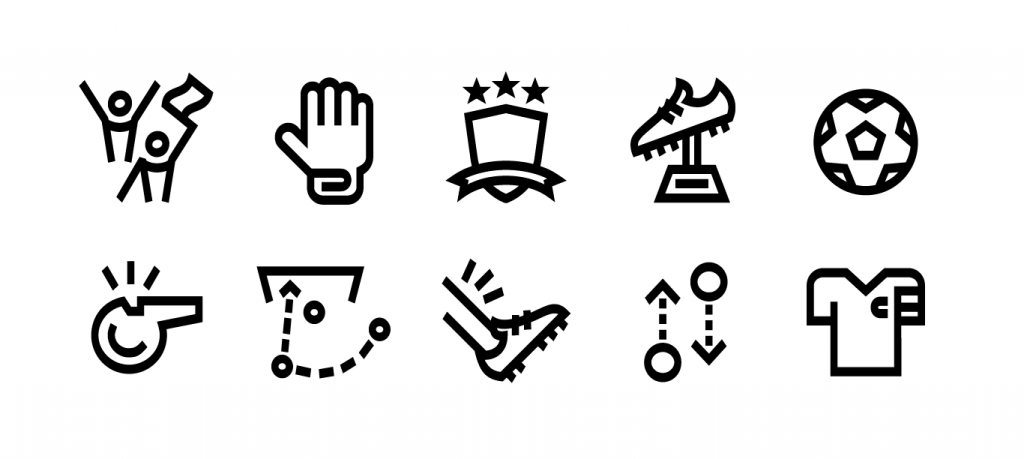
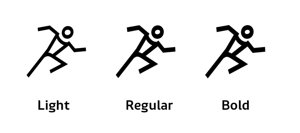
The visual concept is very expressive for several reasons: the thickness of the horizontal strokes is greater than that of the vertical ones, creating a sense of verticality that imposes itself. This thick and thin contrast is exactly the opposite of what we are accustomed to in Latin letters, resulting in a very expressive style.
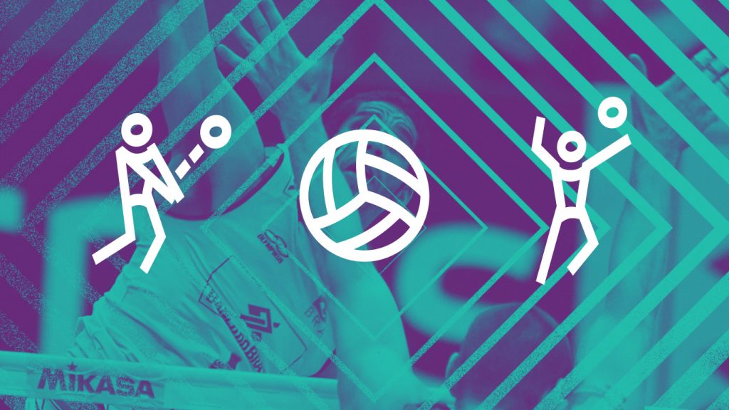

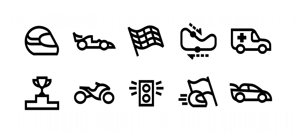
The result is a set of icons with varied themes, even in their unique style. They are accessible through a digital font, in three weights, in addition to a variety of image formats, facilitating the gradual implementation by SporTV.

Creative Direction and Font Production: Fabio Haag
Illustration: Humberto Luis de Oliveira


