

Logotypes
There is no small detail when it comes to a logotype. The thickness of each stem, the path of each curve, the counter space, the spacing… It is in the details that we show who we are, literally.

A story of the new Itaú logotype: to explore, find and polish

Marca Brasil: a redemption of who we are
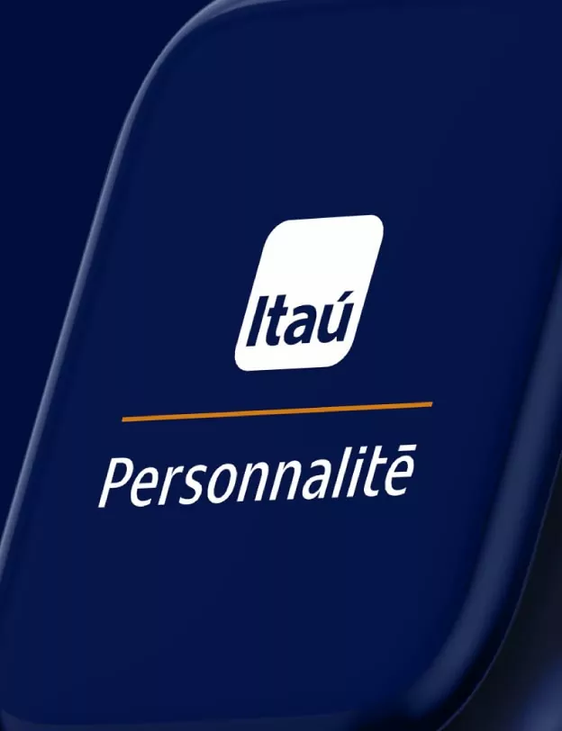
Itaú Personnalité: a new premium on the horizon
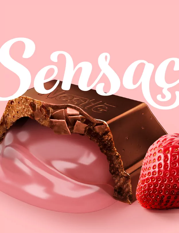
Nestlé Sensação: chocolate with strawberry, letters with indulgence
Rich in Details
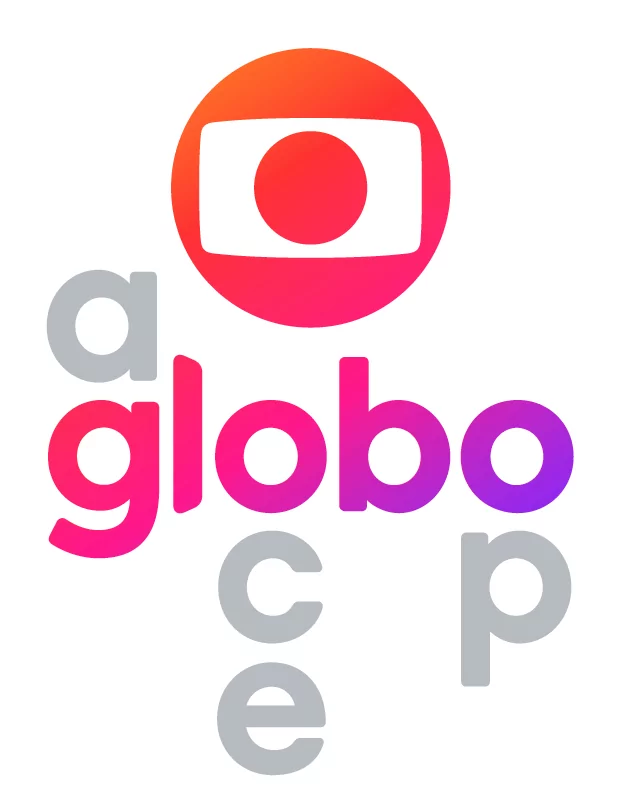
Globo’s new brands arrived to shine on all screens
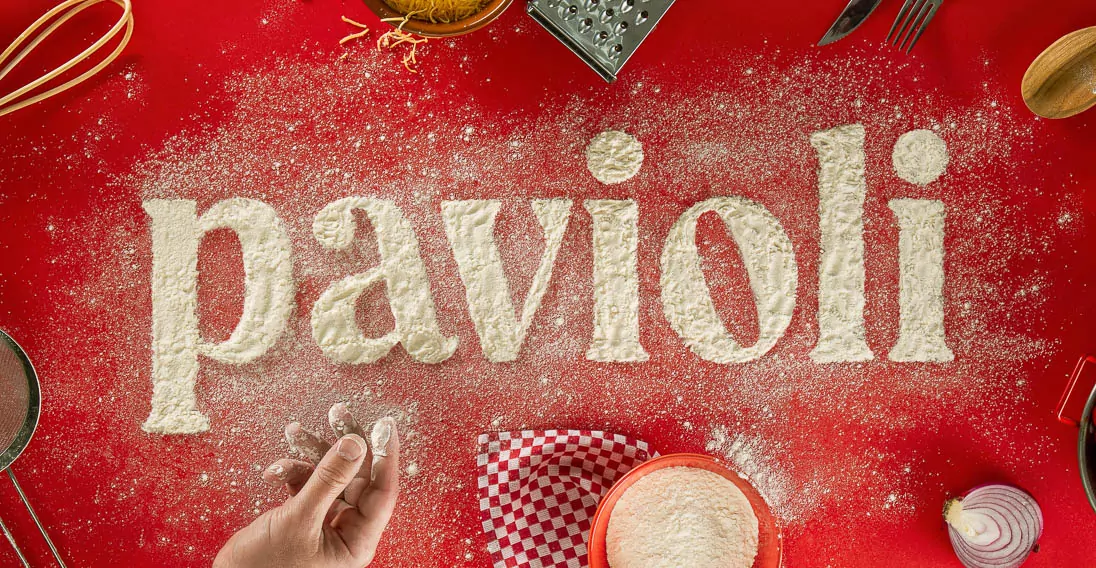
Pavioli: rescuing good memories through typography