CVC: a typeface for a new destination
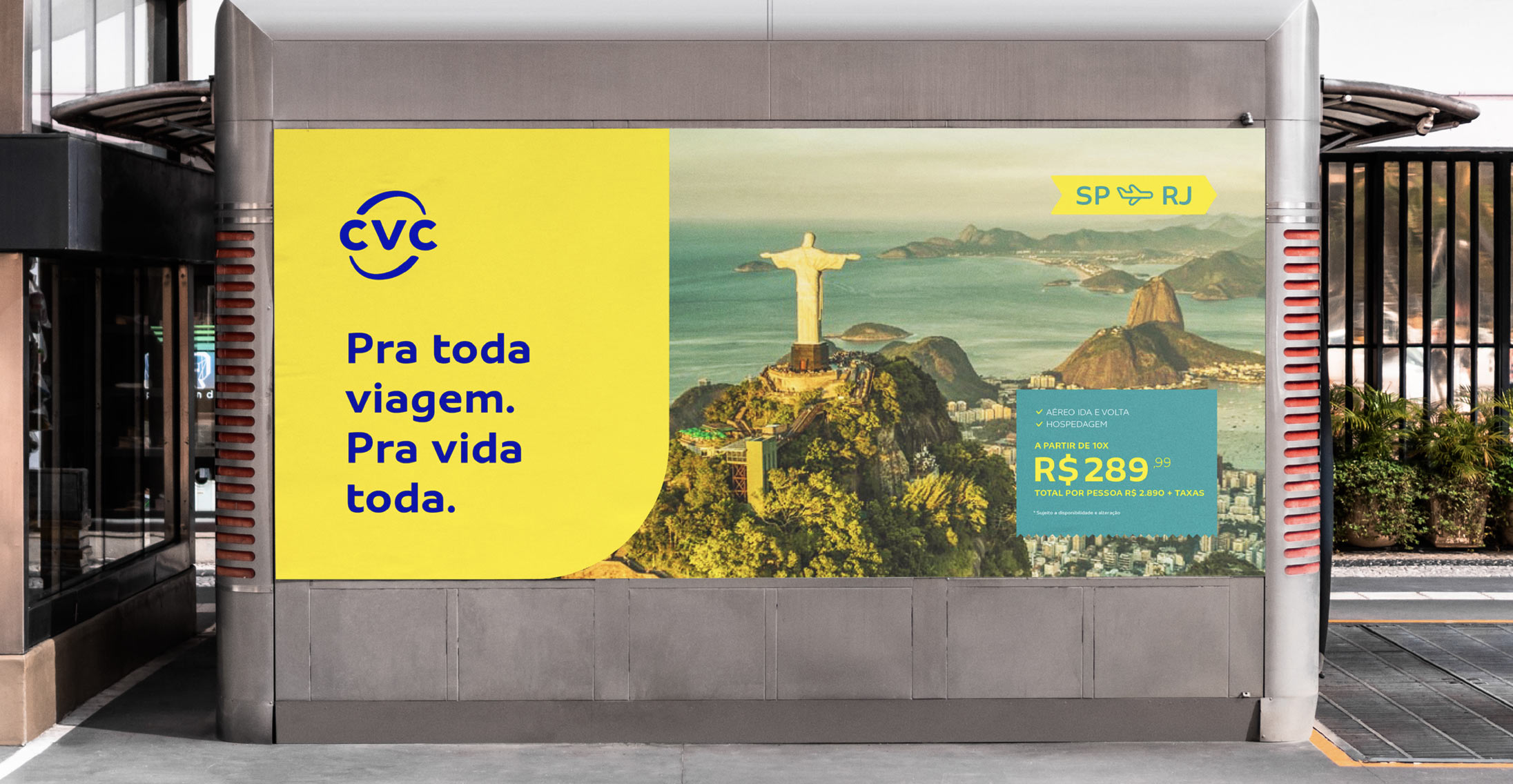
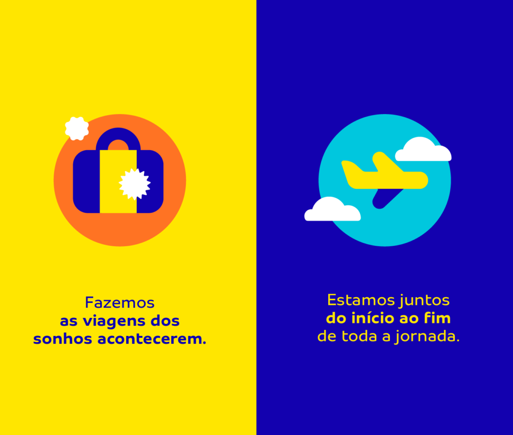
To experience a new chapter of its history, CVC defined a new positioning: ‘Creating, on each trip, stories for a lifetime’.
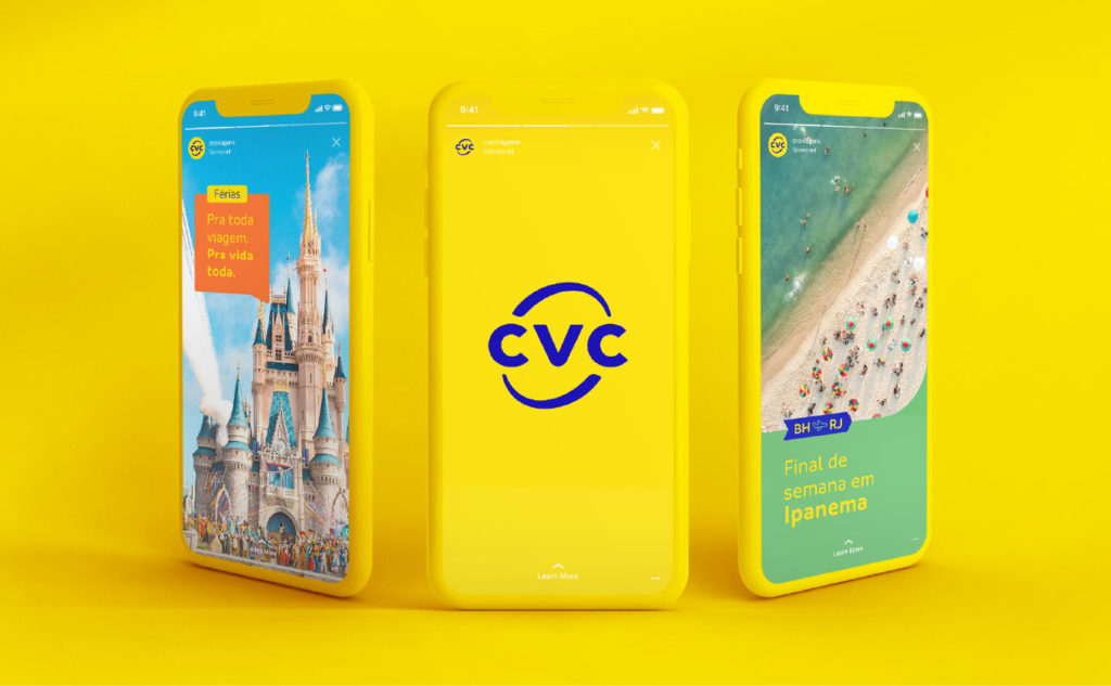
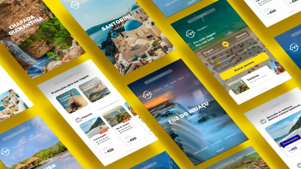
The new brand, created by FutureBrand São Paulo, aims to deliver a more digital CVC, customer-centric and guided by sustainability and diversity.
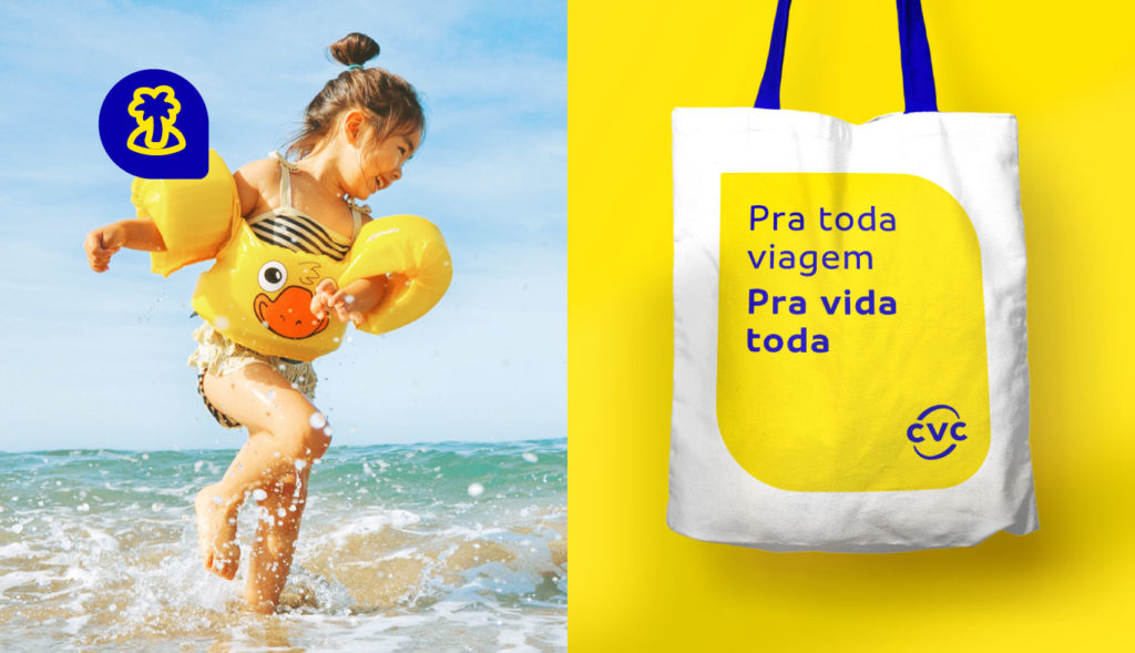
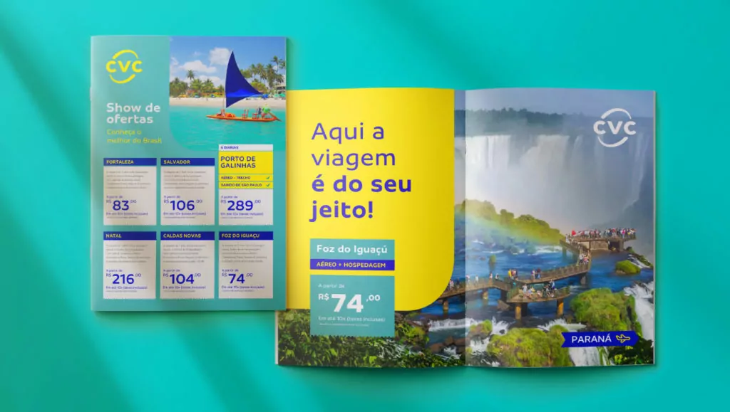

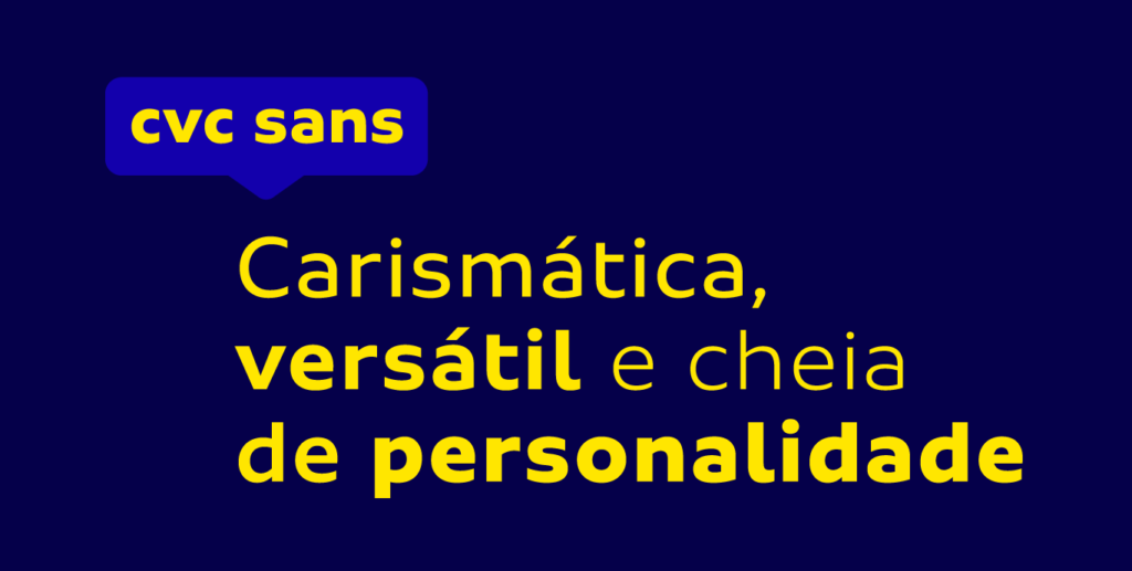

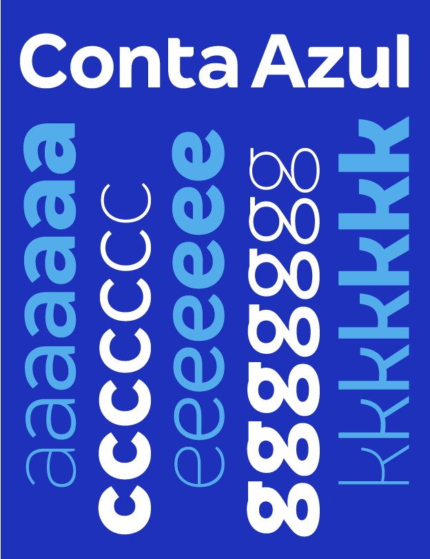
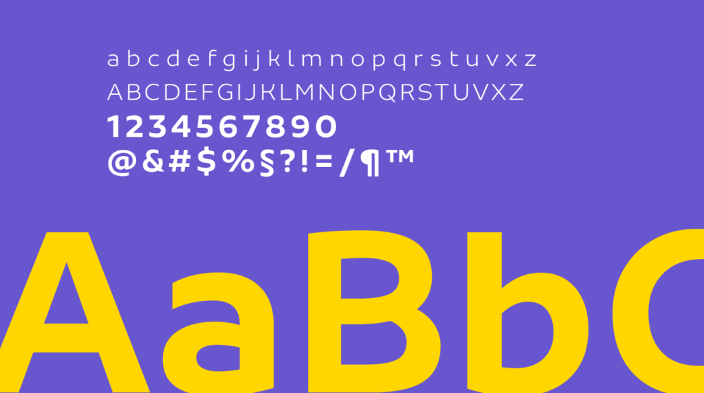
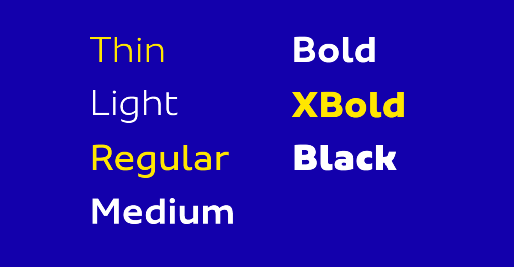
For the typographic palette, an existing font from the Fabio Haag Type library seemed to connect well with the new visual identity, called Sua. From there, we created an exclusive modification for CVC, so that the font would be even more fit with the new brand, plus offer the same freedom for distribution, internal and to suppliers, as a custom font.
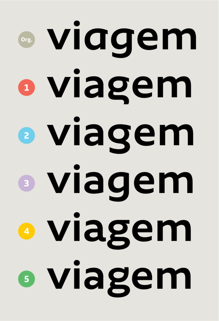
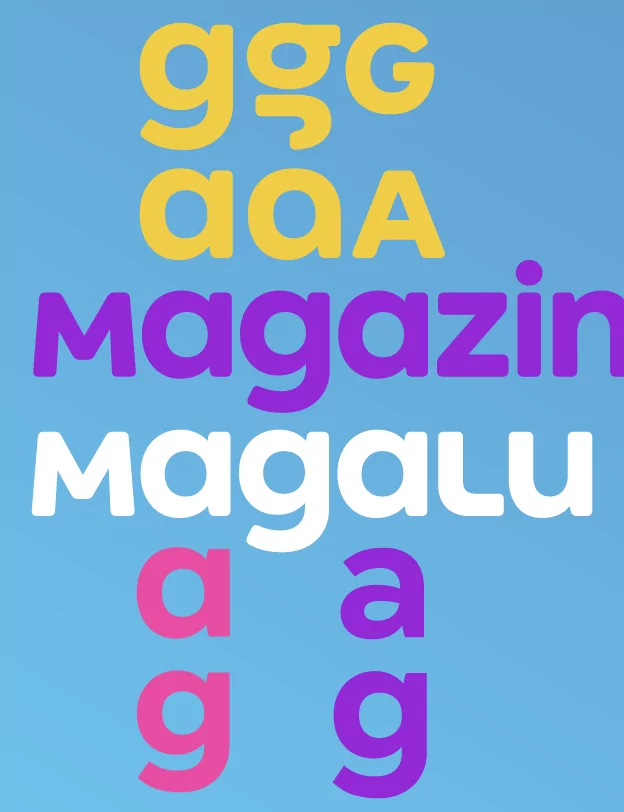
We traveled through five creative routes, going through adventurous and riskier places like the letter ‘g’ in options 1 and 2, to safe and popular destinations like options 3 and 4. Even if the font is only aimed for headlines and advertising, within the mobile universe, these are small. So, one design change was inevitable: the letter ‘a’ needed a more traditional, two-story construction to make it more legible. Yet, different options of how the curve of the bowl happens were considered, and the addition of a small terminal, in option 4. The curves that extended beyond the stems in the letters’ b’ and ‘q’ have been removed in multiple option, as the general plan asked for improved legibility and comfort for reading.
The winning option, number 3, not by chance, is the one that offers greater clarity and performance in the digital environment — a future-proof destination for CVC.



Fabio Haag (Creative Direction), Henrique Beier (Design & Engineering), Ana Laydner (Design) and Eduilson Coan (Design); FutureBrand: Alan Cano Munhoz, Amanda Rodrigues de Oliveira, Andressa Trindade, Arnaldo Bastos, Eduardo Katayama, Eduardo Meurer, Everton Silva, Ewerton Mokarzel, João Lobo Jeveaux, Letícia Shino, Luis Vidovix, Matheus Calderoni, Thomás Debeus and Victor Garcia.


