

Suspire
9 weights, 2 stylesAconchego
9 weights, 2 stylesPitanga
8 weights, 2 stylesPasso
8 weights, 2 stylesPasseio
8 weights, 2 stylesCuriosa
9 weights, 2 stylesVersos
8 weights, 2 stylesPausa
3 weights, 2 stylesSeiva
6 weights, 6 stylesSalva
9 weights, 4 stylesIgual
8 weights, 4 stylesMargem
7 weights, 12 stylesSua
7 weights, 1 stylesLembra
6 weights, 2 stylesParece que você está no celular, acesse nosso site pelo computador para conhecer nossas fontes
Type your genius idea here
Let’s try a few different futures
The shape of our letters has always been transformed by technology.
Text-DaVinci-002
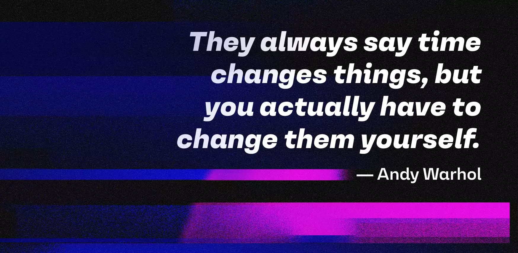
They always say time changes things,
but you actually have to change them yourself.
Andy Warhol
Em 2009 dei uma festa para viajantes do tempo em minha faculdade, em Cambridge. Para ter certeza de que apenas viajantes do tempo genuínos viriam, só divulguei depois que festa terminou. No dia da festa, fiquei esperando, mas ninguém apareceu.
Stephen Hawking
If it keeps up, man will atrophy all his limbs but the push-button finger.
Frank Lloyd Wright
We study history not to know the future but to widen our horizons, to understand that our present situation is neither natural nor inevitable, and that we consequently have many more possibilities before us than we imagine.
Yuval Noah Harari
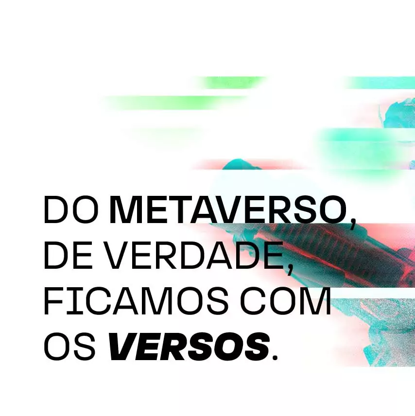
Maybe we’ll be extinct. But from the metaverse, really, we keep the verses.
Uppercase & Lowercase
Numerals
Diacritics
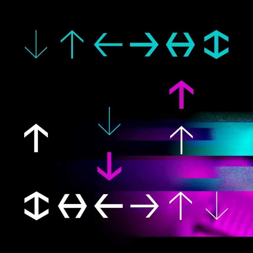
Symbols
About
The shape of our letters has always been transformed by technology. In the hands of the scribes, it was their brush that decided which part would be thick or thin. Advances in ink and paper quality allowed the printing of very delicate lines in the 18th century, which are still synonymous with luxury today. Variable fonts now offer precise adjustments to the user’s taste. But for all that, if you compare the page of a current book with that of a fifteenth-century one, you'll see how little the design of the letters has changed compared to all the transformation of our civilization over the last few centuries.
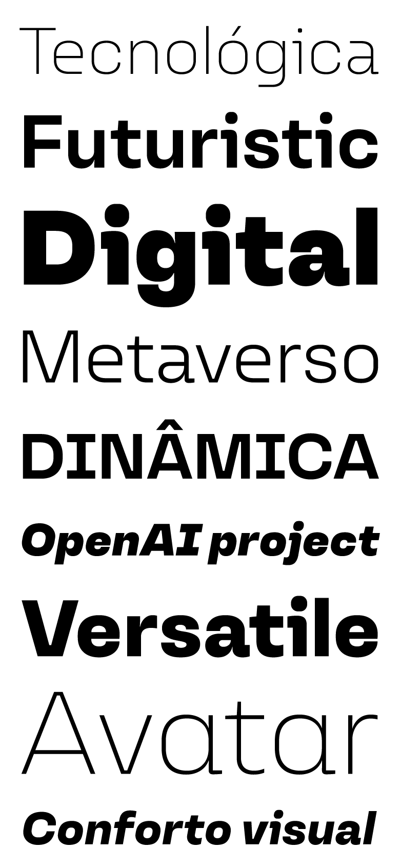
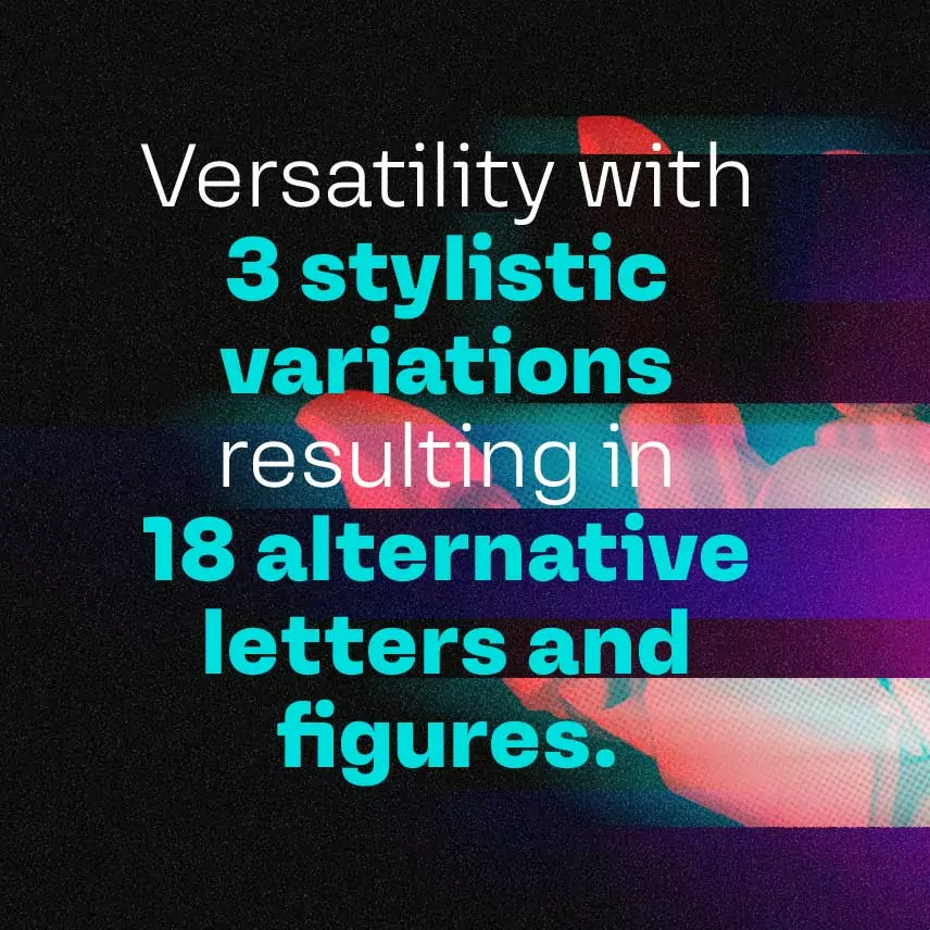
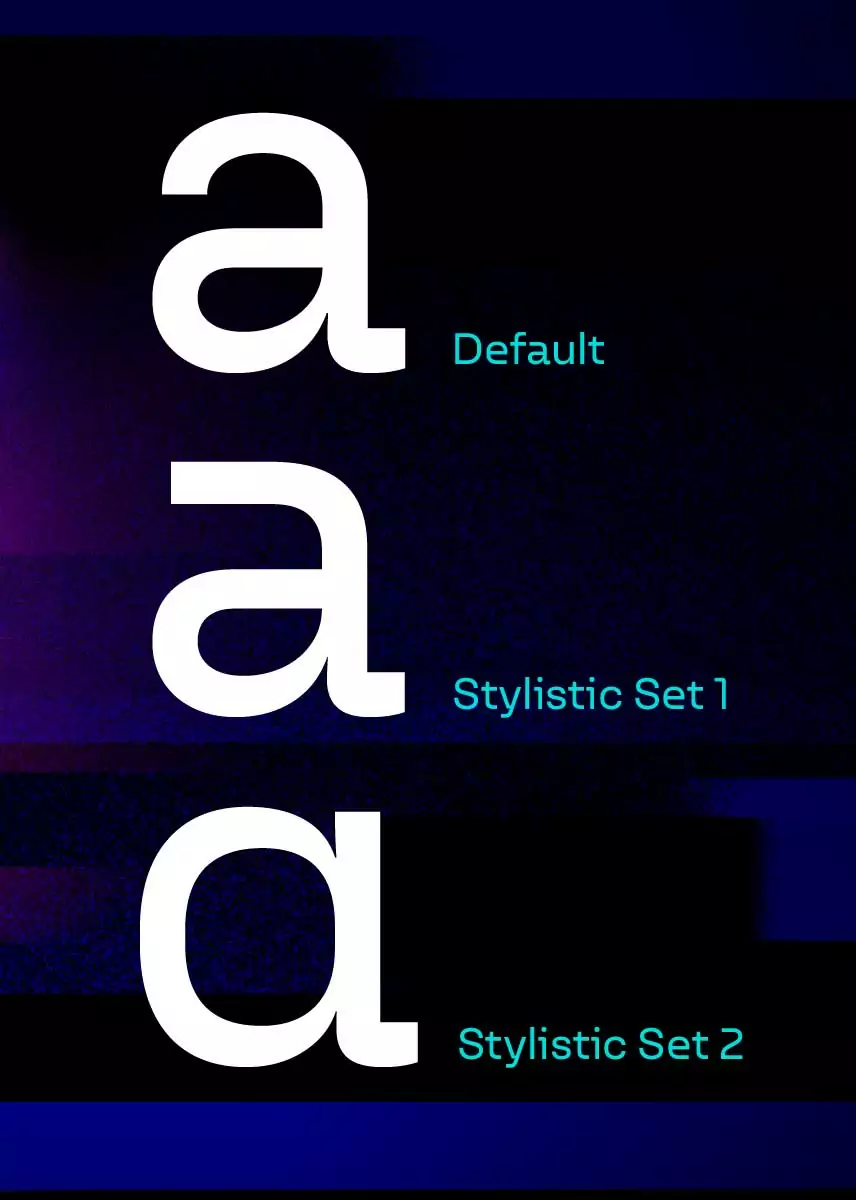
Today we launch the typeface Versos looking into the future, inspired by a style of 50 years ago. In other words, yesterday in the history of typography. In 1962 in Italy, Aldo Novarese launched Eurostile, with very characteristic rectangular shapes, reminiscent of the shape of televisions and reflecting optimism in technology during the space race. Versos interprets this heritage and expands the possibilities of the future through a series of alternative letterform designs. Combined or not, they offer flexibility for every type of application.
In a virtual world, where our identity is replaced by avatars, fonts can become even more important as a form of our personal expression. Who said that was the own artificial intelligence Text-DaVinci-002 of the OpenAI project, which helped us to prepare this text. Still, we're a little skeptical. Maybe we’ll be extinct. But from the metaverse, really, we keep the verses.
Finally, font licenses designed for you:
Clients can easily share with suppliers and don’t need to worry about web pageviews or renewals at any time.
Designers and studios have easy free trials and fair pricing, no matter the size of their practice.
Who are you and what do you need?

