

Suspire
9 weights, 2 stylesAconchego
9 weights, 2 stylesPitanga
8 weights, 2 stylesPasso
8 weights, 2 stylesPasseio
8 weights, 2 stylesCuriosa
9 weights, 2 stylesVersos
8 weights, 2 stylesPausa
3 weights, 2 stylesSeiva
6 weights, 6 stylesSalva
9 weights, 4 stylesIgual
8 weights, 4 stylesMargem
7 weights, 12 stylesSua
7 weights, 1 stylesLembra
6 weights, 2 stylesParece que você está no celular, acesse nosso site pelo computador para conhecer nossas fontes
Type your genius idea here
Recycling of typographic waste?
It does happen, and it’s okay
Less technology
more humanity
The more the merrier
Nowadays, things are always advancing; sometimes, for the worse.
Fairy tales are more than true:
not because they tell us that dragons exist, but because they tell us they can be defeated.
Cometam interessantes, impressionantes, gloriosos e fantásticos erros.
The world always seems brighter when you’ve just made something that wasn’t there before.
Funny and serious are not opposites.
The opposite of funny is not funny. You can absolutely be funny and serious at the same time.
Quando uma empresa tem sucesso, é natural assumir que ele é o resultado de decisões inteligentes. Na verdade, aleatoriedade e sorte desempenham um papel vital.
Uppercase & Lowercase
Numerals
Diacritics
Symbols
About
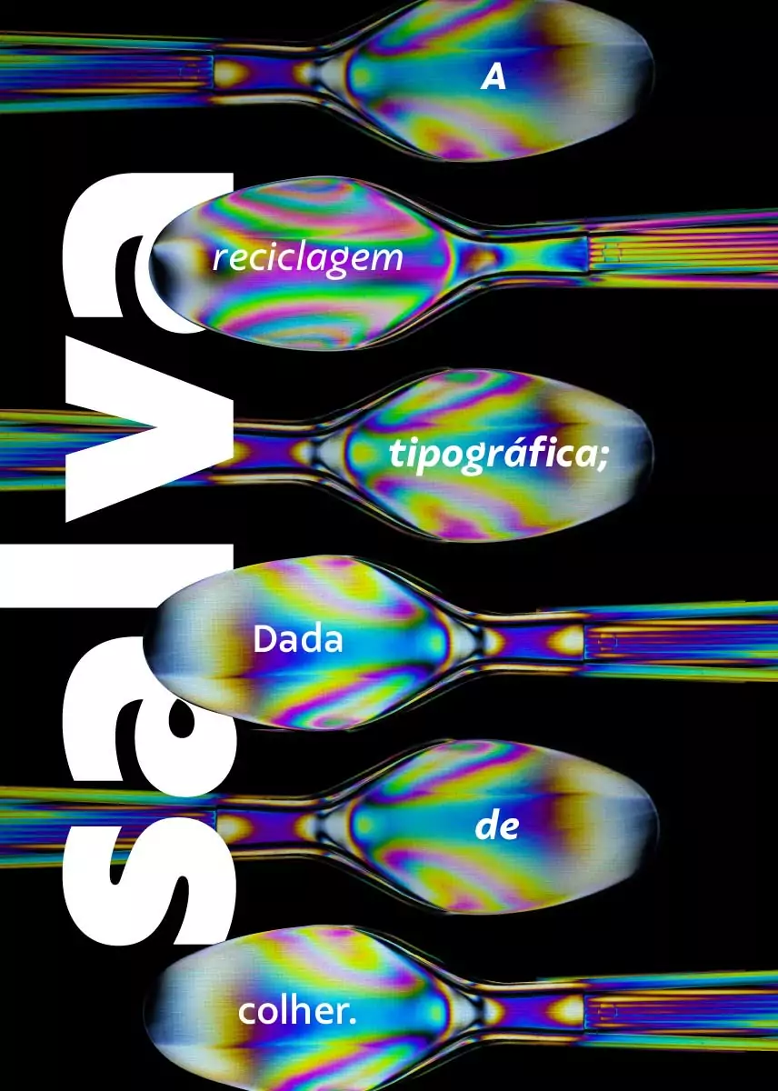
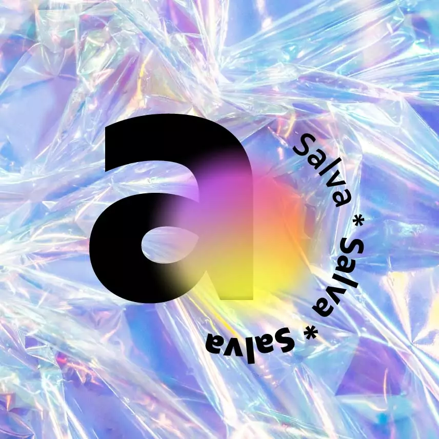
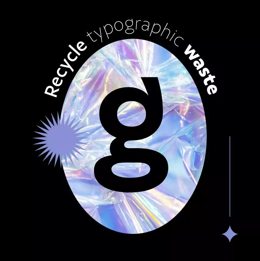
Recycling of typographic waste? It does happen, and it’s okay. Our new font, Salva, emerged from a concept discarded by a corporate client, and we think this is a very natural process.
Each idea has its time and place, and we never know for sure when and where it will arrive. The fact is that we have thousands of bytes shelved in virtual folders with ideas that have not yet found their place. It was from there that we collected the raw material for what would become the Salva family.
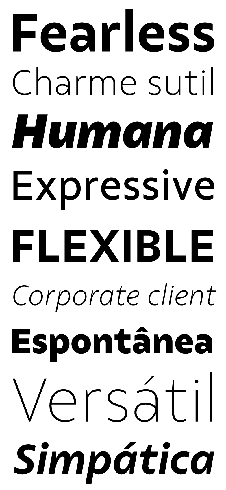
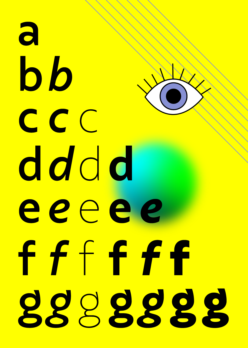
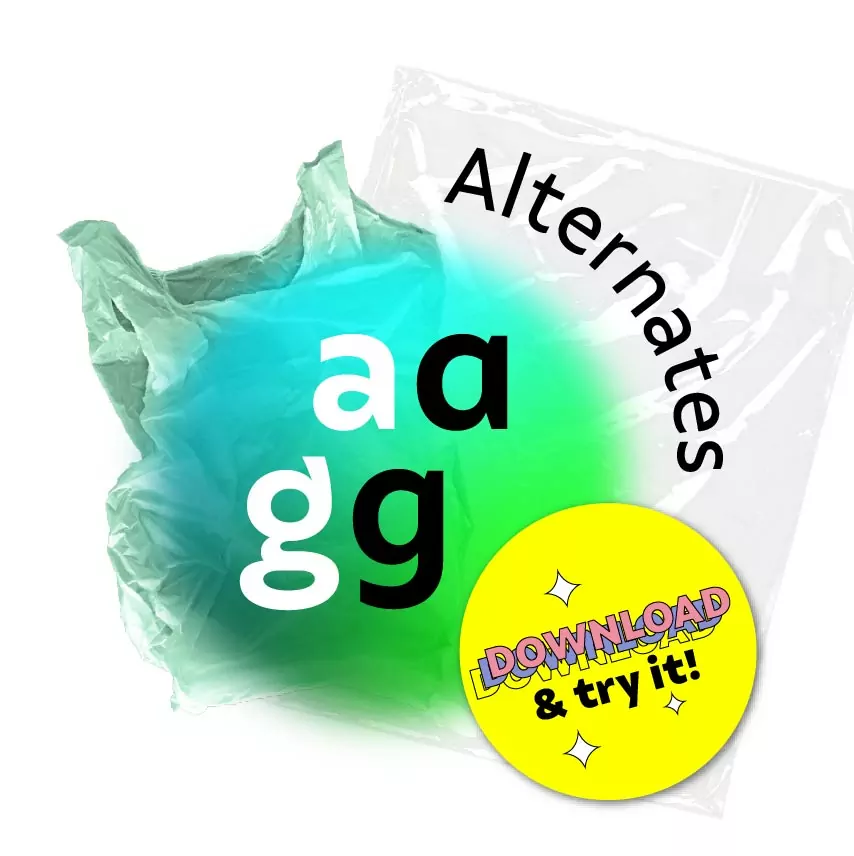
Idealized for a briefing aiming at a mixture between ‘humanity’ and ‘technology,’ we filtered the best characteristics and removed the impurities — less ‘technology’, and more room for ‘humanity.’ Thus, we have the contrast modulation increasing when the curves meet the stems, or the slanted bar of the letter ‘e’, inherited from calligraphy and the human hand. We brought a subtle charm to the number 8, with the optically larger top, and designed an inventive letter ‘g’ that doesn’t conform to the standard.
Salva is a versatile family that proves: nothing is lost, everything is transformed.
Salva inaugurates an important moment for Fabio Haag Type. It is the studio’s first release within its current collaborative structure: Eduilson Coan is the lead designer, along with Henrique Beier, Ana Laydner and Fabio Haag, in several sessions of our Brain Trust — a dynamic explicitly stolen from PIXAR — and countless reviews together. The striking graphic design for this launch is by Fernanda Salgado.
Finally, font licenses designed for you:
Clients can easily share with suppliers and don’t need to worry about web pageviews or renewals at any time.
Designers and studios have easy free trials and fair pricing, no matter the size of their practice.
Who are you and what do you need?

