

Pitanga
8 weights, 2 stylesPasso
8 weights, 2 stylesPasseio
8 weights, 2 stylesCuriosa
9 weights, 2 stylesVersos
8 weights, 2 stylesPausa
3 weights, 2 stylesSeiva
6 weights, 6 stylesSalva
9 weights, 2 stylesIgual
8 weights, 4 stylesMargem
7 weights, 12 stylesSua
7 weights, 1 stylesLembra
6 weights, 2 stylesParece que você está no celular, acesse nosso site pelo computador para conhecer nossas fontes
Have a play typing here
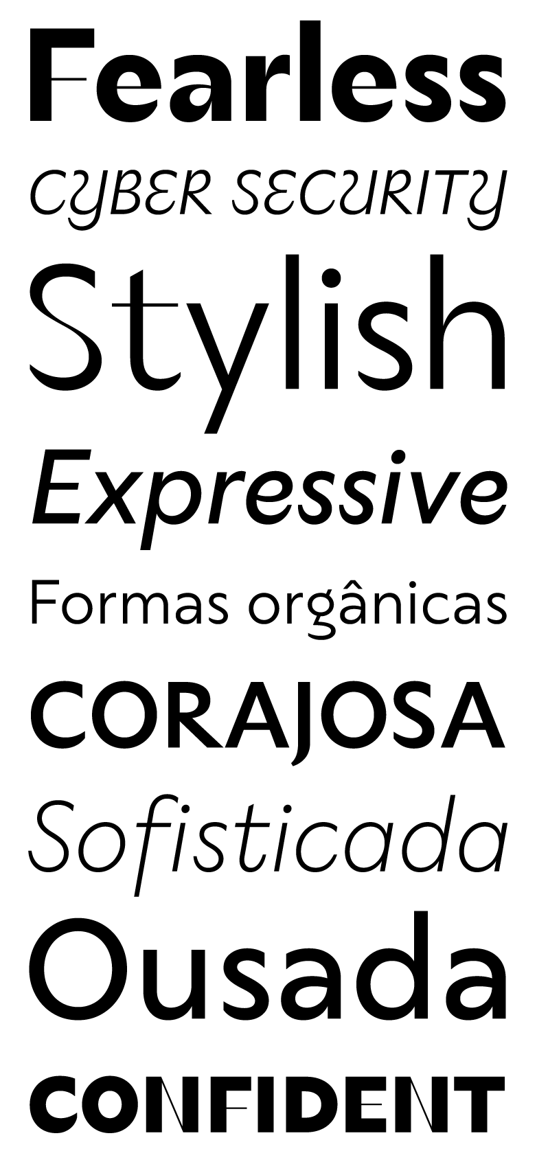
It grew up defying tradition
Transformação
No form in nature is simply random
ELEGANT AUTHORITY
The exuberance is pruned as the size decreases, in favor of legibility
Rica diversidade
The Seiva family adapts to the environment in which it lives using Variable Font technology
Nutrientes do solo brasileiro
Delicate details gain the vitality needed to work at text sizes.
Uppercase & Lowercase
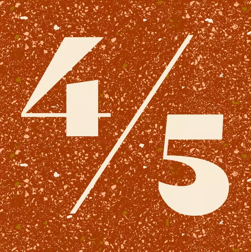
Numerals
Diacritics
Symbols
About
Just like the liquid that nourishes the plants, the typeface Seiva has transformation in its essence.
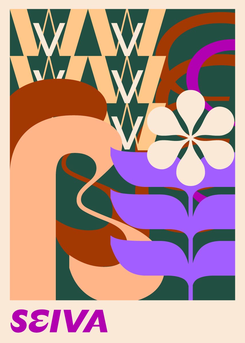
From its Modern roots, only the high contrast of Bodoni or Didot remain, as it grew up autonomously, defying tradition. As the letters grow, the expressiveness of Seiva blossoms with fine and delicate lines, contrasting with voluminous organic forms, charged with life.
No form in nature is simply random. In the same way, the Seiva family adapts to the environment in which it lives using Variable Font technology: the exuberance of large-size letters is pruned as the size decreases, in favor of legibility. Delicate details gain the vitality needed to work at text sizes.
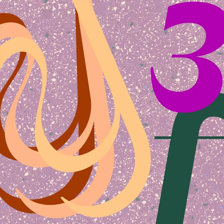
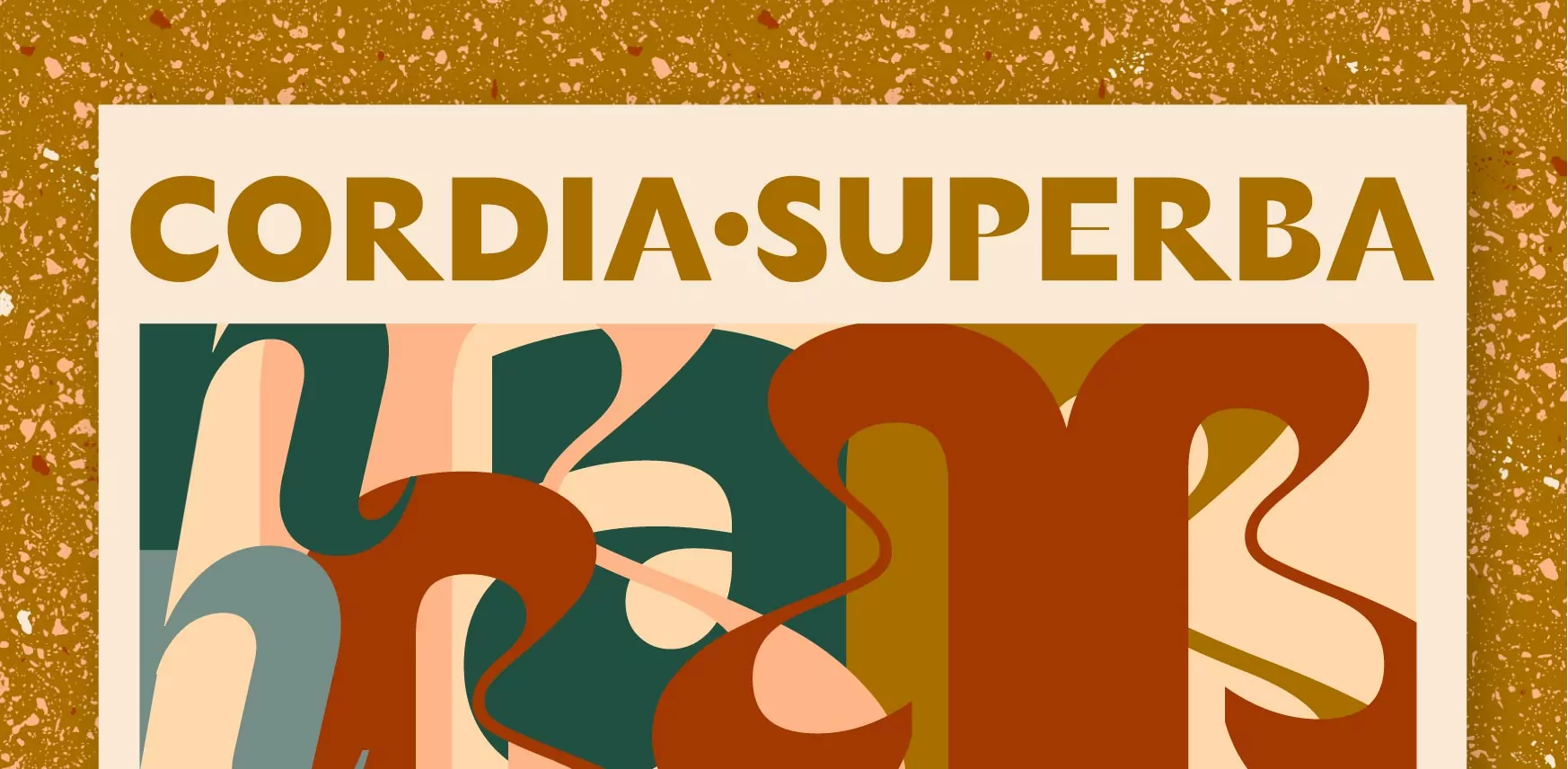
Italics grew vivid and with exotic stylistic alternates thanks to the rich nutrient diversity of the Brazilian soil.
Finally, font licenses designed for you:
Clients can easily share with suppliers and don’t need to worry about web pageviews or renewals at any time.
Designers and studios have easy free trials and fair pricing, no matter the size of their practice.
Who are you and what do you need?

