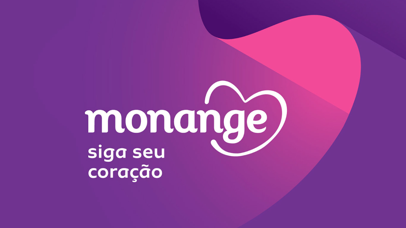
Sua font: an intuitive choice for Monange
Designing retail fonts – not commissioned by a particular client – has an exciting dynamic. Hundreds of hours are invested in creating something that we do not know where will stand. Who will use it? In what way? Will it behave in the contexts out there, in real life? Will it walk in the company of which other elements? Will they get along? Did I do all I could to prepare it?
The analogy with raising a child and seeing it leave our arms to fall into the world is not a mere coincidence. Once released, our fonts are out of our control. They may get lost along the way. Fonts raised for titling end up being used by long texts; some may have the space between their letters slashed by ignorant software applications, or, have their shoulders squeezed to fit in a claustrophobic layout.
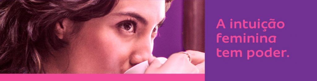
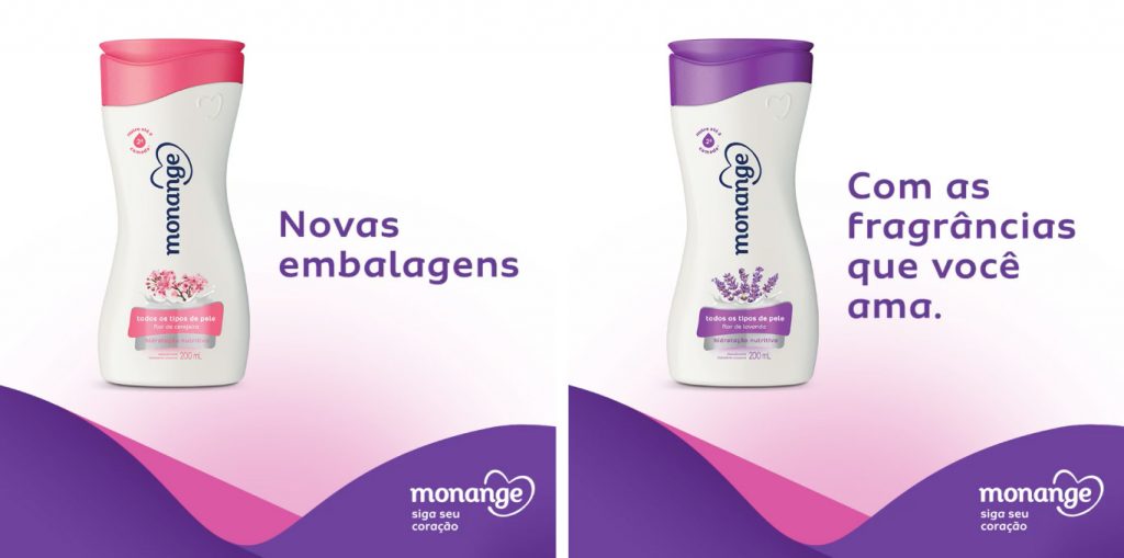
Monange’s new brand strategy and design, created by the studio Ana Couto, focuses on the power of female intuition, on following the heart; and nails it by adopting the Sua font:

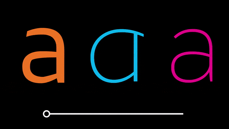
“We were looking for a typeface to dialogue with the curved forms of the system and reinforce aspects of the personality of the Monange brand. Sua was a good choice because of the balance it presents. There is certain neutrality that is sometimes surprised by the unexpected terminations in letters like ‘a’ or ‘g’, becoming a recognizable and memorable presence. It can be both delicate and courageous, just like the Monange woman.” – Johnny Brito, senior designer at Ana Couto.

The font’s father here is super proud : )
Thank you, Johnny, Fernanda, Danilo and all the team for the trust, always.