More than educated, the Margem typeface is now an enquirer

The most respected publication for education in Brazil, Nova Escola, adopted the Margem typeface in its new editorial design, created by Laboota studio.
Well-chosen words deserve well-chosen letterforms, as Robert Bringhurst once said.
Typography exists to honor its content, and there is nothing more noble and transformative than education.
“I’ve seen my typefaces being used on banners calling for military intervention, so, this choice is a kind of redemption.” – Fabio Haag
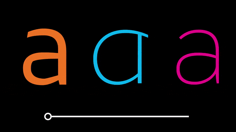
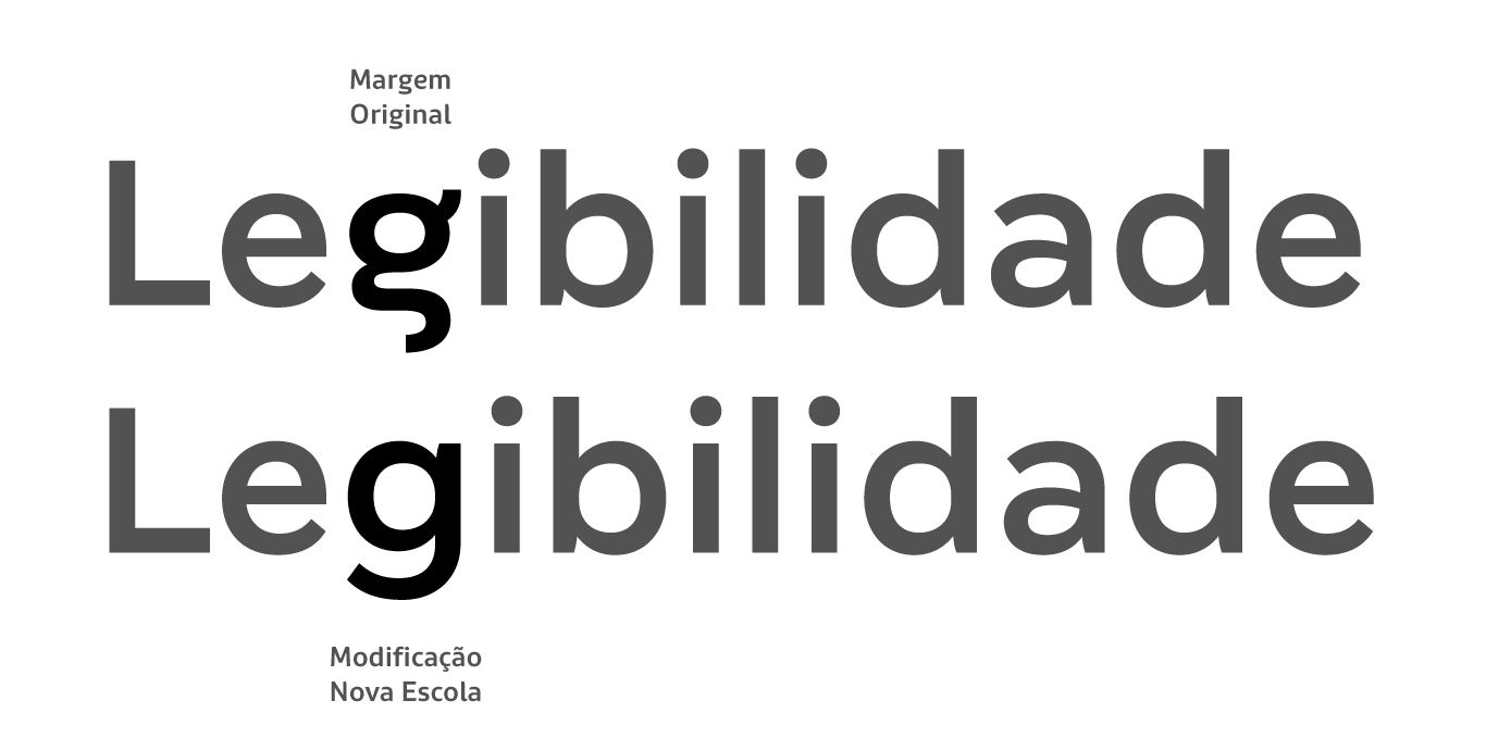
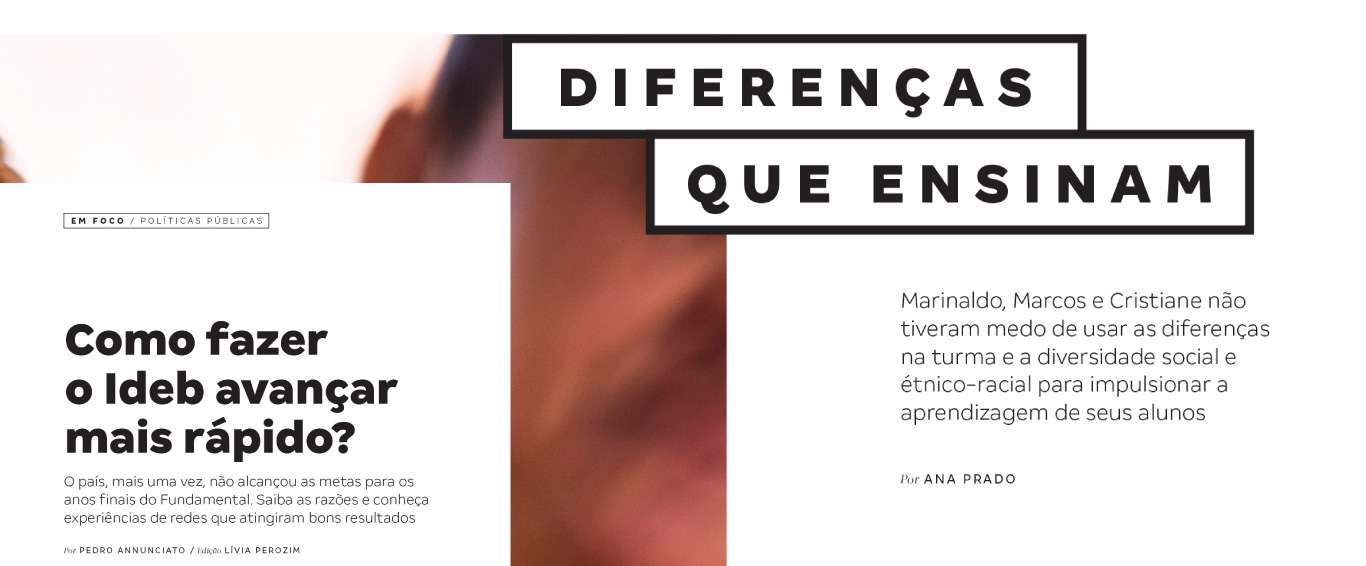
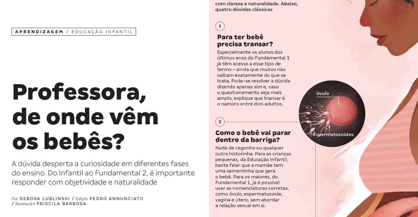
The new design modernized the appearance and aligned the look of the magazine with the dynamism that the new editorial project demanded, according to the Laboota studio. In the exclusive version for New School, the font Margin had the letter ‘g’ modified to a more conventional form, putting legibility and accessibility first.
“Margem proved to be extremely suitable and versatile as the main font of the new project for Nova Escola, making it easier to read in both more conventional titles and more creative lettering. Not to mention that it is very modern and brought the freshness to the look we wanted for the magazine.”- Alexandre Lucas, Creation Director of Laboota.


The corporate use license allowed the distribution and usage without any restriction of the new fonts, which was vital so that the visual expression could be implemented successfully, from print to digital, without limitations or concerns with the licensing.
Get to know Nova Escola
Meet the studio Laboota
Discover the Margem typeface in all its styles