Inside the margins in 500 pages
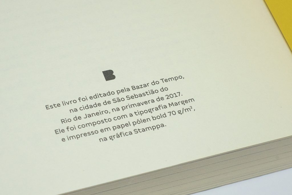
The book which stars the Brazilian Heritage series also premieres Margem in the editorial world, for the record, in more than 500 pages.
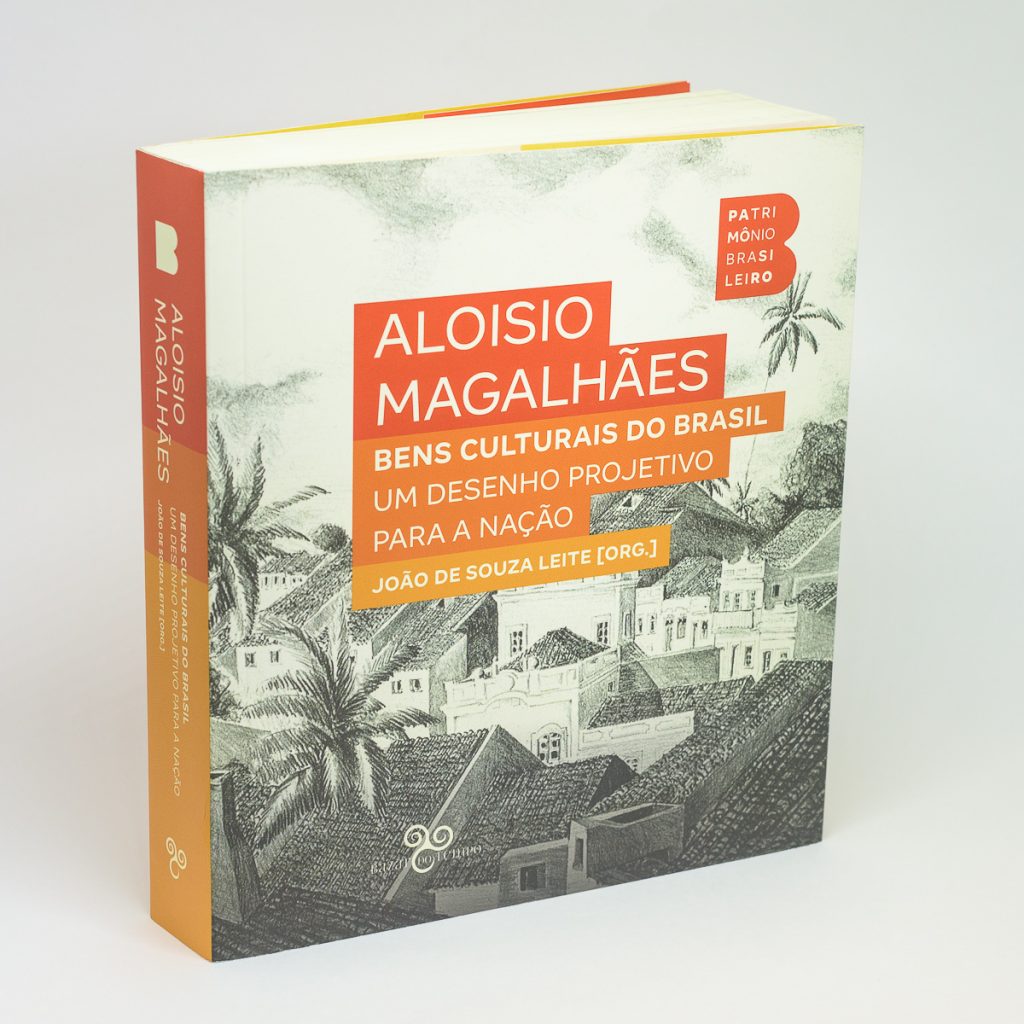
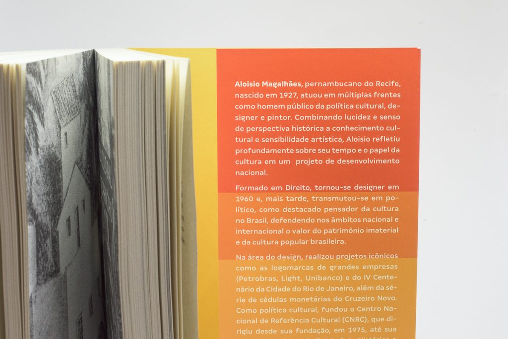
Cultural Goods of Brazil, organized by João de Souza Leite, focuses on the political-cultural thinking of Aloisio Magalhães, considered one of the most important Brazilian graphic designers of the 20th century.
Ney Valle, a partner at Dupla Design, tells us about this typographic choice:
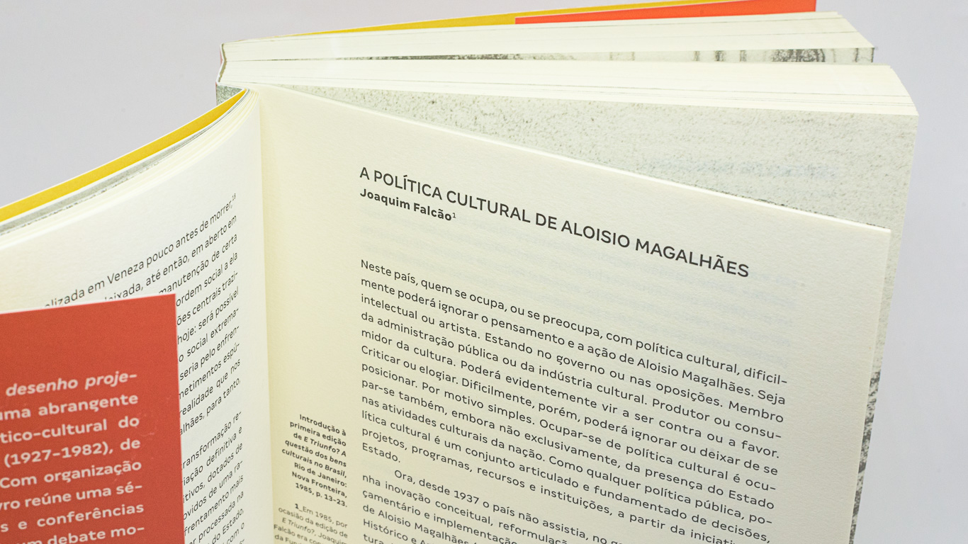
Contrary to consensus, we love running texts with sans serif fonts. For us, when the font is well drawn, the body/lead ratio is well adjusted and the texture is comfortable, the result is unbeatable.
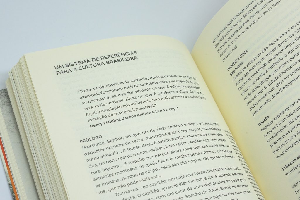
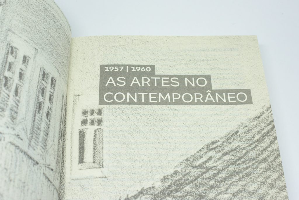
For this project, we chose Margem because we needed a font with many weights and that worked in different sizes and situations. To serve a collection of long, medium and short textbooks, each with specific needs – starting with the collection’s brand identity – to typographic hierarchies: titles, subtitles, body text, quotes, footnotes and credits.
We also chose it because it is geometric, with seductive curves and with the most beautiful letter ‘g’ ‘missing a piece’ we have ever seen. Simple and clear, but full of personality to sign a project of this size.