A book is not a sum of words, phrases, and chapters.
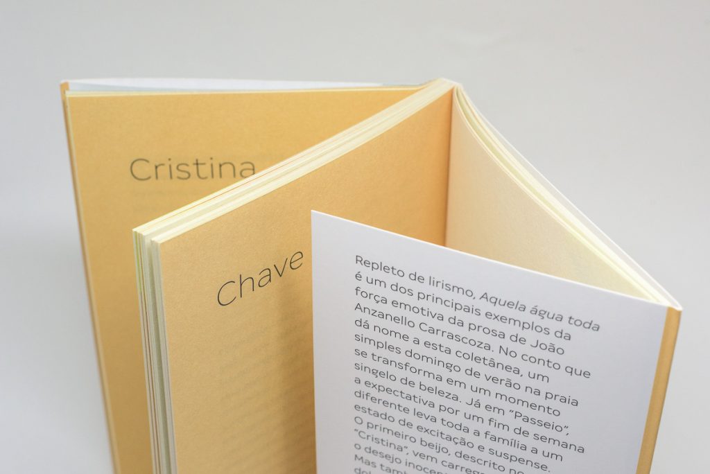
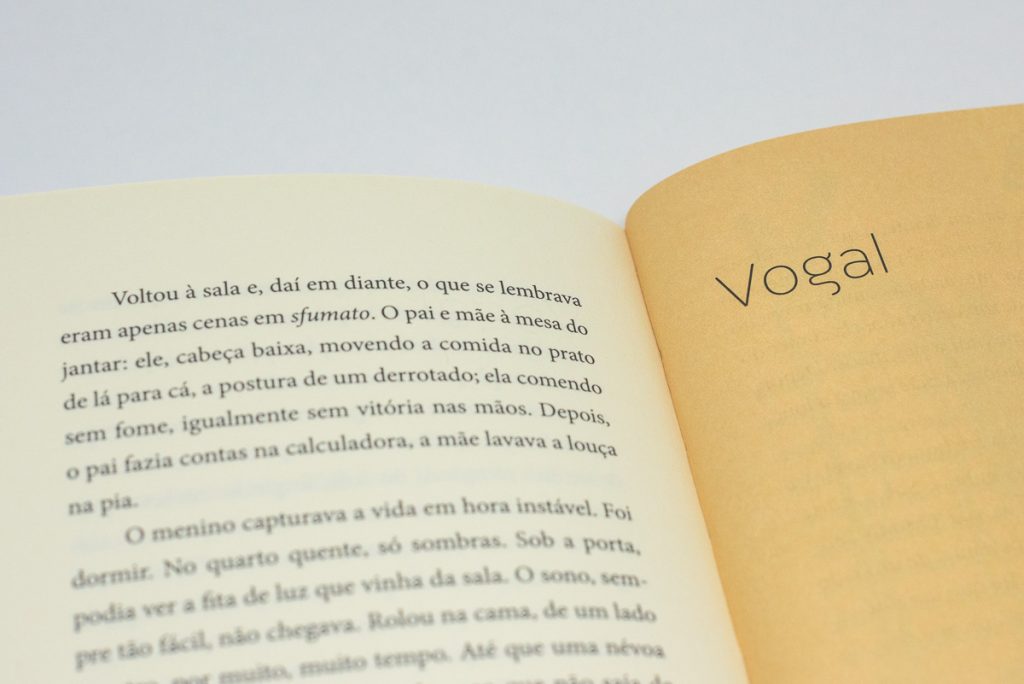
It is an object, physical and palpable. We feel the weight of a book. We touch the texture of its cover. We open and flip its pages comfortably. There is a sense of pleasure hard to explain when we hold a book which is complete – besides well-written, very well-designed.
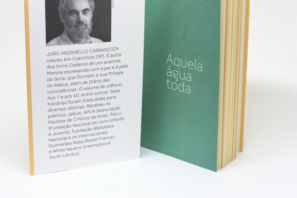
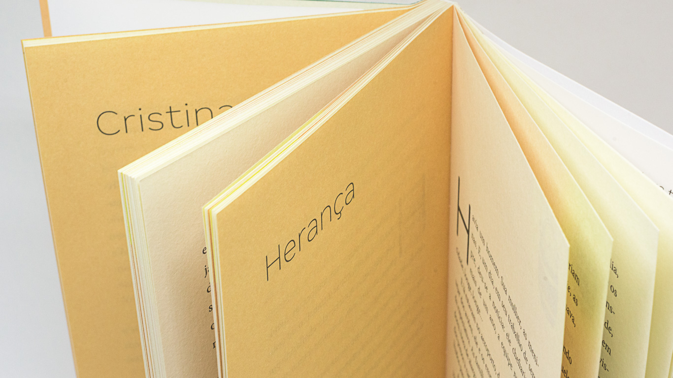
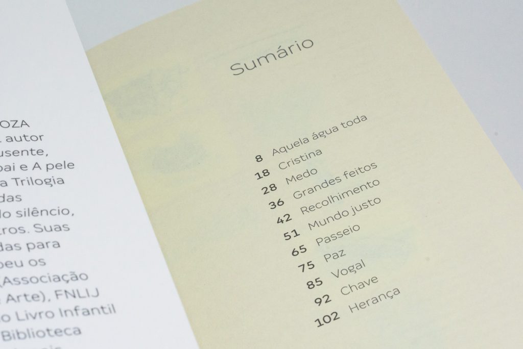
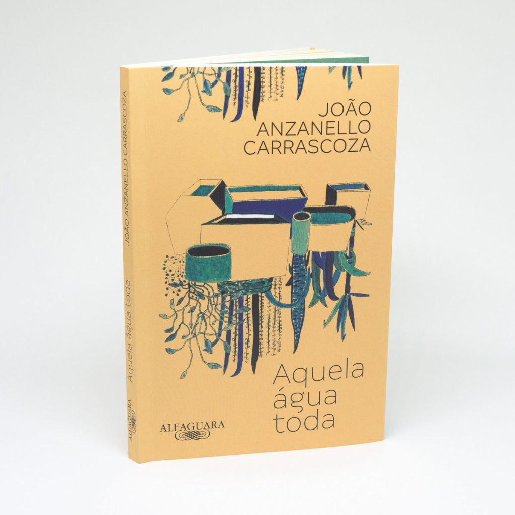
“Aquela Água Toda” by João Carrascoza, is one of these books. Comfortable in the hands and to the eyes, the design by Alceu Nunes orchestrates diverse elements in a unique harmony. The imaginative illustrations of Rodrigo Visca, the clean expressiveness of the Margem font for the covers and chapter openings, and the traditional functionality of Minion in body text – all this in a sober color palette soft.
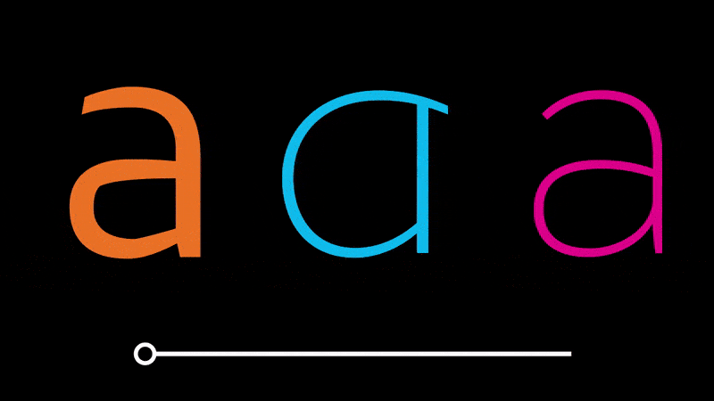
“When I wrote the title of the book, and the letter ‘g’ flowed like water, I had no doubt that Margem was the perfect font for the project.” – Alceu Nunes
The work has won several awards including Jabuti and White Ravens. But it would not be complete without this design, after all, a book is not a sum of words…
Title: Aquela Água Toda
Author: João Anzanello Carrascoza
Publisher: Alfaguara/Grupo Companhia das Letras
Design: Alceu Chiesorin Nunes
Typeface: Margem, by Fabio Haag Type
Illustration: Visca